Flo Water Offers A Refreshing Take
By
Published
Filed under
By
Published
Filed under
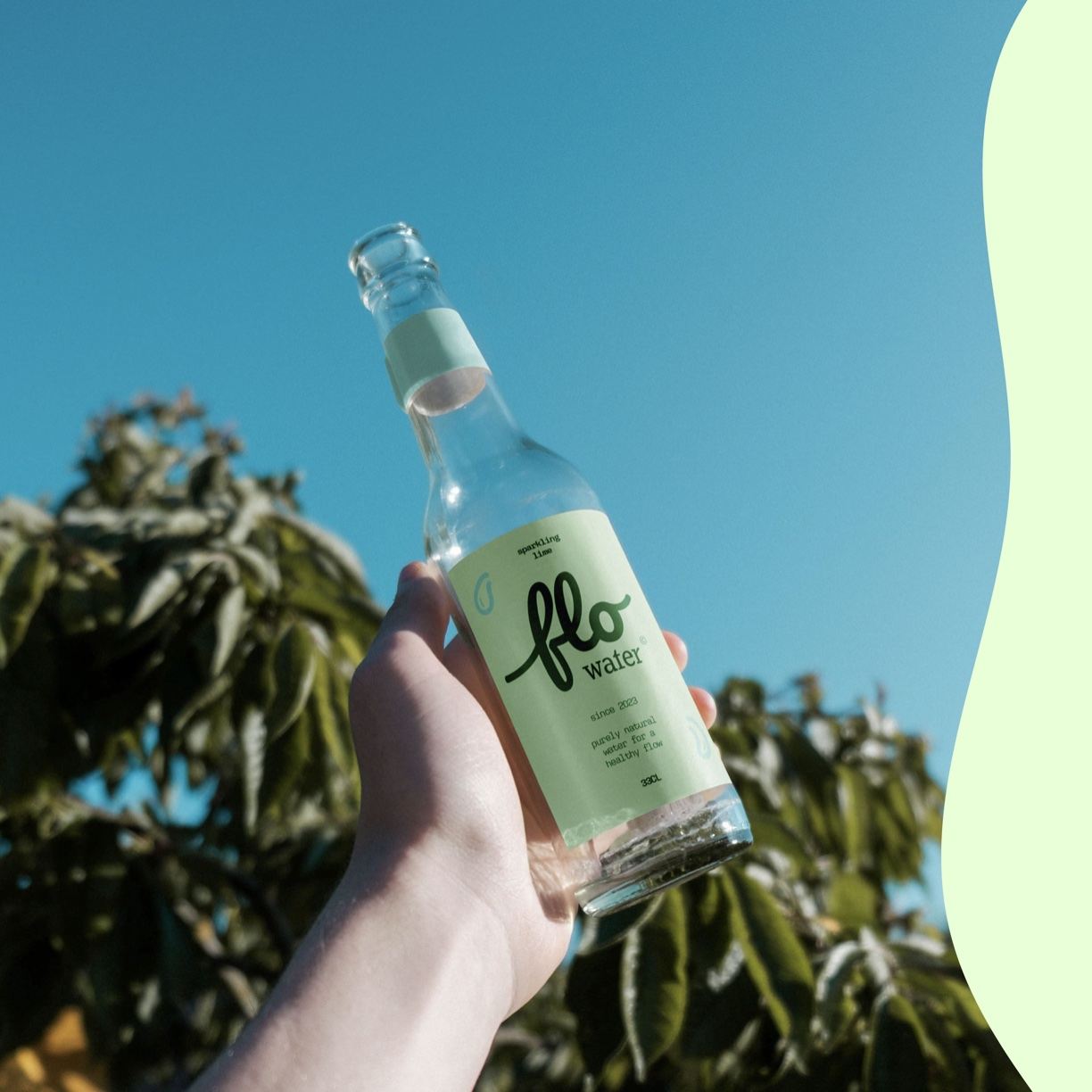
Designer Veerle Klein worked with Flo Water to develop a packaging system that speaks to the brand’s healthy flow. The water brand leaves plastic bottles behind, instead using glass bottles and cardboard outer packaging. The sustainable shift is wonderful to see in a market so consumed by plastic. Plus, the mint green and turquoise hues paired with the loopy typeface offer a sweet, refreshing take.

Meet Flo Water: a new all natural water with hints of fruit flavours. Their values are to purely take from and give back to our mother nature, focusing on sustainable packaging and healthy ingredients. The brand colours in this project are very refreshing & the logo fits the flowing and fun vibe of Flo.
Get unlimited access to latest industry news, 27,000+ articles and case studies.
Have an account? Sign in