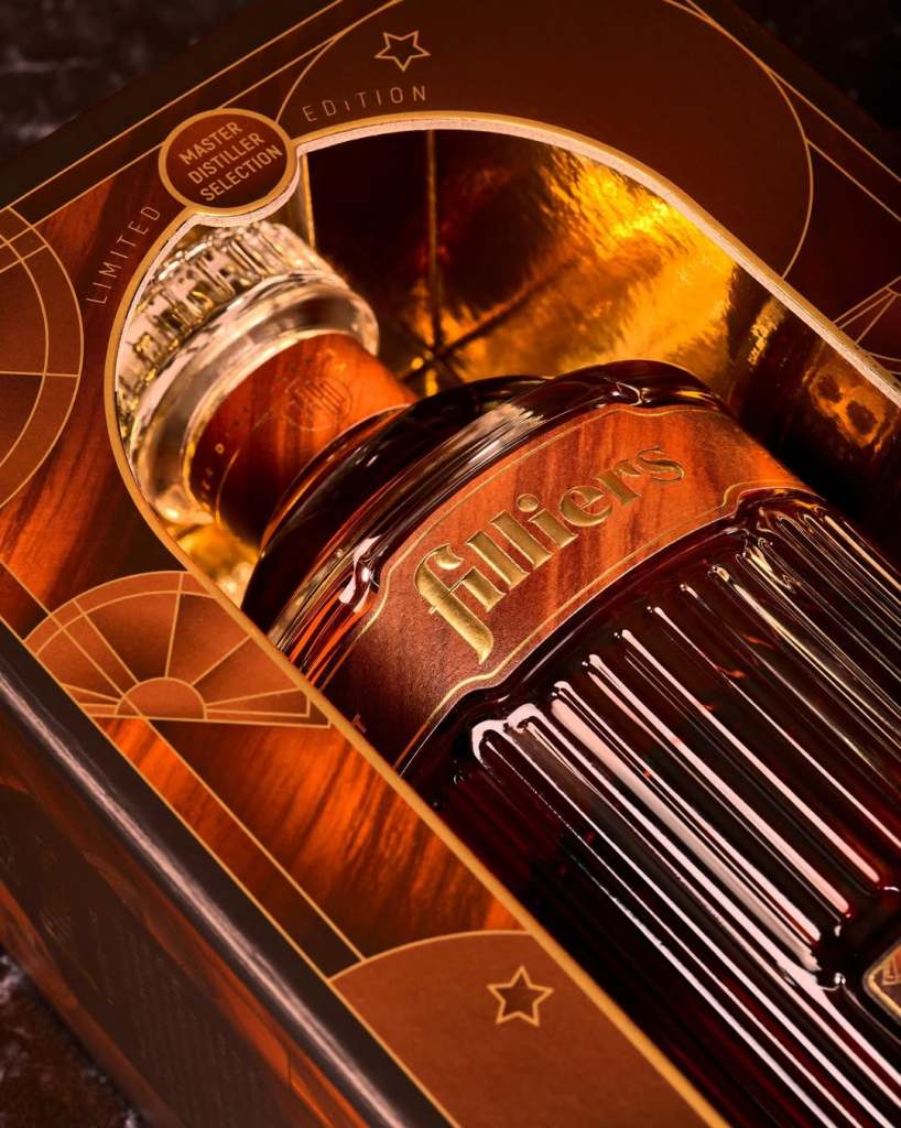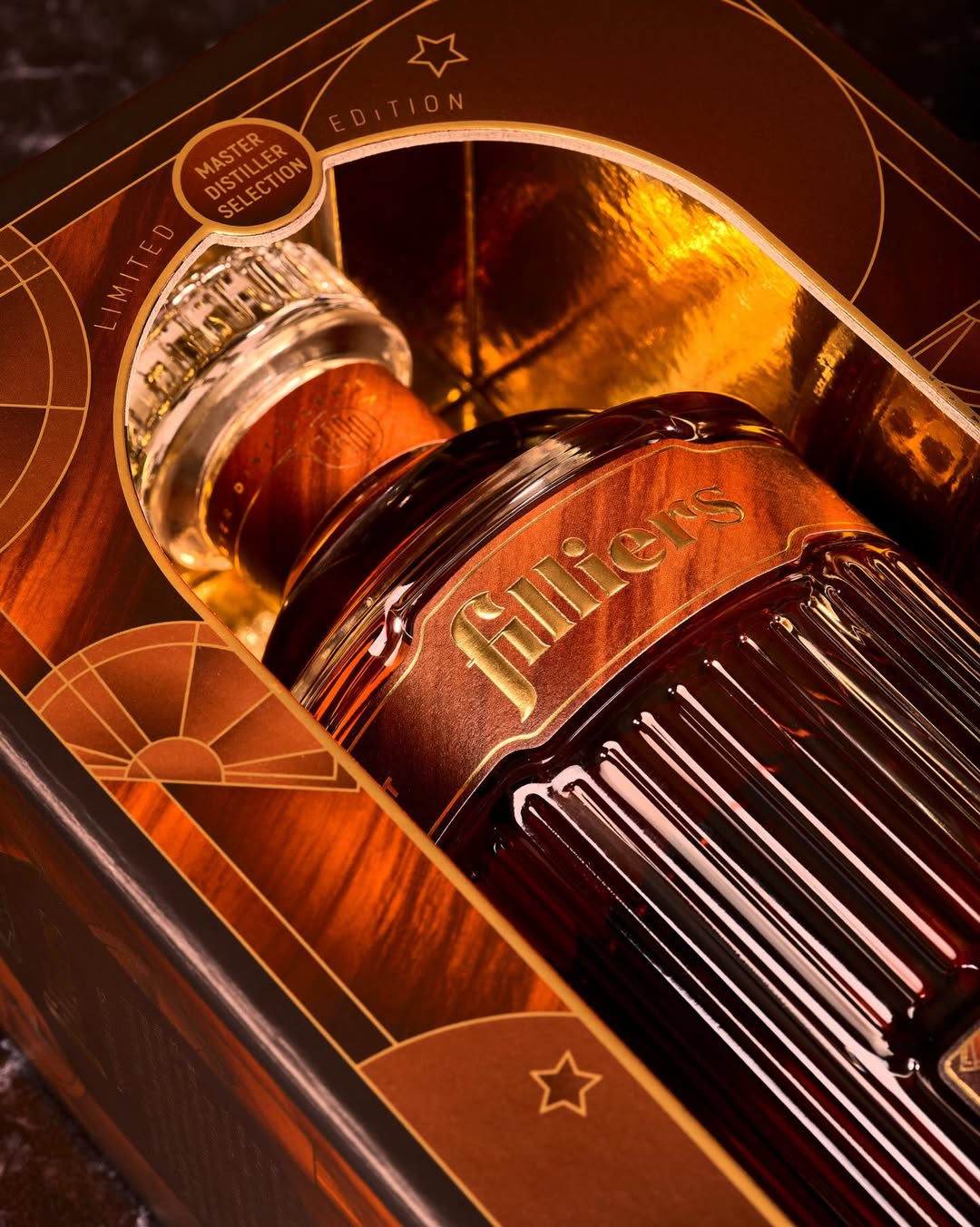
Filliers’ packaging leans into an Art Deco-inspired visual language that most whisky brands don’t touch. The ribbed glass and outer box layer geometric linework, warm copper tones, and precise framing that hints at drafting tools and vintage barware. Gold foil amplifies a theatrical reveal, and instead of the usual tartans or rugged cues, Quatre Mains pushes the whisky category toward a more architectural, gallery-ready presentation.