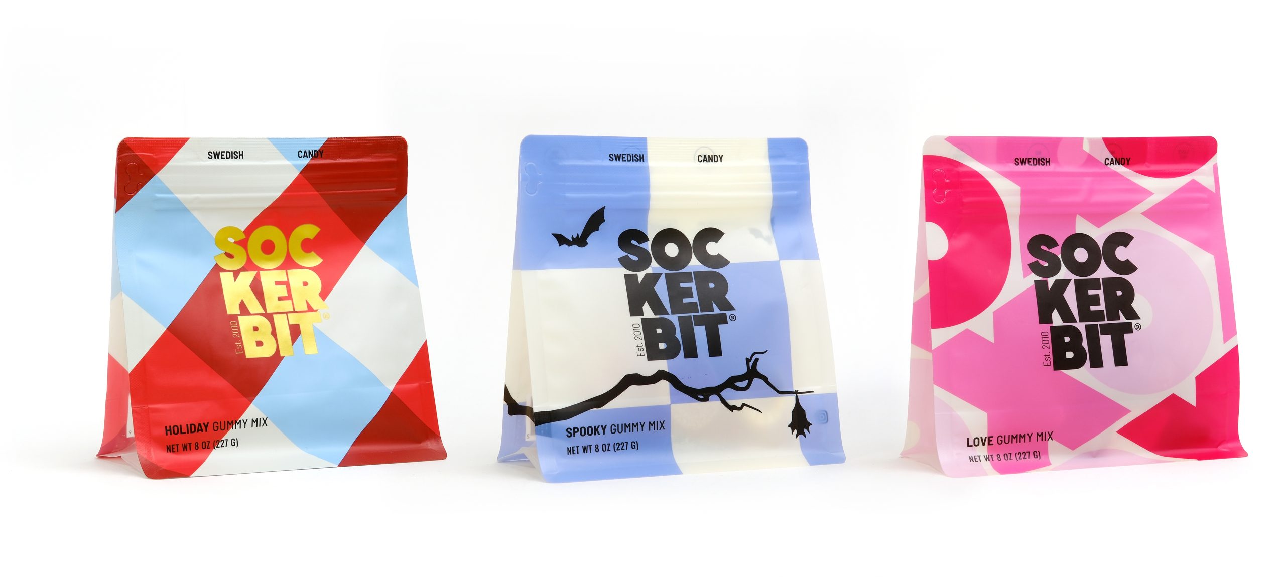
Studio Chenchen worked with the Melbourne-based chocolate company Cacao to redesign its packaging system to introduce a more energetic ideology. The result is a system that infuses a geometric-inspired design with deep, rich colors, beautifully representing the textures and flavors of the decadent sweets within.

Cacao is a boutique Melbourne chocolatier. They came to us to re-design a series of chocolate packaging. The design needed to align with Cacoa’s house brand while also introducing more energy and fun so as to reach a broader and more youthful audience. We combined a series of colours and geometric patterns to offset and complement Cacao’s dark brand identity. It creates a way for Cacao to show a new side of its brand that has continuity and connection to its core identity.