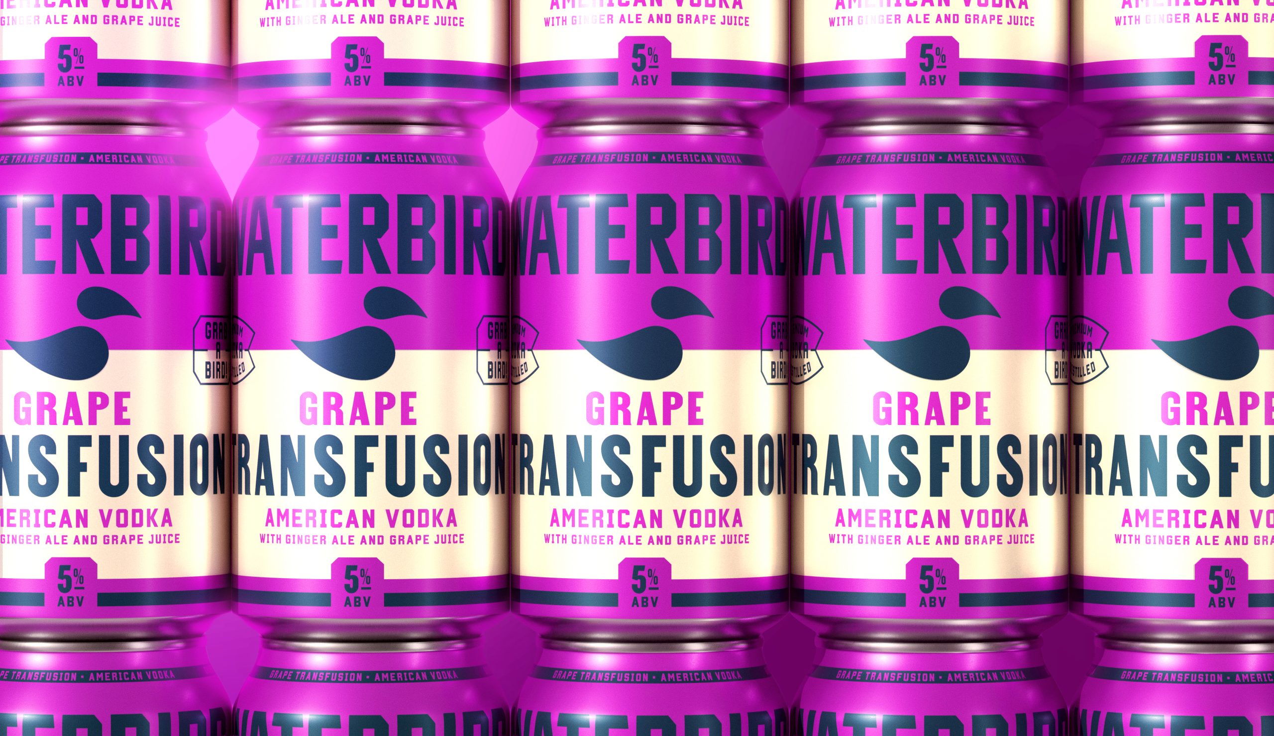
- Tavern’s design for Waterbird uses bold typography and vibrant colors to create a confident, modern RTD cocktail identity inspired by mid-century Americana.
- Oversized type and high-impact color palettes drive flavor differentiation, striking a balance between simplicity and standout shelf presence.
RTD cocktails often lean into either ultra minimal or overly illustrative styles, but this design lands in a sweet spot that taps into the resurgence of punchy, typographic branding.
For Waterbird, Tavern Agency built a system that draws on mid-century beverage graphics and roadside Americana while sharpening them through a modern lens. The typography is oversized, making product names the primary visual driver, but color does much of the storytelling, too, with each flavor expressed through high-impact combinations.