Featured image for Popp Studio Gets Bold With New Packaging

Popp Studio Gets Bold With New Packaging

by Casha Doemland on 07/16/2018 | 3 Minute Read

Editorial photograph

Popp Studio does just that with Experimental Perfume Club's new line of fragrances, by adding a pop of color to half of the label and packaging. On top of that, the font is clean and the logo is minimalistic, creating a bold yet sophisticated design. 
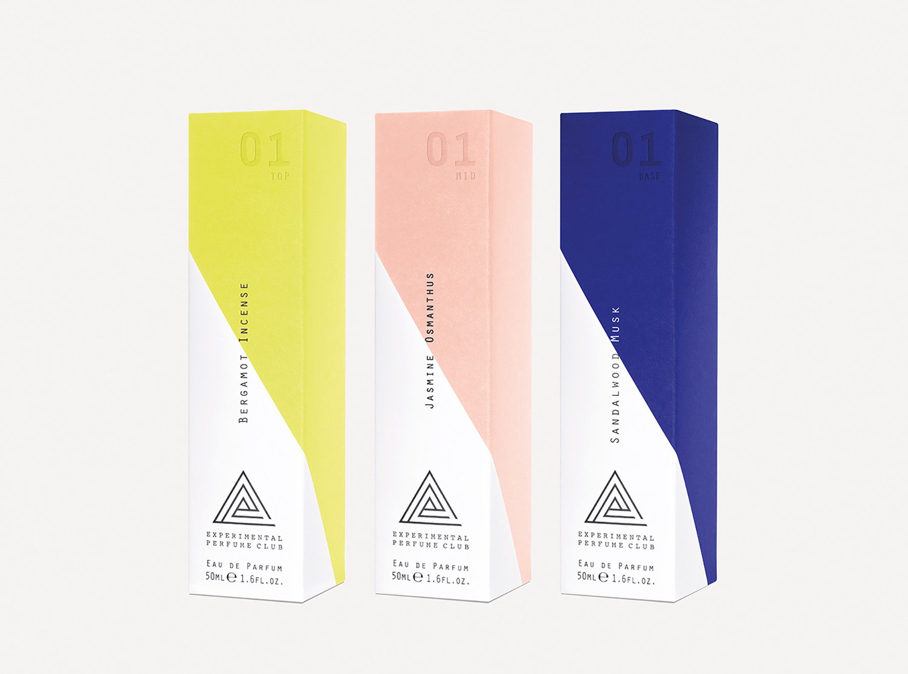
"London-based Popp Studio has created an identity and packaging design for the first collection of fragrances from Experimental Perfume Club. Experimental Perfume Club (EPC) runs a range of unique fragrance workshops, hosted at the EPC Lab in East London, introducing consumers to the world of scent, and helps them create bespoke fragrances unique to them.

The new Layers perfume collection is a “lab in a box”, and enables perfume enthusiasts to explore the world of scent in their own homes. Each collection contains three scents that can be worn individually, layered, or blended together using the included pipette and empty bottle to create a distinct personal fragrance."

Editorial photograph

"The EPC logo, inspired by the three fragrance layers used in the scent-creation process, is represented as three triangles, which also spell the brand’s acronym.

The logo is paired with a typewriter-inspired wordmark to capture the creative, hands-on feeling of the Lab, and is set in a bold yellow, black and white colour palette.

The Layers packaging builds on these assets, introducing two new colours alongside the core yellow to help users understand the three different scent layers in each collection. The colours create a dynamic slice across each scent bottle – echoing the angles in the core identity – and this is repeated on the secondary packaging for individual scent refills, which can be ordered separately."

Editorial photograph

"Launching exclusively in Liberty, London, the Layers packaging needed to be elevated from its workshop origins to the world of premium beauty. The outer packaging uses a subtle combination of soft grey and white on a heavy, uncoated stock. It also features a bold deboss of the collection edition number alongside modern, understated typography.

True to its origins, there is still a nod to the creative EPC attitude: a bright yellow ribbon on the pull-out drawer invites users to open the pack. Each bottle in the collection is layered with a clear spot gloss pattern made from the EPC logo, adding tactility to the experience, and a refined finish." 

Editorial photograph

Poppy Stedman, creative director at Popp Studio, says: “We have taken our bold, vivid identity for EPC’s workshops and premiumised it for EPC Layers. Together with Emmanuelle and her team, we have created a highly desirable, sophisticated packaging expression that captures the quality of this exciting product, without losing the creativity of the Lab experience.”

Emmanuelle Moeglin, perfumer and EPC founder says: “As the creators of EPC’s visual identity, Popp Studio instinctively understood how we needed to expand our brand world to make Layers a success. It is the most beautiful, premium expression of our brand yet, and we’ve loved working with a team with the imagination to bring our vision to life, and who share our dedication to delivering with the quality and attention to detail that Layers deserves.”

Editorial photograph

Agency: Popp StudioCreative Director: Poppy StedmanClient: Experimental Perfume ClubLocation: London, United Kingdom