Kombucha design is on fire lately, and brands have been getting super ambitious with can design, typography, and interesting flavors. We’re seeing tons of impressive stuff in the field lately, but Spain’s Bioma stood out right away for their old-fashioned pop open bottles and colorful matte typography. The wavy, SCOBY-inspired logomark swirls across the bottle in bright, hard-to-miss hues with charming illustrations of ingredients like lavender, rose, and artichoke. They even made a cool cardboard carrier for anyone grabbing a bunch— and who wouldn’t?
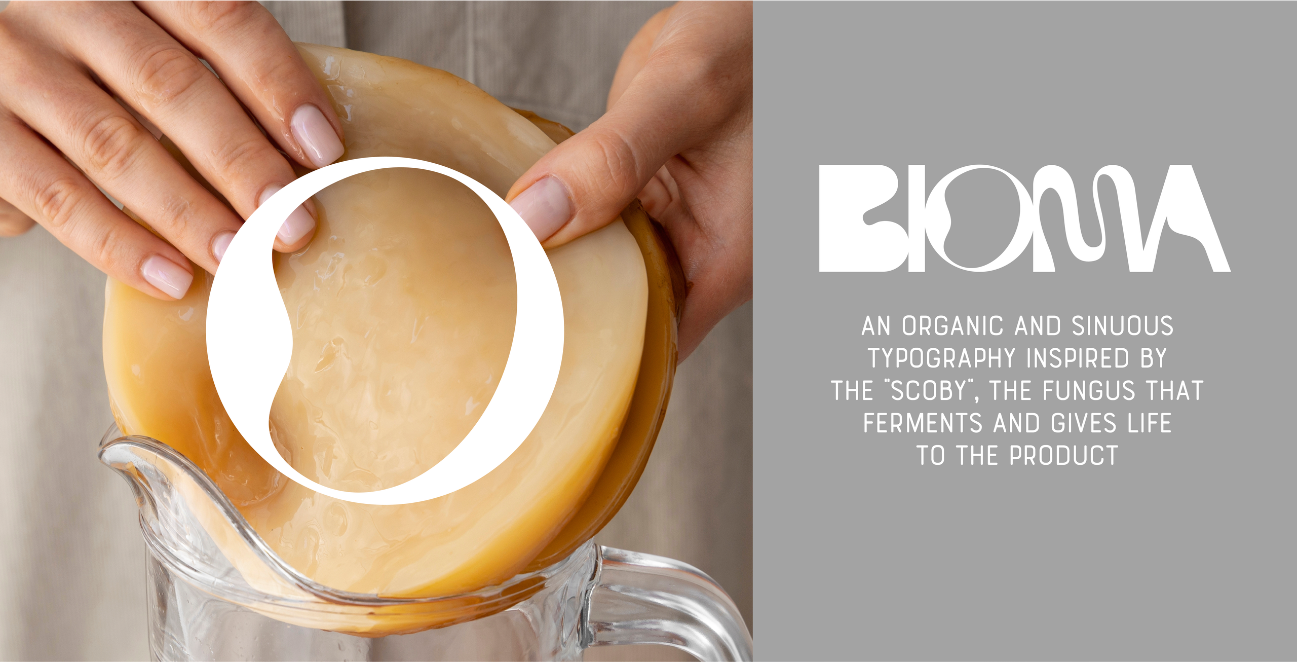
Few brands, like Bioma, show such dedication and commitment when it comes to bringing the best of ingredients to the consumer. We wanted to reflect that idea in a proposal with the same level of detail, commitment, and connection to raw materials. A thick and opaque glass bottle with a mechanical cap preserves the conditions of the liquid. An organic and sinuous typography inspired by the “scoby,” the fermenting fungus that gives life to the product, fits perfectly with the bottle. A unique execution for each reference that merges the element of nature with the bottle through shapes and a chromatic palette. Quality details such as the seal on the cap and the screen-printed impression add a special texture to the bottle. And a brand that invites interaction by delving into the bottles and forming the word Bioma. BIOMA kombucha manages to capture in the packaging and identity the same commitment to ingredients and the production process, ensuring the consumer has a perfect experience.