Oddity Studio captured the essence of ZVYK Skin Care’s philosophy in its packaging design. Drawing inspiration from the brand’s celebration of individual beauty and small daily rituals, the packaging showcases an array of repeated and transformed shapes, embodying the idea of gradual transformation. These intricate and expressive shapes, a testament to uniqueness, are blended with street-style aesthetic and dynamic typography, creating a visually striking fusion. The packaging design comes alive with holographic printing, adding an enchanting dimension to the visual experience. Against vibrant hues, the dark, thick, and bold ZVYK logo stands in captivating contrast, leaving an indelible mark on the observer’s mind.
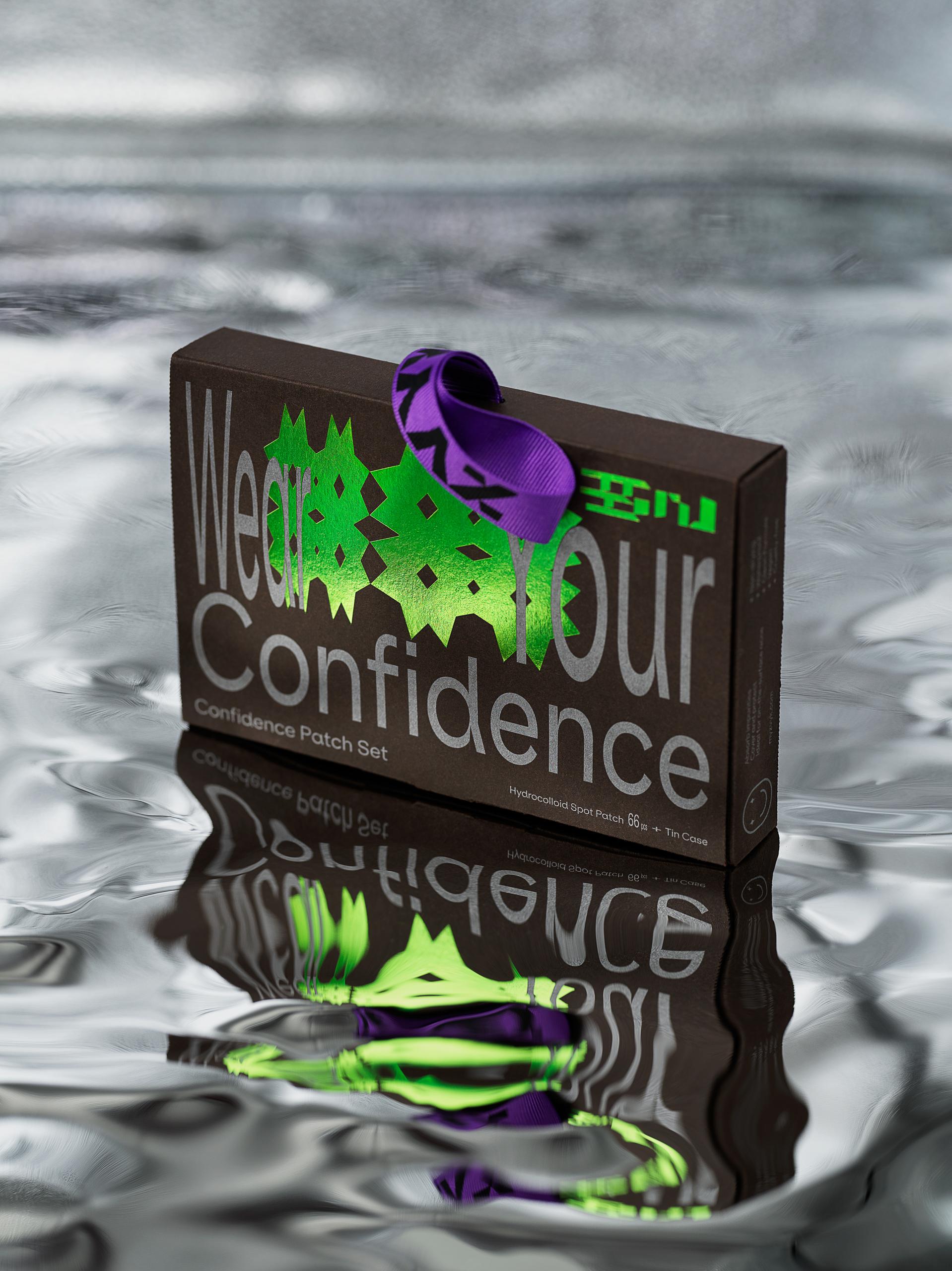
Introducing ZVYK, a new skin care brand from Korea that celebrates the unique beauty in each of us and promotes small good habits that would lead to a healthier and happier self. The visual identity is based on the concept of small habits — repetition. We take simple shapes, repeat them, rotate, scale, mirror, distort and repeat it again until they become unique, bold, beautiful, and expressive shapes – as rare as you are.