The 23 Best Designs We Saw At ExpoWest 2023
by Fred Hart on 03/14/2023 | 6 Minute Read
The World Cup. The Monaco Grand Prix. The World Series. Match Madness. The Tour De France. The Kentucky Derby. The NBA Finals. The Masters Tournament. The Ryder Cup. The 24 Hours of Le Mans. The Olympics. The Super Bowl.
What do all of these incredible sporting events—these tournaments of iron-willed champions and peak performance—have in common? Well, they got nothing on ExpoWest. The Super Bowl of food and beverage trade shows, ExpoWest, just wrapped up last week. After 100,000+ steps, 67,000+ attendees, and 3,000+ exhibitors, we ate our weight in lupini beans and drank enough adaptogenic mushroom teas to turn ourselves into the fungi-headed cordyceps zombies from The Last of Us.
Now that we've had a chance to rest our weary feet, we’ve highlighted 23 design standouts from this year's 2023 show. Dig in.
Cover anything in chocolate, and you know it’s good. But if you give it a funky script wordmark redesign and bold new photography, well, you've got something that's truly delicious AND eye-catching. Could be a real challenger brand that could go toe-to-toe with Bluth's Original Frozen Banana Stand.
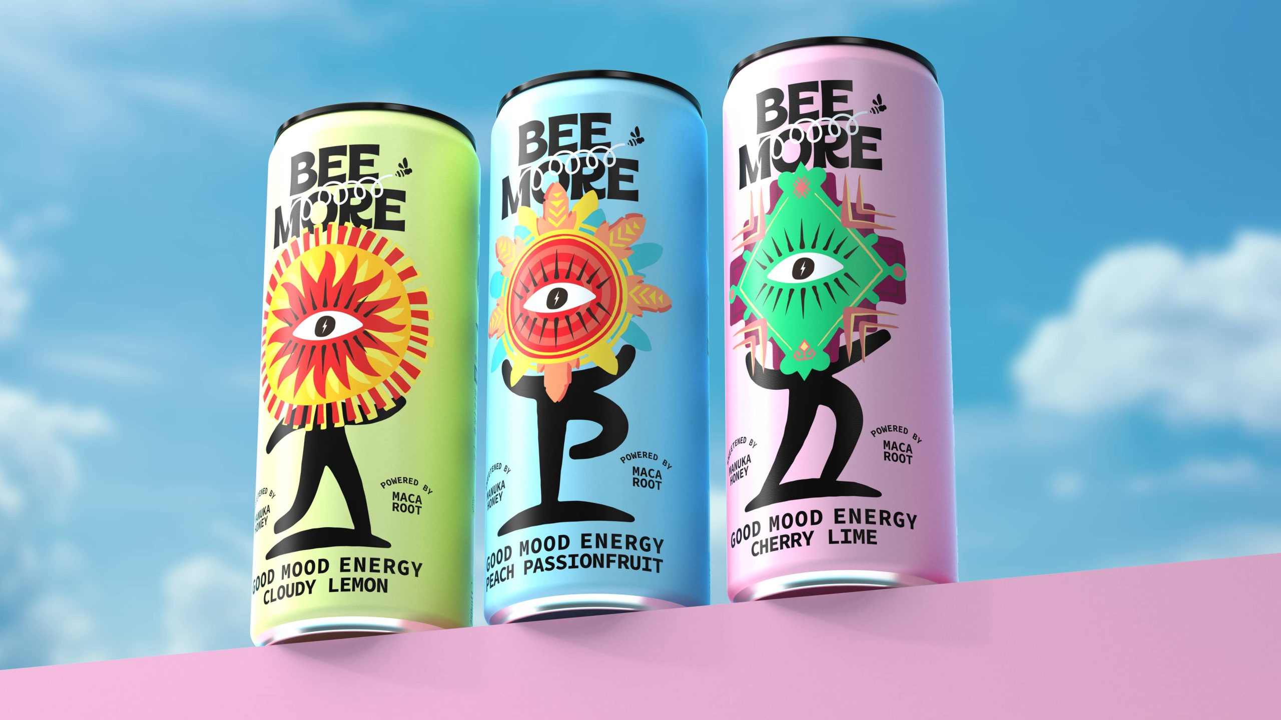
There’s a push to keep our cities weird (Portland, we see you), but don’t be fooled—we need to keep our beverages weird, too. Graphic tattoo-esque aesthetics are fused with nutty character illustrations to create a brand that’s anything but ordinary.
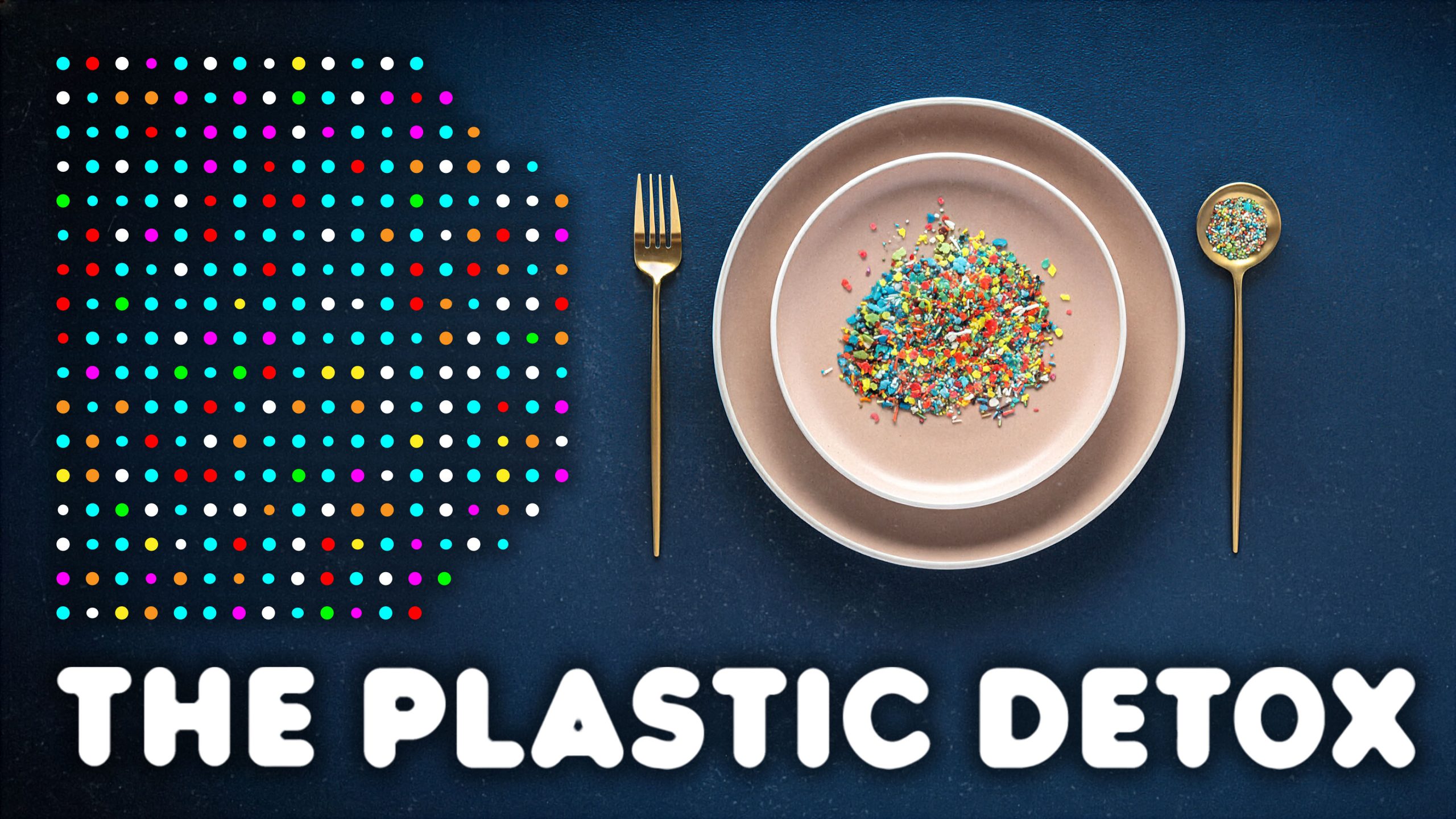
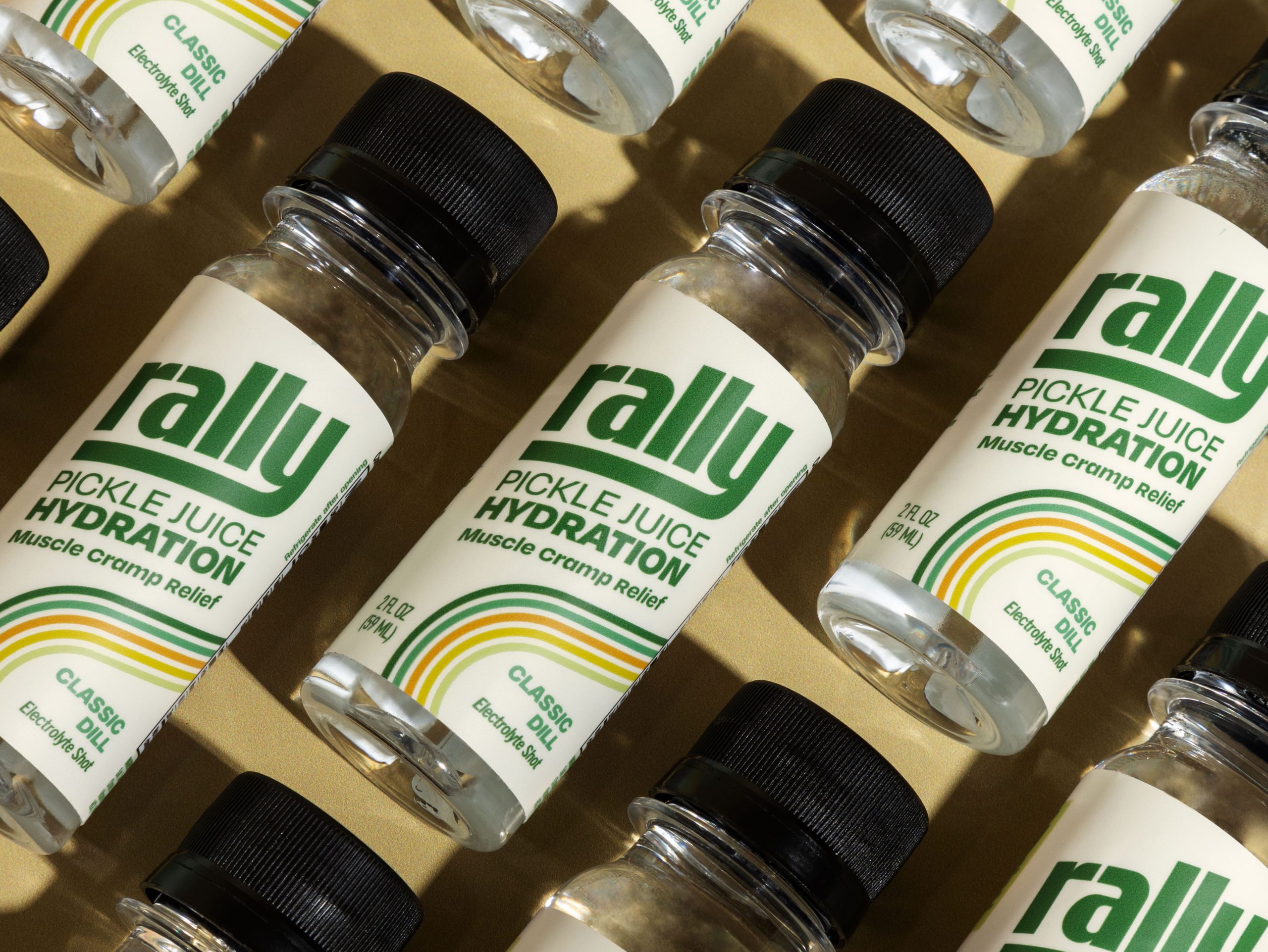
It’s time for a hydration reset. Drop the sugar, cut the plastic, ditch the masculine design and reset your outlook for a much sunnier option.
Welcome to your new family-favorite sitcom delivered in a delicious seaweed puff. This colorful band of sea-dwelling misfits offers waves of flavor and fun. Now we’re just waiting on the Cartoon Network show.
This globally inspired ice cream brand has us yelling “POLO” at our freezers, hoping we'll find a "novelty treat" or pint tucked away underneath a bag of dino nuggets (don't you dare judge me). A sweet script logo meets a spicy photo-copier ingredient aesthetic for something immaculate.
The name pretty much captures it all. A gorgeous wordmark meets cute with a gorgeous color palette that runs into a gorgeous nutritional profile for a gorgeous feeling. Welcome to the power of feminine energy.
Your favorite snacks made from bananas? With playful design and a clever brand name? You’ve got yourself a deal.
Now, these are some cool beans. Funky, chunky type and groovy typography make for a fresh, throwback vibe.
This redesign is giving big wave energy. The brand dropped “superfood” in the name and leaned into Laird’s epic life and flavors with a look to match.
Cut the sugar while you pucker up to these delicious candies. Bright colors, sun-inspired gummies, and organic illustrations. Yum.
Let your taste buds loose as this Latin-inspired beverage dances across your palette. Flat, graphic, and here to bring the boom (and, yes, we see you, Lois Ehlert).
While Snoop Dogg has wrapped much about smokin’ indo, he seems to have traded his love of weed for Indonesian Coffee. And now, he's introducing Indo, a lifestyle coffee brand made with beans from Indonesia. Bold in design and cool to be seen with.
You want color? You want flavor? You want heat? You’ve come to the right place. This Queen brings it all together in a maximalist aesthetic that’ll tickle your retinas and taste buds. Plus, it's hard not to love the exclamation mark on top of the jars.
Welcome to a world of pure imagination, where hibiscus water bubbles and antioxidant benefits come together in a low-sugar land that’s oh-so-sweet.
Clean, simple, and editorial—this chic branding and packaging delivers full-functional supplements with just a touch of character from its script emblazoned on the front of the pack.
AF = alcohol-free. Duh.
Now that we’ve cleared that up, this New Zealand-based brand has landed in the states with a unique ingredient that adds “afterglow” to your drinking occasion without any of the hangover for a true-to-form drinking experience.
These seaweed crackers have an ingredient list as clean as the packaging design. Simple, airy, and with just enough whimsy to make you smile.
Welcome to the disco of drinks, with dancing boba balls and flashy flavors. This brand looks as fun as it is to drink.
These Asian apps are looking like a snack. Colorful backgrounds meet bold food photography for a full-flavor, surprisingly plant-based pork taste.
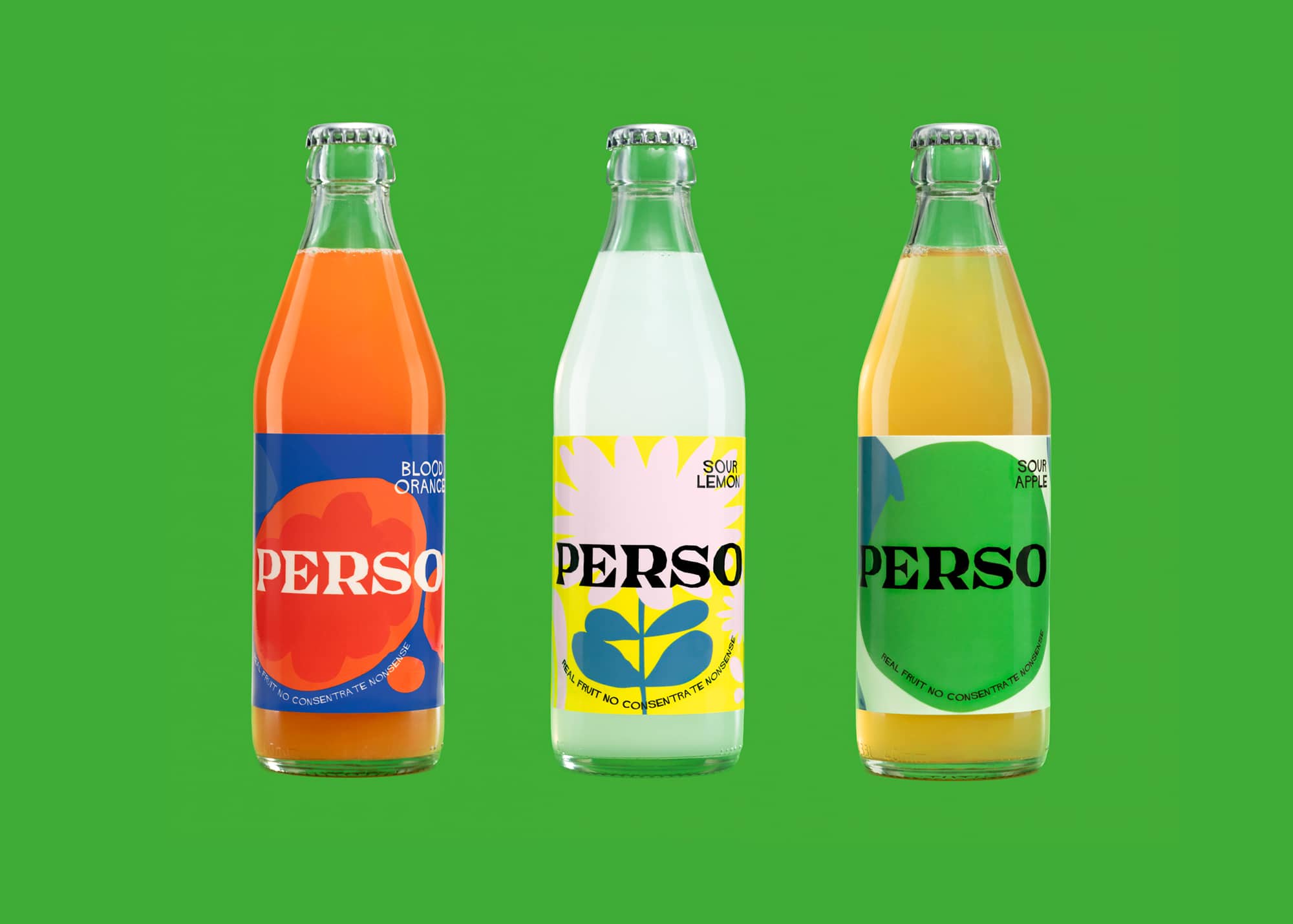
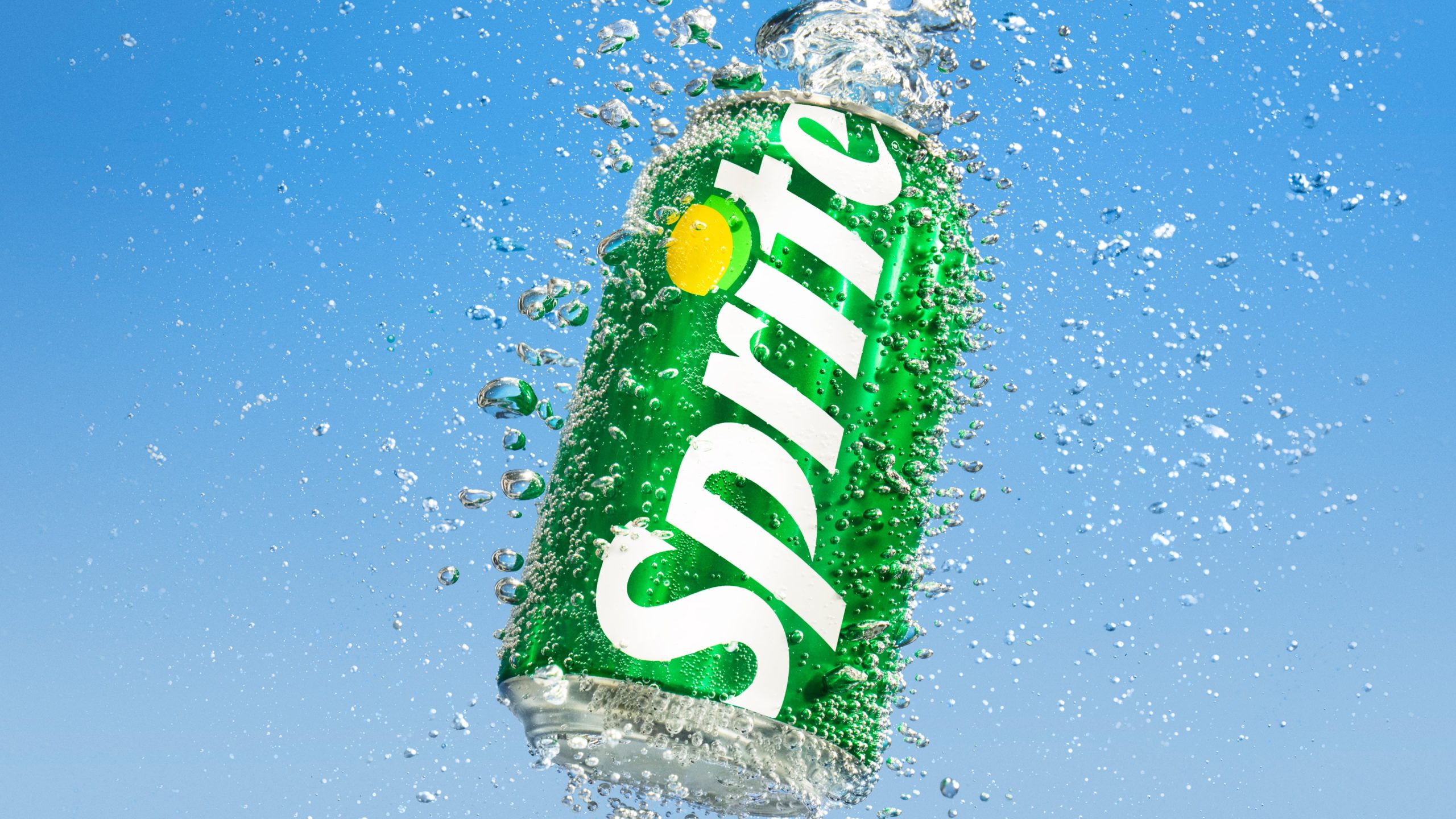
Zero sugar meets a full-on-flavor redesign. Gorgeous, leaf-inspired typography anchors the undulating swipes of color that mimic the best of soda while ditching the calories.
Plant-based chocolate packed with plant-inspired illustrations? What's not to lovo? I mean love.
Snacks that make "u" smile. Cause the "u" is literally smiling. Get it? Anyways! This organic snack brand balances a bold typographic wordmark with an adorable pattern of fruit-filled graphics.
It’s time to make pasta groovy again. Each bag in Presty's line received a nifty makeover to communicate maximum flavor and induce extreme levels of drooling.