Featured image for Pack of the Month: Paquera Mezcal Revels In Its Handcrafted Aesthetic

Pack of the Month: Paquera Mezcal Revels In Its Handcrafted Aesthetic

by Bill McCool on 08/31/2022 | 4 Minute Read

We're a sucker for a good mezcal. As it turns out, a lot of our readers are as well.
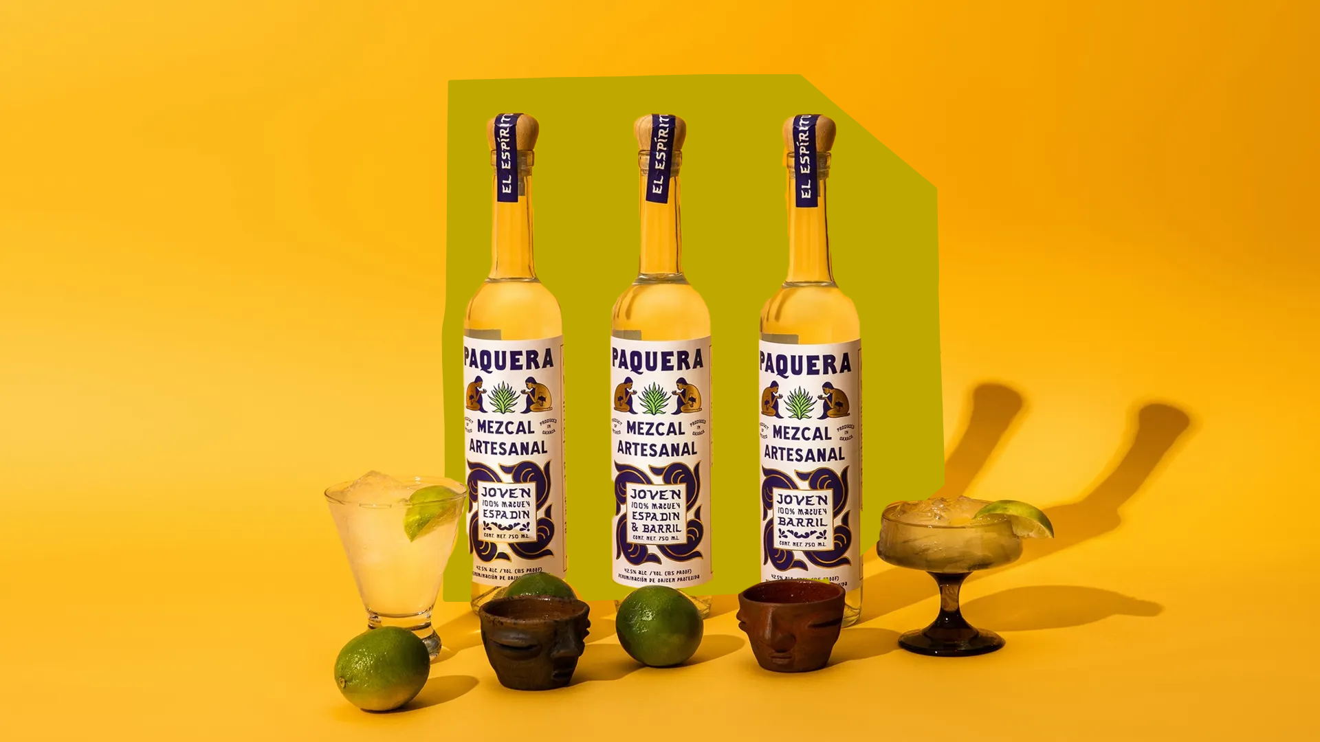
So it wasn't much of a surprise at all when Paquera mezcal stole our readers' hearts this past August as one of Dieline's highest-rated and most viewed projects. Dreamed up by Schubert Studio, the bottles feature gorgeous typography reminiscent of hand-painted signs and graphics inspired by Mexican tile work. Add in some beautiful photography courtesy of Fortlion Studio, and you've got an artfully realized mezcal brand that's all smoke show.

We caught up with Jon Schubert and talked about the inspiration behind the design and the magnificantly executed spirit

Editorial photograph

Tell me a little about your studio?

I'm Jonathan Schubert of the Schubert Studio in Dallas, TX. My studio just made it to five years this June; it's been my full-time career since June of '17. I specialize in brand development and graphic design—everything from naming and concept exploration to developing core brand assets, logo marks, custom illustrations, typographic work, packaging, and label design. My recent clients of note range from big names like Chobani, O'Neill, and Howler Brothers to more bespoke brands like Patara Shoes, Sundream Coffee, Condesa Gin, and a range of apparel brands, restaurants, bars, and a few hotels.

Editorial photograph

Can you walk us through the design process you went through for this project?

The main aspect of my process on Paquera Mezcal, which seems worth mentioning, would be where the overall inspiration for the aesthetic approach was derived. As a starting point, we knew the brand should reflect its authentic roots in the agave fields of Oaxaca. Naturally, the use of color was a major opportunity for the brand. 

At some point in my visual research, I started to collect beautiful samples of hand-painted Mexican tile artwork; I loved the color, the handling of lines, and the general approach to depicting human forms and plants. The evolution of inspiration ultimately inspired the core marks, including the "smokey kiss," which you can see on the bottom half of every 250ml bottle, and the seated woman blowing the "kiss" (spirit of the agave, the Earth itself, from plant to spirit, etc.). Hand-painted signage from Mexico and my home state of Texas inspired the typography utilized throughout the brand. This sort of typography felt appropriate to compliment the inspiration and execution we ultimately pursued for Paquera due to the uniting hand-drawn quality of the aesthetic itself.

Editorial photograph

What was one of the biggest goals you set out to achieve with the Paquera packaging, and how did you accomplish it?

My personal biggest goal was to use color boldly and create a memorable and recognizable 250ml bottle within the competitive space. When the brand first launched, every bottle (Espadin, Barril, and a blend) utilized the vibrant blue, which is now only seen on the Espadin. The potential for color has since been fully realized in employing red and green in bold ways on the labels and giving each mezcal its own color identity within the brand. My favorite bottle is the Barril, as it boldly contrasts the red and blue—just love how this one turned out!

Editorial photograph

What was the most challenging part of this project?

The most challenging aspect of designing this entire brand (not just the labels) was the competitive space (other agave spirit brands). We wanted to tell an authentic story about the origins of the spirit itself without overusing key iconography (like the agave, for instance). Ultimately, we let the inspiration at the root of Paquera's origins guide the process and were able to find an authentic aesthetic and voice for the brand.

Editorial photograph

If you could pick one aspect of the finished design that you like the most or feel proud of, what would it be and why?

I absolutely love how the "smokey kiss" reflects the inspiration of hand-painted Mexican tile art; working this into the actual label was a huge win because I was obsessing over exploring this aesthetic territory. The combination of color and metallic gold also turned out quite nice.

Editorial photograph

Share one lesson that you learned while developing the finished product.

The most interesting knowledge I acquired in the process of working on Paquera Mezcal was simply everything I discovered about the process of distilling a quality mezcal; everything from the different types of agaves and what kinds of mezcal are linked to each, the harvest times, the regions of Oaxaca where Paquera is actually procured, and the hard-working and dedicated individuals and families behind every sip. Mezcal is a fascinating spirit, and it was truly a pleasure to develop a brand for everyone involved with Paquera.


Images by Fortlion Studio.

You may also like