Marinical Packaging Design Delivers Beyond The Typical

Published

Editorial photograph

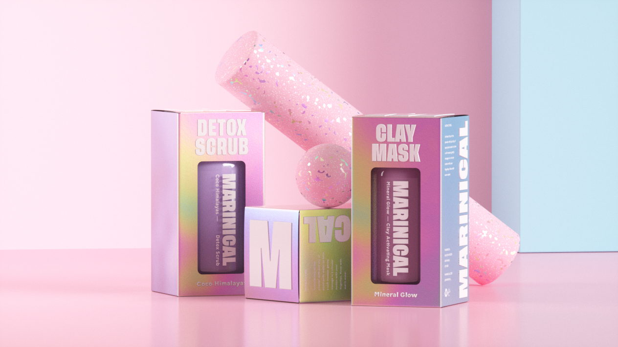
Marinical is a Scottish vegan skincare company offering cutting-edge, plant-powered products that offer a fresh take on the cold and clinical face of ordinary skincare. Inspired by this, we knew they deserved something beyond the regular offering delivered to the consumer.

We drew inspiration from modern fashion, art, and music to instill a brand image that defies convention, and shouts its identity from the rooftops. To support this larger than life identity we opted for a heavy sans serif font, Tusker Grotesk that employs purposefully written and bold tag lines across social, web and campaign. Paired with a bold yet soft colour palette and a beautiful suite of campaign imagery we crafted the perfect solution for the brands approachable yet authoritative aesthetic.

Editorial photograph

When it came to packaging we knew we had hard competition in the current world of beauty and cosmetics, we needed to craft a product that not only had shelf appeal but was fun and interesting to receive when posted out through director to consumer commerce. We opted for a material focused approach. crafting holographic foil box outers with an embossed white gloss finish, channelling early y2k aesthetic. Our research presented us with futuristic materials, fun bold type and an ever shifting colour palette. paired with a minimal inner containers – using a screen printed logo type on the glassware. The result was a stunning, tactile product which harks older generations back to their formative years and serves Gen-X that touch of 2000s culture they love so much.

Editorial photograph

Too Gallus was enlisted to bring to life the brand identity in a way the reflected its bold and playful approach. With an audience of skin-care savvy Gen-xers it was essential that the product come to market swinging and instantly stood out as a name to watch in the beauty and skincare industry. The brand had to be exciting, and fun yet still carry its self with all of the weight and authority of a major player. We were conscious not to make the brand to novel and were aware that all through the process although the aim was to target a younger audience that the professionalism of the brand must never be lost.

Editorial photograph

This placeholder is removed when the ad slot is configured.

This placeholder is removed when the ad slot is configured.

This placeholder is removed when the ad slot is configured.

This placeholder is removed when the ad slot is configured.

This placeholder is removed when the ad slot is configured.

This placeholder is removed when the ad slot is configured.