Athletic Greens’ New Branding Feels Soulful, Healthy, And Clean
By
Published
By
Published


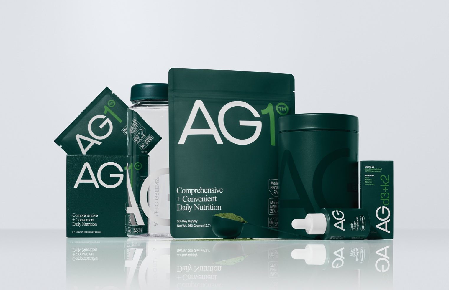
Every aspect of the Athletic Greens brand was evolved through this comprehensive rebranding. Rooted in the company’s minimalist product philosophy, a brand creative platform called Essential Nutrition was created. All branding decisions were inspired by this platform. Interestingly enough, the prior dominant brand color was blue. While green is an obvious choice for a primary brand color , we felt it was ultimately necessary for a brand with the word “green” in the name.
We chose a modern green that feels soulful, healthy, and clean. The brand typography has a modern sporty look, but the layouts are classic and timeless – inspired by old advertising layouts. Product is hero and we use Times Now for headlines. Stamps and badges give it a feeling of trustworthiness that’s necessary in this space. Lifestyle photography captures all types of active people in a cinematic way.