Making the Everyday Special: How To Design For Accessible-Premium Brands

Published

When consumers tighten their belts, it’s logical to assume that they’ll replace more premium grocery brands with standard or budget offers that cost a little less. 

Many accessible-premium brands must work harder to justify their price points when grocery budgets are painfully squeezed. But it’s a noted fact of recessionary times that while people may cut back on big-ticket items, they’re likely to scratch that consumerist itch by indulging in life’s little luxuries. And when they’re spending less in restaurants and bars, they’re more likely to recreate a higher quality experience at home.

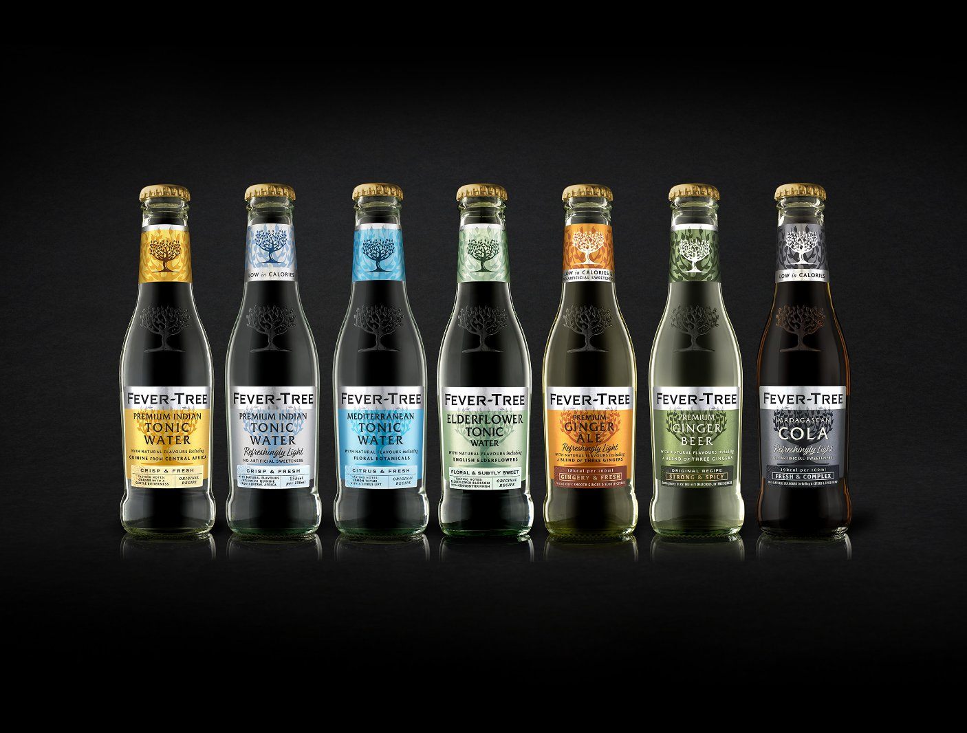
So, it’s not an inopportune time to be an “everyday special” brand. But hitting that sweet spot that cues premium quality but doesn’t alienate everyday consumers is a delicate balancing act. Of course, it all comes down to the product—from cheese to chocolate, your product must taste, feel and perform better than the more mass brand, and it needs to have the backing of provenance or a true sustainability story. But to successfully pitch that product at the accessible-premium price point, brand design is critical. 

Editorial photograph

The Goldilocks Factor 

When it comes to design cues, consumers understand the difference between everyday and premium. They can decode the promise of a tube of Oreo cookies versus a box of Ladurée macaroons. And so, arguably, it’s easier to design at either end of the spectrum, as those guidelines exist to direct us all.

But with everyday special, we’re playing in the middle. And getting it just right can entail a more nuanced and subtle balancing act between codes that elevate by promising craft and quality and those that reassure through ease and familiarity. It’s potentially about carving out a whole new space in your category—and that puts the pressure on design to create a new visual language. 

Challenger Heartland

That is partly why challenger brands find such success in the accessible-premium space. More often than not, these more entrepreneurial brands are coming to the market with an improved product, and they need design to tell that story. Neither are they confined by the handcuffs of the marketing handbook to which plenty of global brands still subscribe. 

Everyday special offers a real opportunity to challenge the category at every level, reshaping the supermarket aisle and forcing sustainable improvements in product—and design—quality across the board.

Editorial photograph

Design Principles

There’s no single recipe for getting everyday special design right. Every product, every brand, and every brief is different. But there are a few themes we continue to see in the accessible-premium brands we admire and those we’ve designed over the years that are worth considering if you want your brand to win in this space. 

Editorial photograph

PROOF

Design touches that show proof and share knowledge.

While premium brands come with the expectation of sophisticated understanding, accessible premium openly shares what makes it special to help consumers feel included. Examples such as The Fever-Tree Pairing Wheel and the Green & Black’s Tasting Collection demonstrate how to prove product quality and increase exploration of your range while welcoming consumers into the brand. Indeed, the latest iteration of Fever-Tree’s packaging design introduces a new tasting notes label to help deepen that understanding of what makes the brand a cut above.

Editorial photograph

CLARITY

Cutting through the clutter of craft.

Premium brands—and those that aspire to be seen as such—can often be overloaded with embellished detail and overworked craft codes. But what makes accessible premium work is its straightforward clarity—confidence in its product quality that allows for colorful stand-out and simplicity of messaging. While vibrancy often gets viewed as the preserve of mainstream brands, when it gets delivered through thoughtful design and considered typography, it can be a great way to strike the perfect balance of premium and accessibility. Border Biscuits’ recent redesign is a great example, challenging the existing cookie category with a bold, colorful design that quite clearly captures the quality and care the brand brings to its process. Similarly, plant-based and sustainable chocolate brand Raw Halo redesigned away from more traditional premium cues towards a spirited, simple identity that celebrates its premium product quality with pride. 

Editorial photograph

BRAVERY

Not being afraid to break the rules. 

There’s a conformist approach to traditional premium design, while a desire to break the rules is implicit in accessible premium’s challenger mindset. Oatly is an obvious example of packaging design that refuses to conform to the plant-based dairy codes of its more corporate competitors—and it looks all the more premium for it. Equally, nut butter pioneer Pip & Nut was deliberately designed to challenge category convention—from how its pure white backdrop showed up on the shelf against a sea of earthy tones to its lifestyle focus that revolutionized the whole how, where, and who of eating nut butter.

Editorial photograph

WIT

Stop being so serious.

There has always been a polite reserve and quiet seriousness to premium categories, but accessible premium has shown how to break the silence with subtle wit, humor, and playfulness. Clipper Tea is a lovely example of how to combine a beautifully considered illustrative design with a smile-infused tone of voice that instantly increases its accessibility and consumer connection. In Pret A Manger’s new retail design, boldly placed product photography echoes the brand’s signature Food Art posters to bring a lighthearted feel to the pack in keeping with the retail mission of bringing Pret joy to your home.

Editorial photograph

The moments that matter

What’s great about accessible premium brands is that they are there for the everyday moments that are just a little bit special, rather than the big —and often so pressurized—occasions that call for the premium tier. 

With a more relaxed, playful, and welcoming mindset, these are often the moments that mean the most in our lives—so they should demand brands that signify more to us too. It’s that ability to connect with consumers in the moments that matter that makes everyday special design so, well, special.

This placeholder is removed when the ad slot is configured.

This placeholder is removed when the ad slot is configured.

This placeholder is removed when the ad slot is configured.

This placeholder is removed when the ad slot is configured.

This placeholder is removed when the ad slot is configured.

This placeholder is removed when the ad slot is configured.