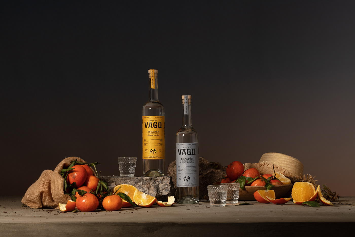
Honoring The Story Of Every Bottling Through Vago Mezcal’s Packaging
By
Published
Filed under
By
Published
Filed under
To create authentic packaging for Vago Mezcal, Abraham Lule journeyed from village to village to best understand the spirits’ “ingredients” and honor the story of every bottling within the design. The textured typeface of the logo paired with the organic texture of the label creates a superbly naturalistic sense surrounding the libation.
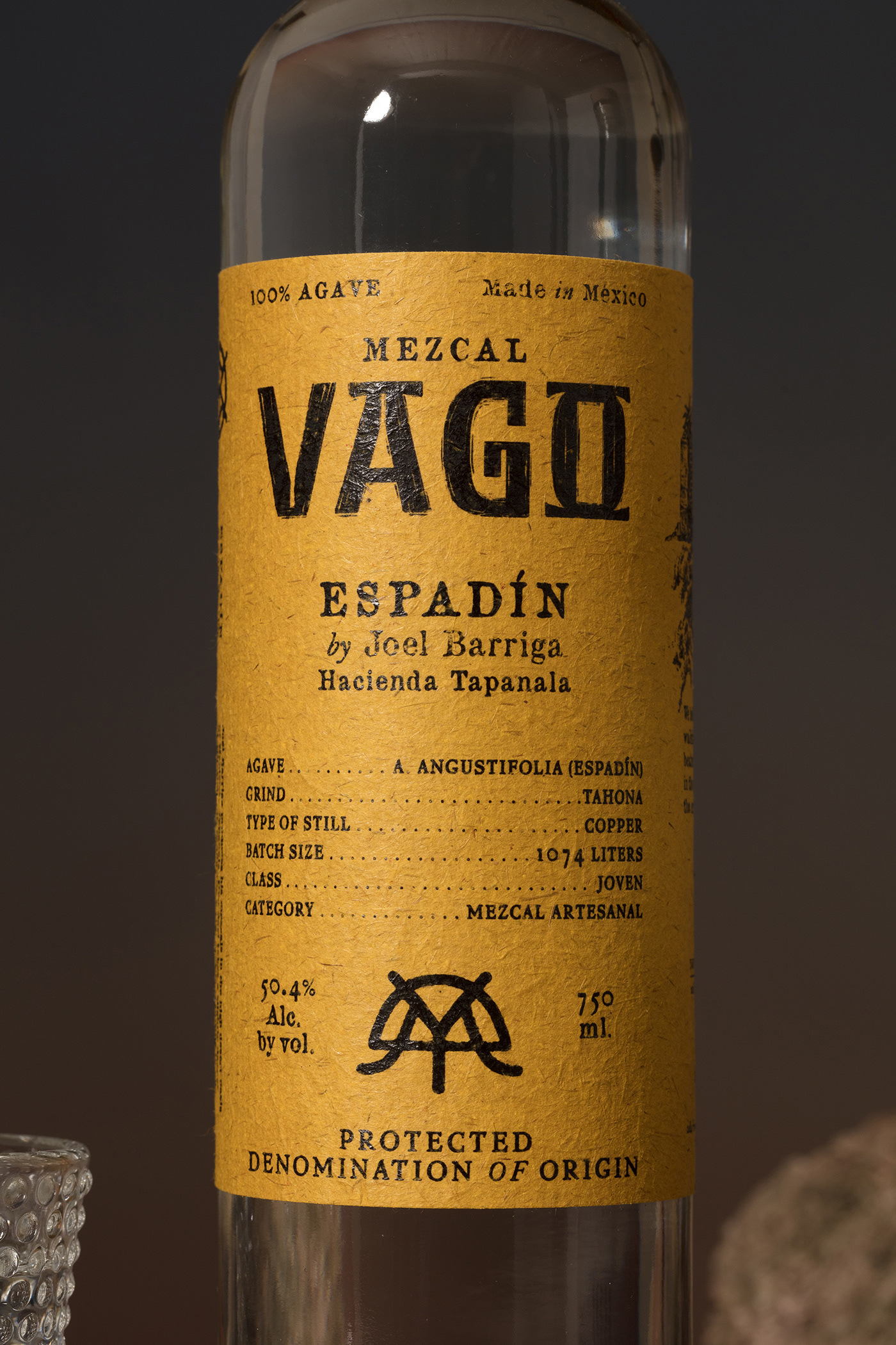
Unlike any other spirit, to drink mezcal is to taste the intuition of a mezcalero—its master and maker—and the raw combustion of place. We set out to capture both in our packaging brand and design for Mezcal Vago.
Get unlimited access to latest industry news, 27,000+ articles and case studies.
Have an account? Sign in