Featured image for Monotype Infuses Charisma and Versatility To Helvetica With Variable Update

Monotype Infuses Charisma and Versatility To Helvetica With Variable Update

by Rudy Sanchez on 07/13/2021 | 3 Minute Read

Like The Office reruns and White Claw, Helvetica’s popularity remains unabated. Designed in 1957, the love for the sans-serif type hasn’t changed much, but the world in which designers use Helvetica and the world it resides in is very different. 

Monotype, now the stewards for the iconic font, took a big step forward in 2019 when it released Helvetica Now, an update with additions and changes that allows designers to apply the storied type in modern applications like smartphones.
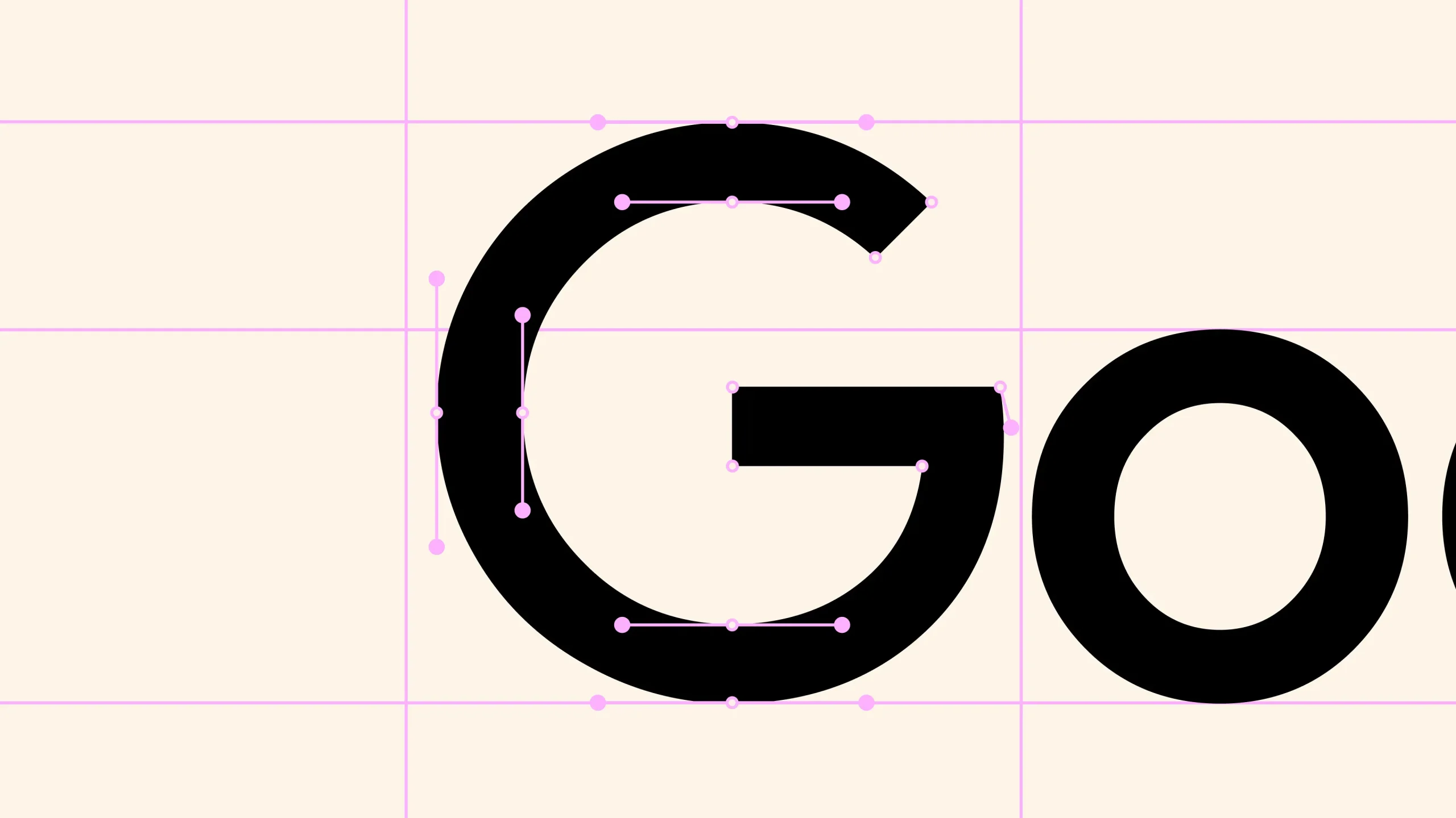
The font's full potential wasn’t realized, however, and Monotype has just announced the release of Helvetica Now Variable, an update that makes the typeface more pliable in designers’ hands. Variable adds the ability to blend weights, sizes from four-point to infinity, and new compressed and condensed widths. Monotype’s update makes it easier to use Helvetica in new, expressive ways, making the typeface adaptable for applications needing responsive typography.

“Because Helvetica Now Variable encompasses a spectrum of millions of possible weights, widths, and optical sizes, designers can create fluid, typographic animations along those axes. Imagine subtle (or overt) motion graphics—or headlines that respond to external stimuli—the time of day, cursor movement, temperature, or proximity,” says Charles Nix, creative type director at Monotype.

Editorial photograph

The refresh means it has been upgraded to work with current design tools and adaptable to many uses. Helvetica is now much more responsive, not just to screen size, but other display changes like adapting to dark vs. light modes or reacting to other data.

Editorial photograph

“Typographers (and good designers) know that headlines, text type, and tiny type each require special care,” Charles says. “Headlines benefit from tighter spacing and more refined letter shapes. Text type needs a breath more space and a greater emphasis on rhythm. Tiny type needs a larger x-height, breathy spacing, and more rugged forms. White type on a black ground requires different spacing than black on a white ground." 

Editorial photograph

"Helvetica Now Variable knows these things," he adds. "And when combined with CSS, it can be programmed to respond to changing conditions (tiny screens, large screens, night-mode viewing, oblong formats, vertical formats, etc.) to ensure maximum legibility. And like CSS, Adobe InDesign now also has a baked-in capability to take advantage of Helvetica Now Variable’s optical size axis.”

Editorial photograph

What lies ahead for Helvetica Now in the future? Nix would like to see an expansion to non-Latin alphabets, empowering charismatic, expressive, and responsive communications using the storied type in even more languages.

“Helvetica Now needs to get more worldly. Though its current character set supports 127 languages (Afrikaans to Zulu), we want it to exist for other scripts (Cyrillic, Greek, and Arabic, to name a few). And while we've already worked with some brands to create modified versions of Helvetica Now Variable, we expect more brands will want to do the same—simplifying the vastness of the Variable space down to the portion they want and need,” Charles said.

Editorial photograph

You may also like