THIS IS IT! DIELINE Awards 2026 Late Entry Deadline Ends Feb 28
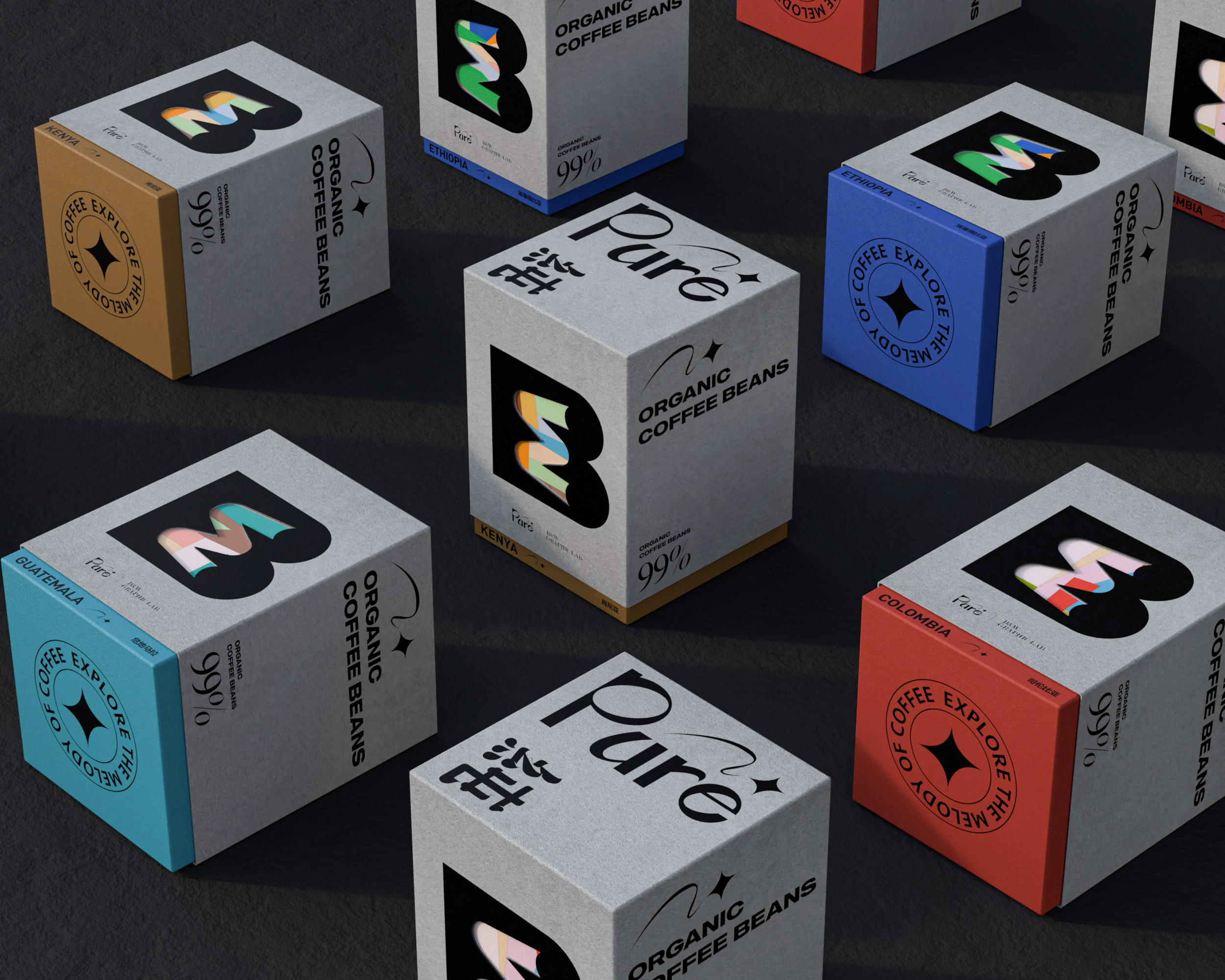
Pure’s branding for their coffee beans is purely magical. B&W Graphic Lab has designed impeccable packaging for the brand, and the opening of each box will take you and your taste buds on a flavorful adventure. The font was chosen to represent the style of traditional Chinese calligraphy due to its unconditional strength and smooth rhythm. Each flavor of the coffee beans is paired with patterns, shapes, and colors that harmonize with the taste of the coffee bean, differentiating this brand from any other on the market.
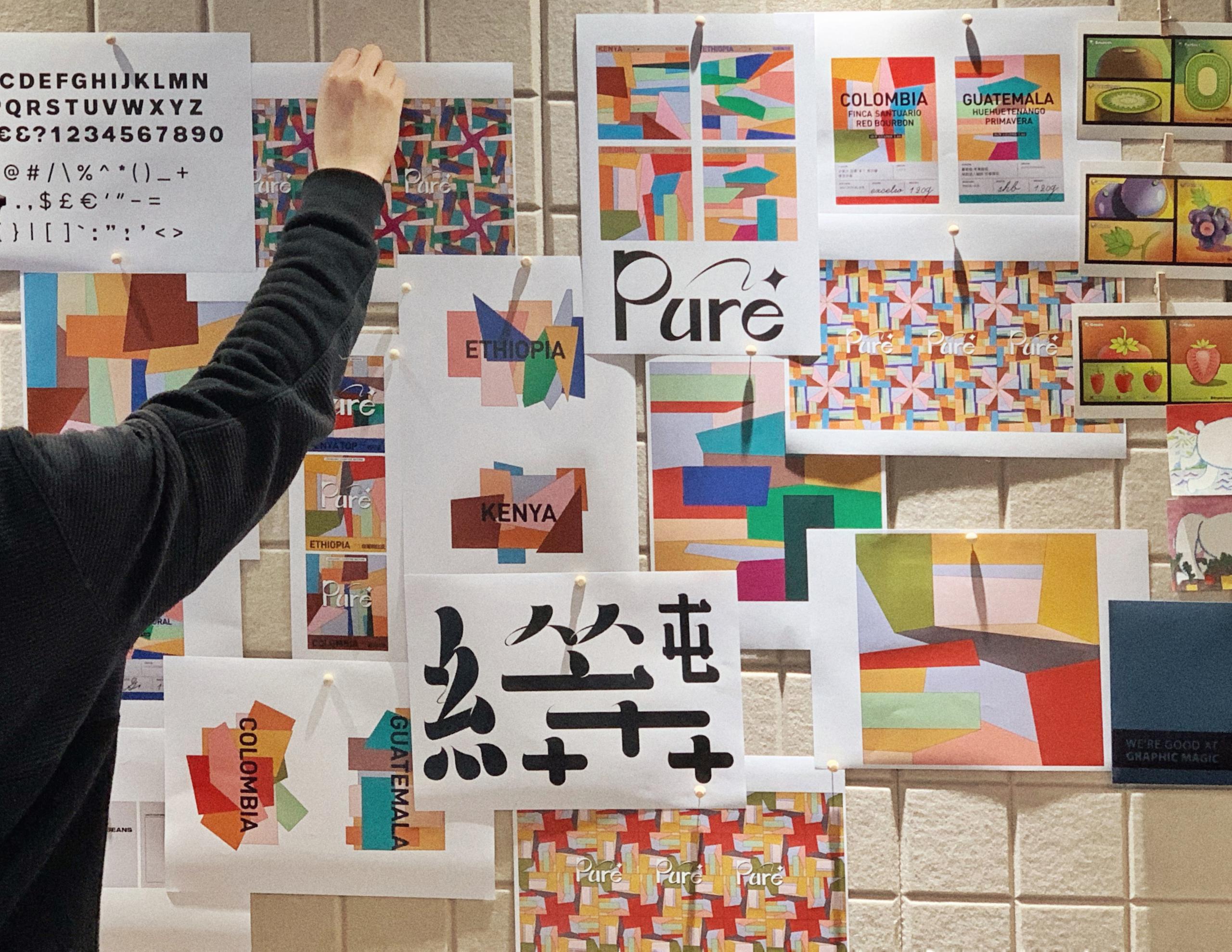
“Pure” is a limited coffee bean for B&W to invite friends. The product is called “Pure Paste”. Our design also pursues the height of Pure Paste by developing a graphic logo through color and form.
Get unlimited access to latest industry news, 27,000+ articles and case studies.
Have an account? Sign in