Featured image for Coco's Packaging Design Brings ‘The Art of Chocolate’ To Life

Coco's Packaging Design Brings ‘The Art of Chocolate’ To Life

by Andrew Gibbs on 03/10/2020 | 3 Minute Read

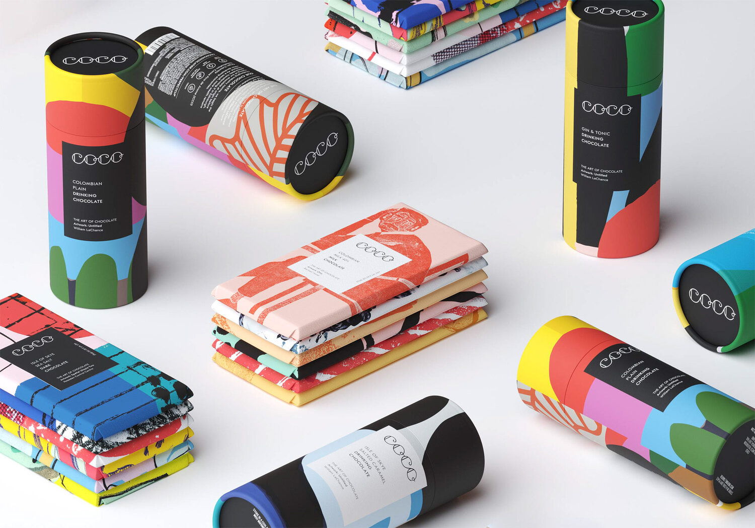
This Edinburgh-based chocolate company was very skilled at creating incredible sweets, but lacked a clear brand positioning. The resulting solution was a beautiful brand design that utilizes bright colors, unique illustrations, and fascinating artistic perspectives. 

"Initially, COCO was using striking geometric stock designs to wrap its chocolate bars. We felt that the relationship between art and chocolate could be built upon as a real point of difference at the heart of the brand. From this idea we developed the brand line ‘The Art of Chocolate’.

To strengthen this positioning we created a visual language based on a gallery concept. Each COCO product is wrapped in specially commissioned original artwork, displayed like installations, in a ‘white cube’ setting. Minimal labels become gallery captions framed within the artwork with artists credited front and centre.

It was equally important for consumers to be aware of the brand’s defining ethical credentials. A set of pictograms were designed to work alongside the logo and brand statement. This simple visual language communicates the quality and provenance of the product at a glance. 

COCO is passionate about challenging industry norms. The making of its chocolate is begun at origin, meaning that more wealth remains within developing economies. Sustainably produced, the finished bars use 100% natural ingredients and are palm oil free."

Editorial photograph
Artist: Rachael Hood
Editorial photograph
Artist: Palefroi
Editorial photograph