Featured image for Ingrid Picanyol Studio Uses Bold Patterns For Chocolate Maker Bahen&Co's Brand Refresh

Ingrid Picanyol Studio Uses Bold Patterns For Chocolate Maker Bahen&Co's Brand Refresh

by Rudy Sanchez on 01/09/2020 | 2 Minute Read

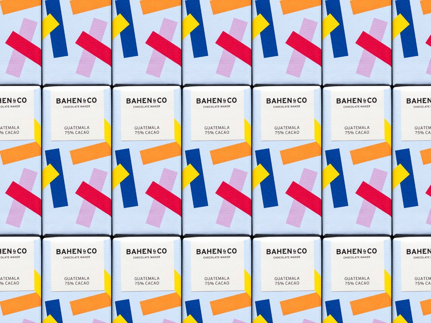
Bright, fun patterns are used to represent the ingredients in Bahen&Co's new packaging, retaining the signature white label to maintain the brand equity built up from the previous visual identity.

"Based out of their farm in Margaret River—Western Australia, Bahen&Co is a family run business that utilises the natural resources of its unique location.

The region’s natural beauty and strong community spirit can be felt across their range of chocolate goods, from delectable drinking chocolate and beautiful enrobed and coated products to their signature chocolate bars.

Editorial photograph

Editorial photograph

In order to create a more contemporary feel for their bars, we proposed a colourful new set of designs—giving each flavour its own unique look—without losing the sense of a collection.

Editorial photograph

Editorial photograph

Editorial photograph

Editorial photograph

Editorial photograph

Editorial photograph

To maintain consistency with the previous design, we decided to keep the characteristic white label which has become a signature for the brand.

Editorial photograph

This family of products is growing day-by-day, providing us with a never-ending (but delicious!) challenge to constantly come up with fresh creative ideas."