New Year, New Look: Our 11 Favorite Brands From The Winter 2020 Fancy Foods Show

Published

Filed under

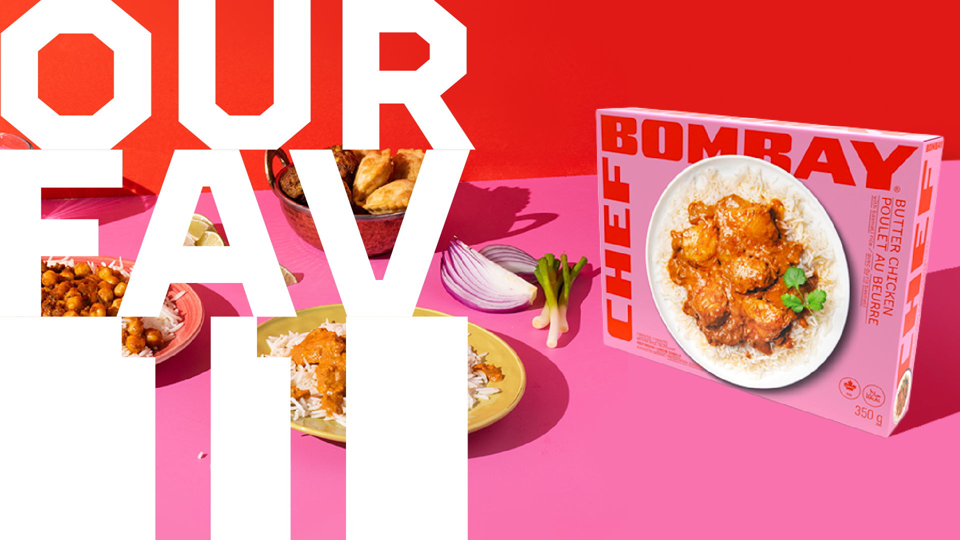
So how was last week’s Winter Fancy Food Show in San Francisco? Well, nothing rings in the New Year quite like a food and beverage trade show built to break your newly minted diet – cheese, chocolates, and cured meats, oh my. 

But even more of a treat was this year’s level of design – from new brand creation to complete overhauls, the show left us excited about the food world’s embrace of creativity and design.

Check out some of our favorites from the show, with none of the calories. 

Editorial photograph

CORO by Salumi

To many of us, salumi is a type of cured meat, which is why the heritage brand Salumi realized they had a problem; it’s virtually unsearchable. So they took the very bold and delicious step to go through a comprehensive rebrand, renaming themselves Coro. With their new name in tow, they reimagined their look, inspired by the brand owner’s love of jazz. As a result, the packaging is full of movement and features hand-painted elements that evoke craft, artisanship, and creativity. The differences in design are stunning and sure to excite consumers. 

Editorial photograph

SPROUD

Everyone say hello to our new plant-based milk friend from Sweden, designed to taste good, be friendly to cows, and help save the earth. While the category gets more and more crowded every day, they’re making a splash with this stark but playful packaging. The diagonal lines give us some serious cow-themed barber’s pole vibes, which we dig. We just hope consumers can understand what the product is on the shelf. 

Editorial photograph

Taika

(415) 212-7711. That’s right, a phone number that you can text and call lives right there on the front of their coffee can. Bold and unconventional, the rest of the design system is simple and straightforward. The liquid inside is a blend of coffee and adaptogens to smooth the highs and lows of caffeine spikes and let you ride a steady wave of clear, calibrated energy. So what are you waiting for? Pick up the phone.

Editorial photograph

Chef Bombay

Chef Bombay is coming in hot, breathing an unflinching vibrancy into the frozen food aisle with Indian entrees ranging from Beef Vindaloo and Vegetable Samosas to Tikka Masala. The unorthodox branding and name placement, paired with elegant and mouthwatering photography, are sure to stand out on the shelf. It’s a youthful, energetic, and modern take on Indian cuisine. 

Editorial photograph

Red Clay Hot Sauce

One part Red Wing Boots, one part craft beer – Red Clay’s new look opts for a stripped-back, pseudo-industrial vibe that lets you know you’re dealing with a hardworking hot sauce, made to enhance food be it a sandwich, taco, or plate of oysters. Of course, we have to admit, the sound of Barrel Aged Hot Honey makes us want to drink it straight out of the bottle.

Editorial photograph

Mrs. Renfro’s

This Tex-Mex-inspired condiment company got a fresh redesign that would cause most of us to do a double-take. Abstracted, playful ingredient illustrations with subdued but happy color palette serve to freshen up this otherwise stale category. Time to dip in. 

Editorial photograph

Tia Lupita

CACTUS. CHIPS. This is not a drill. 

This innovative twist on a tortilla chip made with Nopales, aka cacti, is hoping to shake up the chip aisle. Product innovation aside, the brand garners its powers and inspiration from the founder’s mother, who, coincidentally, it’s named after. The vibrant and charming design help alleviate any nervousness around trying something new for the first time.

Editorial photograph

Spread Delights

While everyone seems to focus on boosting, activating, and supercharging our food, Spread Delights wants to create something epicly simple that’s just meant to be enjoyed. Their redesign efforts have helped the brand show off it’s magically delicious, gravity-defying taste.

Editorial photograph

SF Bay Coffee

Whether it’s your first or fourth cup of the day, SF Bay Coffee has got you covered. The third-generation family business is a carbon-negative company, sourcing and roasting some of the world’s finest and most flavorful coffee. Through bold font, color blocks, and a textured effect on the logo, SF Bay Coffee’s packaging manages to marry industrial and artisanal features to represent the brand and its hometown authentically.

Editorial photograph

SAINT IVY

These sugar and alcohol-free bottled cocktails feature some much-needed flavor complexity that the no-alcohol drink world has been lacking. Saint Ivy uses juniper flavor, bitters, citrus, and coriander to add depth and vibrancy to their virgin G&T. The nearly monochromatic label and filigree logo reinforce Saint Ivy as a sophisticated and elegant alternative to the hangover-inducing classics.

Editorial photograph

ZIBA

Ziba Foods’ nut and dried fruit products are grown in Afghanistan on family-owned farms passed down through generations. These wholesome origins get perfectly reflected in their branding and packaging, with elegant and floral top halves paired with swaths of color beneath. 

This placeholder is removed when the ad slot is configured.

This placeholder is removed when the ad slot is configured.

This placeholder is removed when the ad slot is configured.

This placeholder is removed when the ad slot is configured.

This placeholder is removed when the ad slot is configured.

This placeholder is removed when the ad slot is configured.