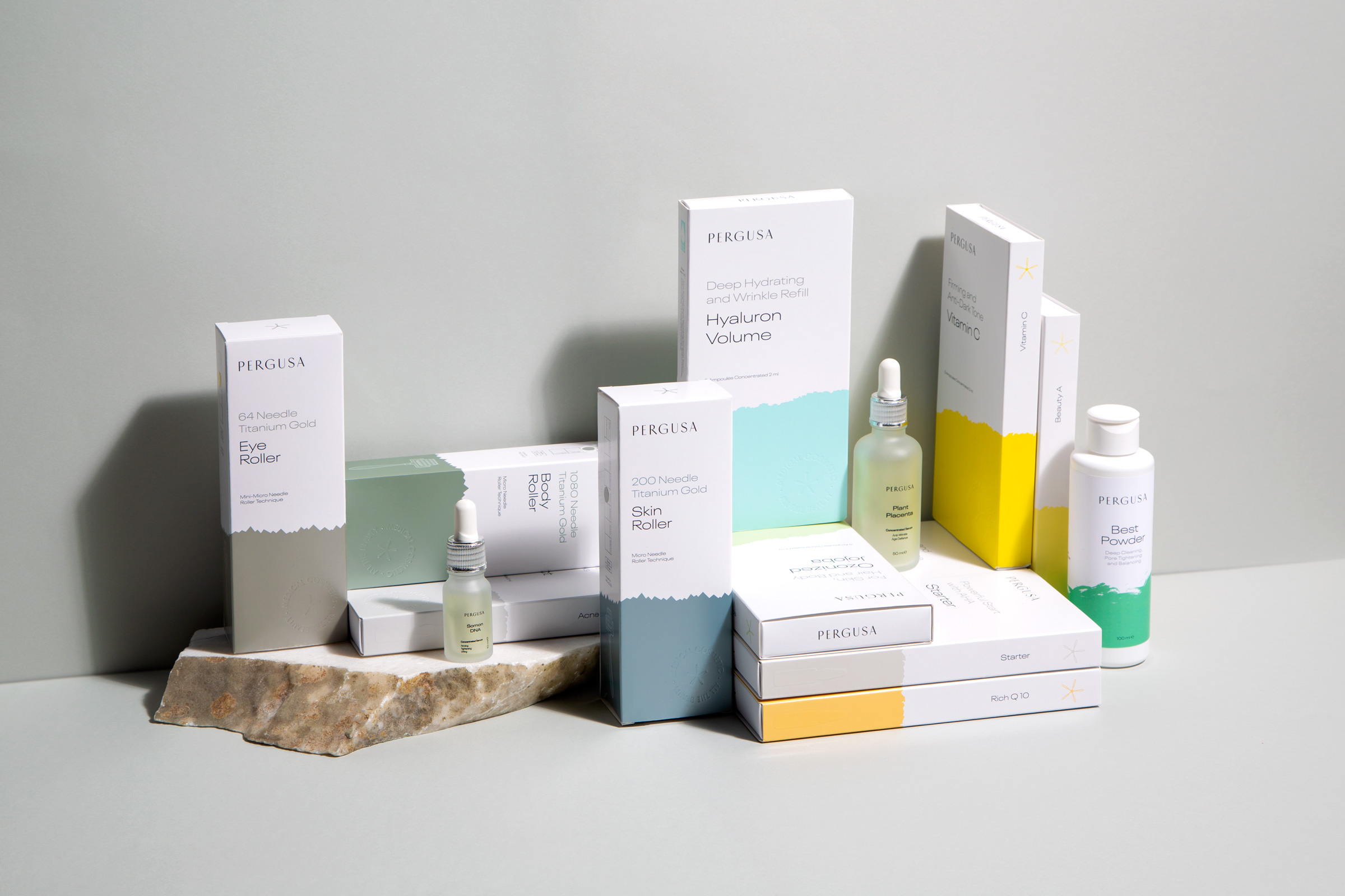
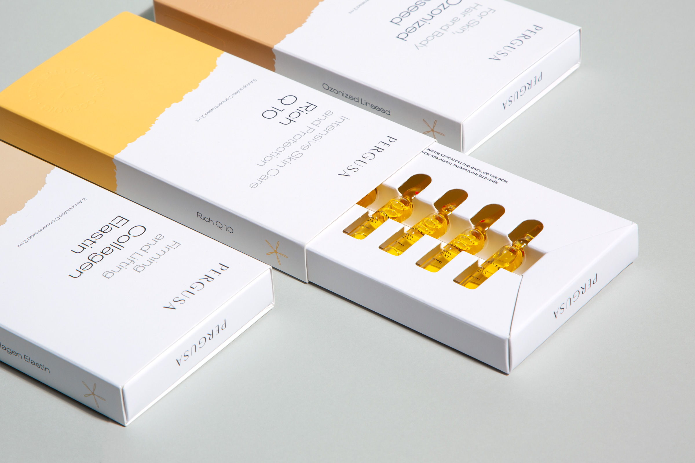
Sömestr Studio designed this minimalistic packaging for Pergusa, a high-end skincare brand. The pop of color along the bottom of the packaging makes for an unexpected look that allows this brand to stand out amongst a sea of other skincare products.


By
Published
Filed under

Sömestr Studio designed this minimalistic packaging for Pergusa, a high-end skincare brand. The pop of color along the bottom of the packaging makes for an unexpected look that allows this brand to stand out amongst a sea of other skincare products.


Get unlimited access to latest industry news, 27,000+ articles and case studies.
Have an account? Sign in