HURRY – EARLY BIRD ENDS TODAY – DIELINE Awards 2024
Featured image for TIBO's Packaging Was Inspired By The Freshest Ingredients

TIBO's Packaging Was Inspired By The Freshest Ingredients

by Natalie Mouradian on 08/30/2017 | 3 Minute Read

Editorial photograph

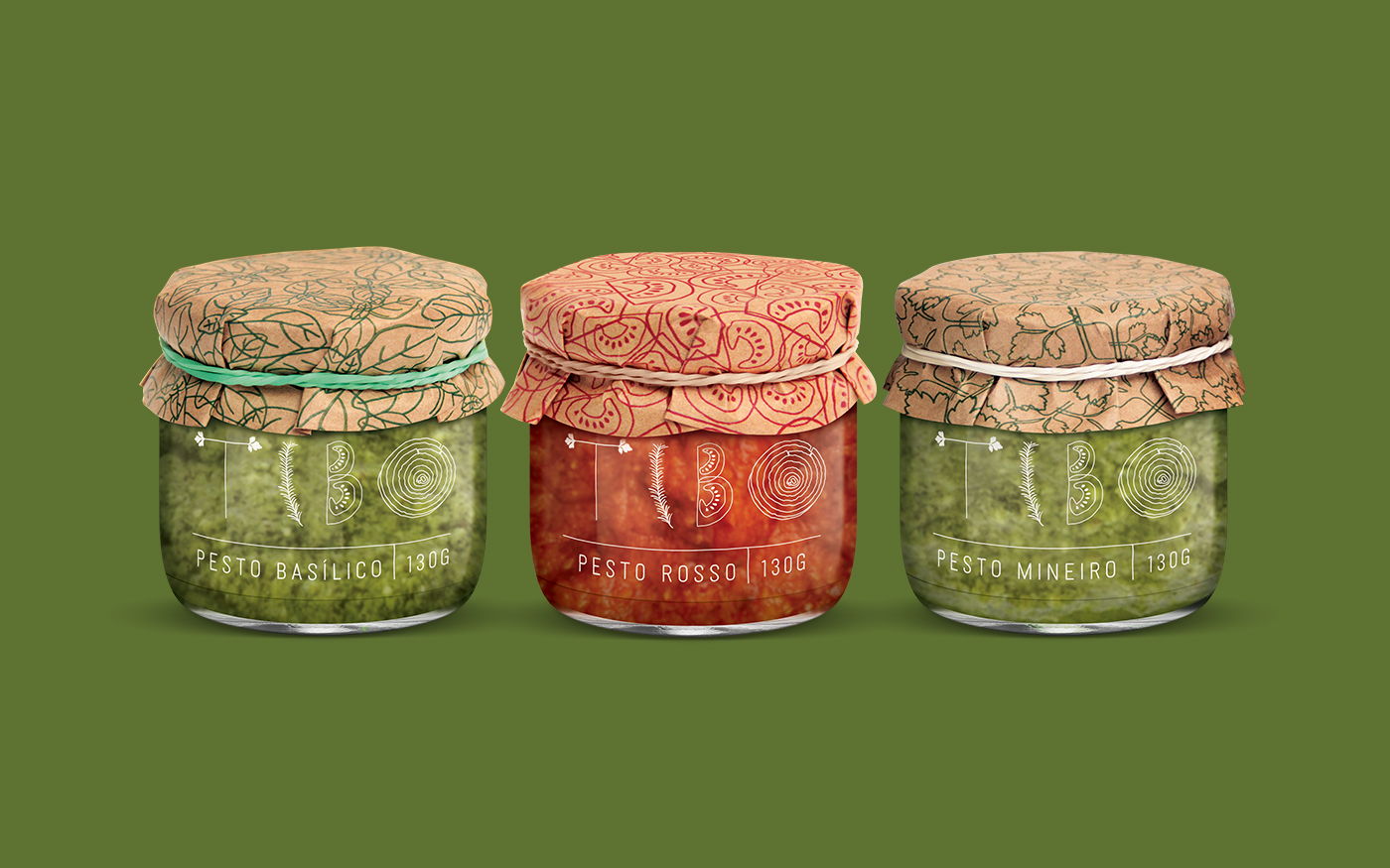
Samuel Profeta designed the funky and earthy packaging and branding for TIBO, a line of artisanal sauces and chutneys. The logo drives home the notion that the product line is made from fresh ingredients.

“TIBO was created from the passion of chef Sinval Espírito Santo for real food and special recipes. He needed a visual identity for the brand and for the line of artisanal sauces and chutneys.

The TIBO logo was designed with typographic illustrations representing the main ingredients of the chef’s creations: parsley, rosemary, tomato and onion.”

Editorial photographEditorial photographEditorial photographEditorial photographEditorial photograph

“For the packaging, the client needed a simple and affordable solution that could allow for a homemade production. To that end, glass jars were used with transparent labels printed in white. Since the sauces’ appearance are so beautiful, they play a leading role in the visual system.

In order to cover the lid, kraft paper was chosen and decorated with a pattern representing the ingredients of each variant. For the finishing touch, colorful rubber bands hold the paper on top giving a charming detail to the packs.”

Editorial photographEditorial photograph

Designed By: Samuel Profeta

Location: São Paulo, Brazil