Featured image for POP Village

POP Village

by Barbara Zandvliet on 08/15/2014 | 2 Minute Read

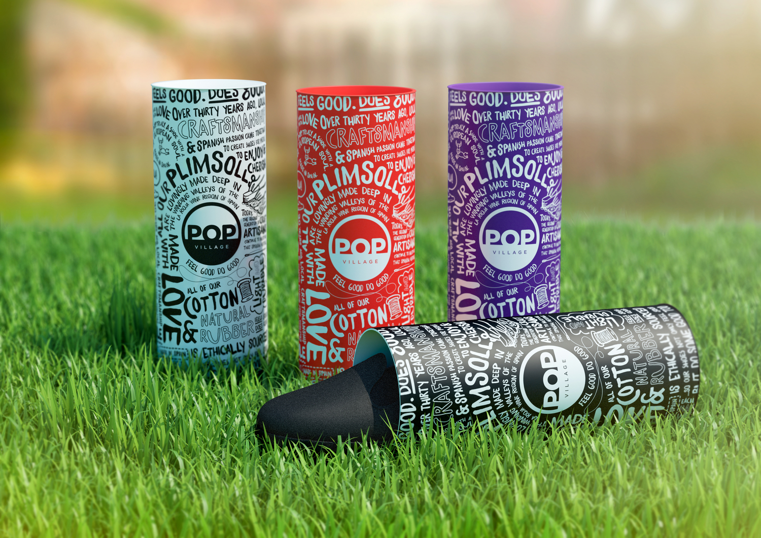
Global brand design consultancy Elmwood worked with new footwear company POP Village to create the brand identity and packaging for their collection of plimsolls, a line of British athletic shoes debuting at summer music festivals this summer.

Each pair of shoes is merchandised inside a striking cardboard tube with a pop-top aimed at creating iconic packaging that is not only engaging to customers, but works well in a festival environment. The tubes feature hand written-style text communicating messages about the brand’s ethos and a palette of on-trend shades, including cherry red, denim blue, candy pink and navy.

Editorial photograph

Elmwood created a bold and distinctive logo of the brand name ‘POP Village’ inside a circle, which features on the heel of each plimsoll.

“POP was a really exciting project to work on because we had the fortune of building the visual identity for the brand from the ground-up. Our aim was to appeal to a fun, young audience by capturing the playful, vibrant feel of the products. A bold versatile logo was especially important in setting the tone and the unique tube packaging and bright color palette brought it all together into a strong highly own-able brand concept. We’re thrilled with the results and cannot wait to see POP Village hit festivals this summer” - Abi Turner, Designer at Elmwood
Editorial photographEditorial photograph

Circular business cards were also produced and designed to feel like fabric patches.

POP Village launched at Global Gathering in July and will showcase at Leeds festival Aug. 22-24. POP plimsolls retail for £30 per pair. 


Agency: ElmwoodCountry: UK