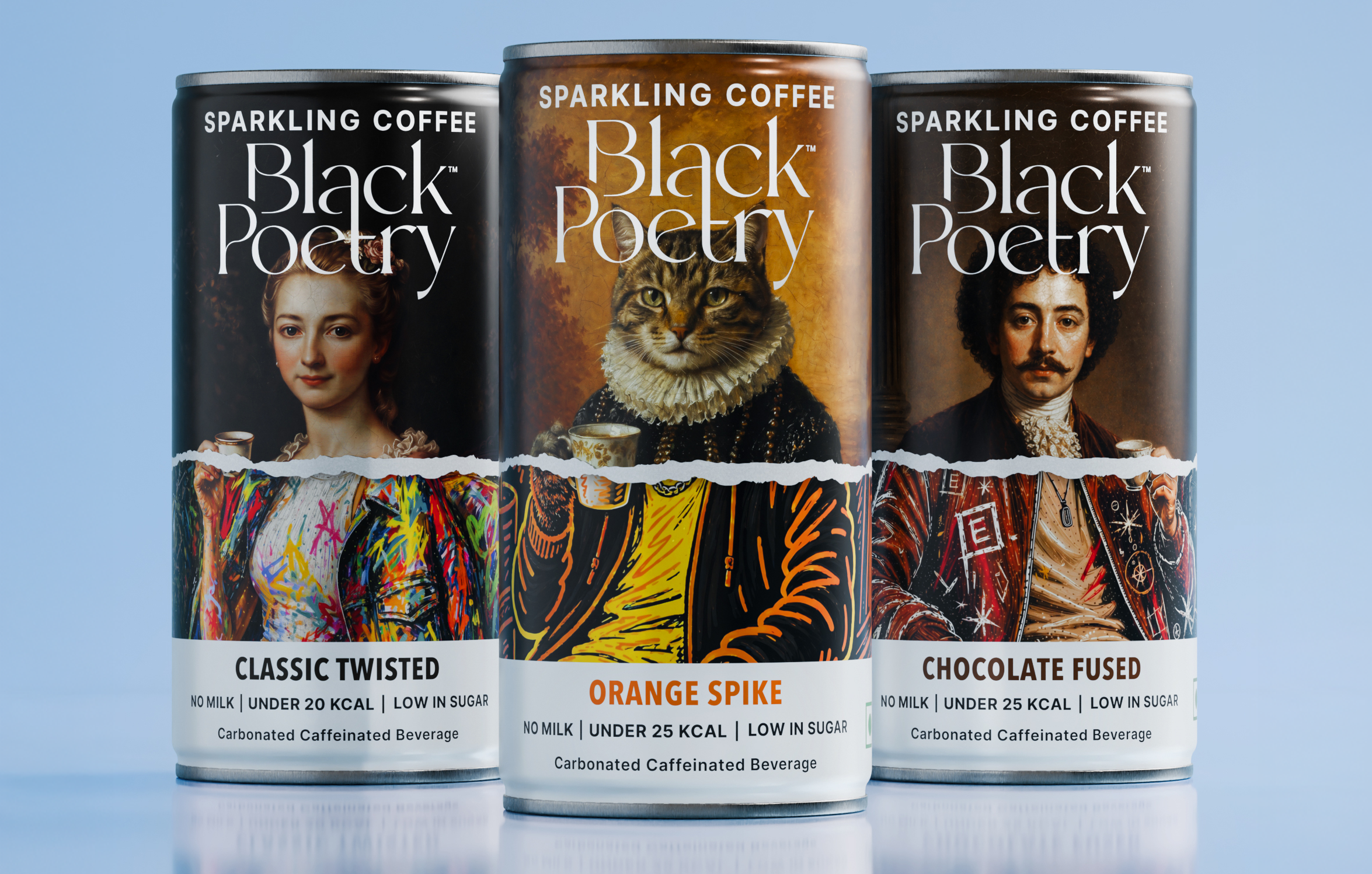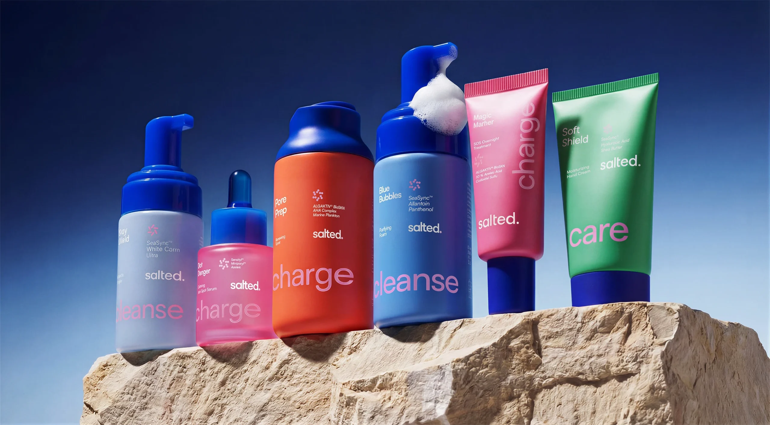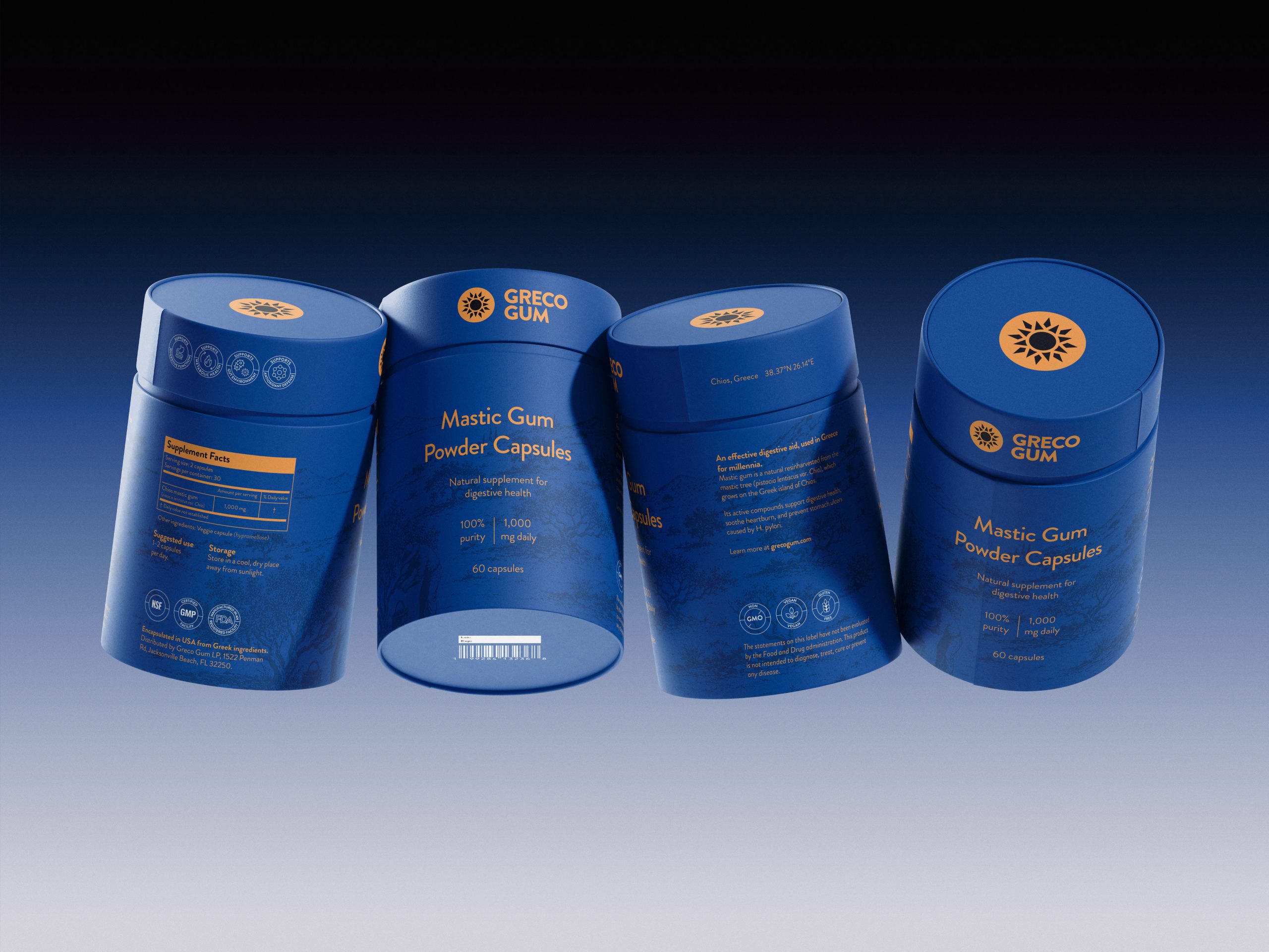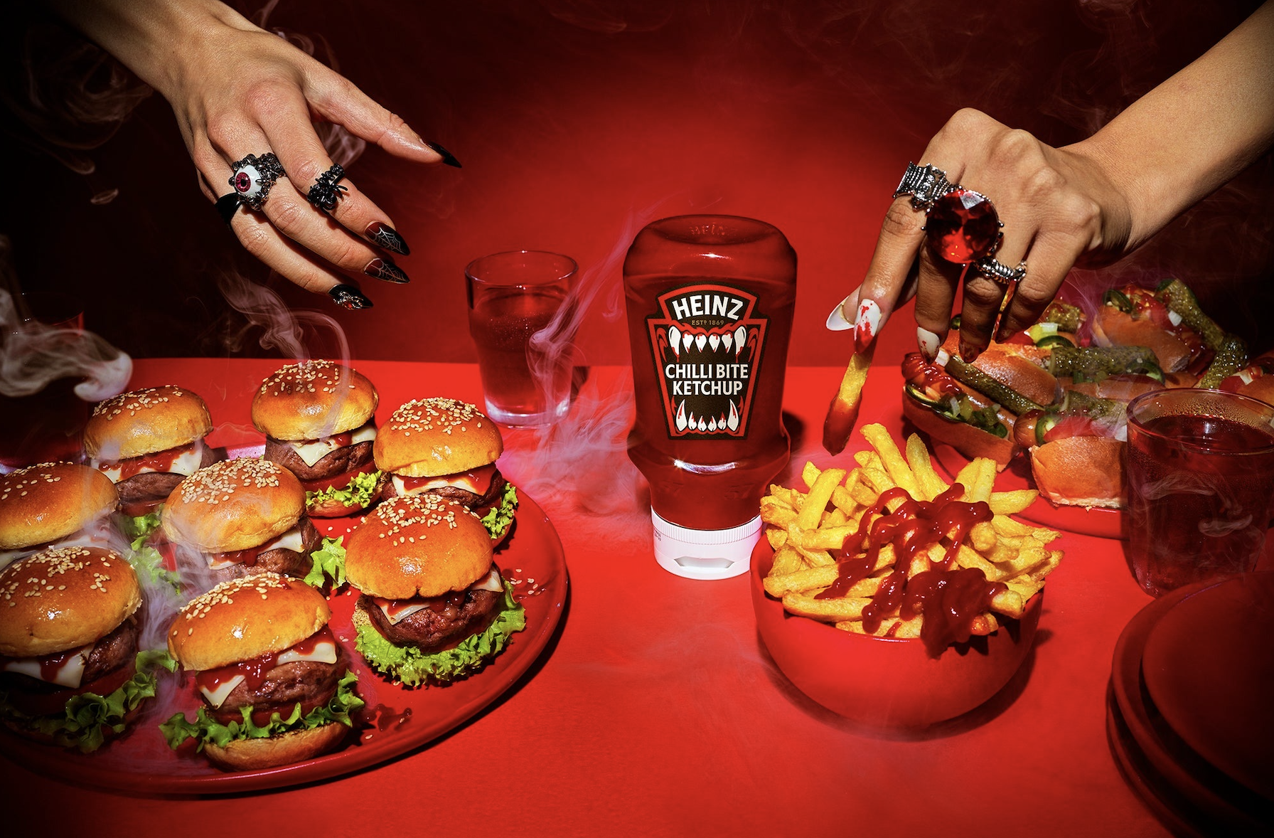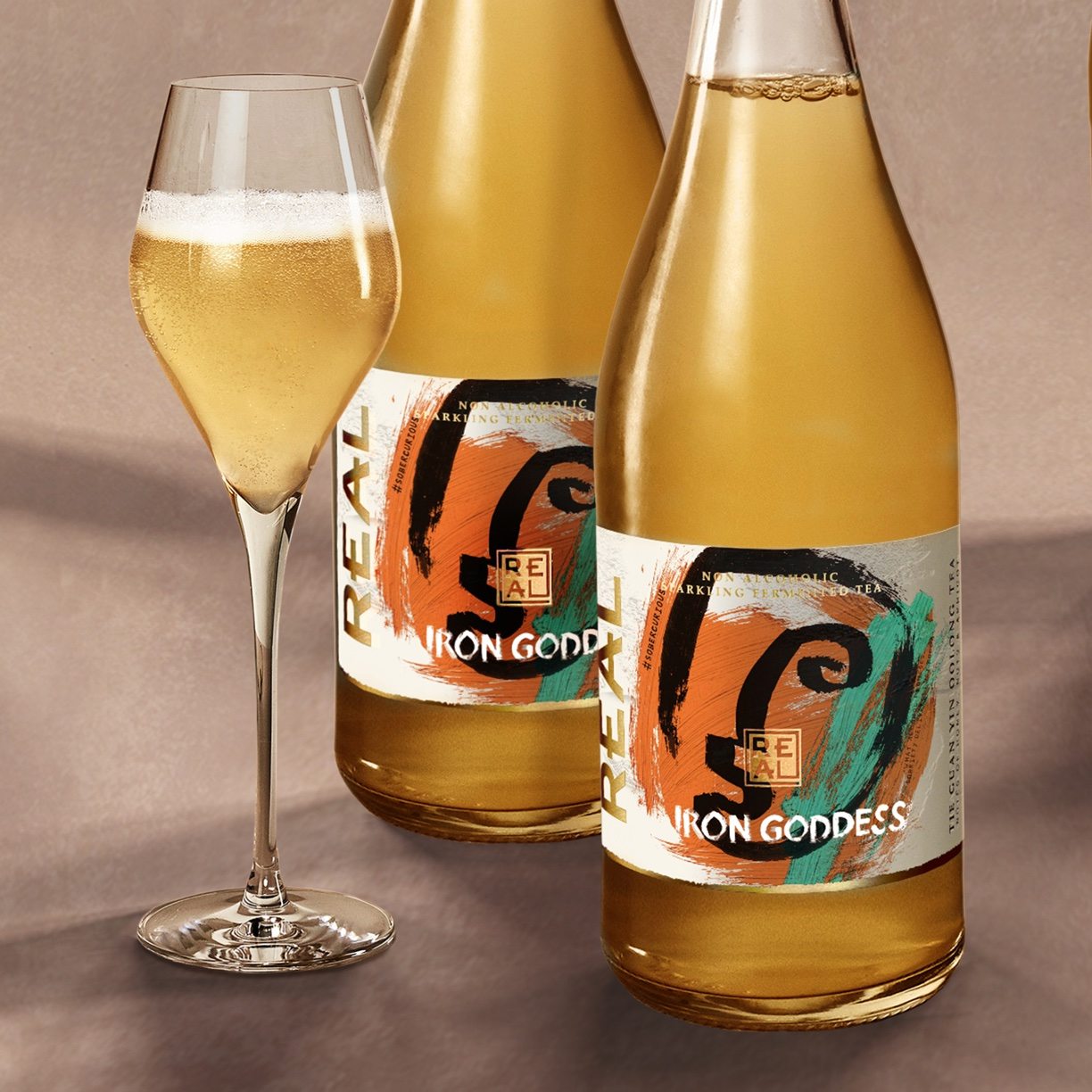
Butterfly Cannon is back with another stunning beverage packaging design. Created for REAL Sparkling Fermented Tea, this packaging design blends artistic inspiration from Japanese and Chinese origins, inspired by the heritage of the tea itself. The addition of the gold foil overlay acts as a seal of the highest quality. Remarkably artistic, this label represents the craftsmanship and quality of the beverage within.

REAL Sparkling Fermented Tea is the no-alcohol premium alternative to champagne and sparkling wines. Since our redesign, REAL has experienced strong growth, which has only been accelerated by the pandemic and sober curious movement. Iron Goddess is the first seasonal edition to sit alongside that core range. REAL first came to Butterfly Cannon for a redesign. We were challenged to balance the brand’s raw, radical and disruptive positioning with the refinement of its beautifully crafted products and the gourmet world in which it is consumed. We quickly identified the ‘primal artistic’ quality of the brand to be our leading inspiration. Inspired by the Founder, David Begg’s love of contemporary street art, we decided to use this visual aesthetic as our bridge.