B&B Studio Rebrands Border, Bringing Accessible Design To The Biscuit Category
By
Published
Filed under
By
Published
Filed under
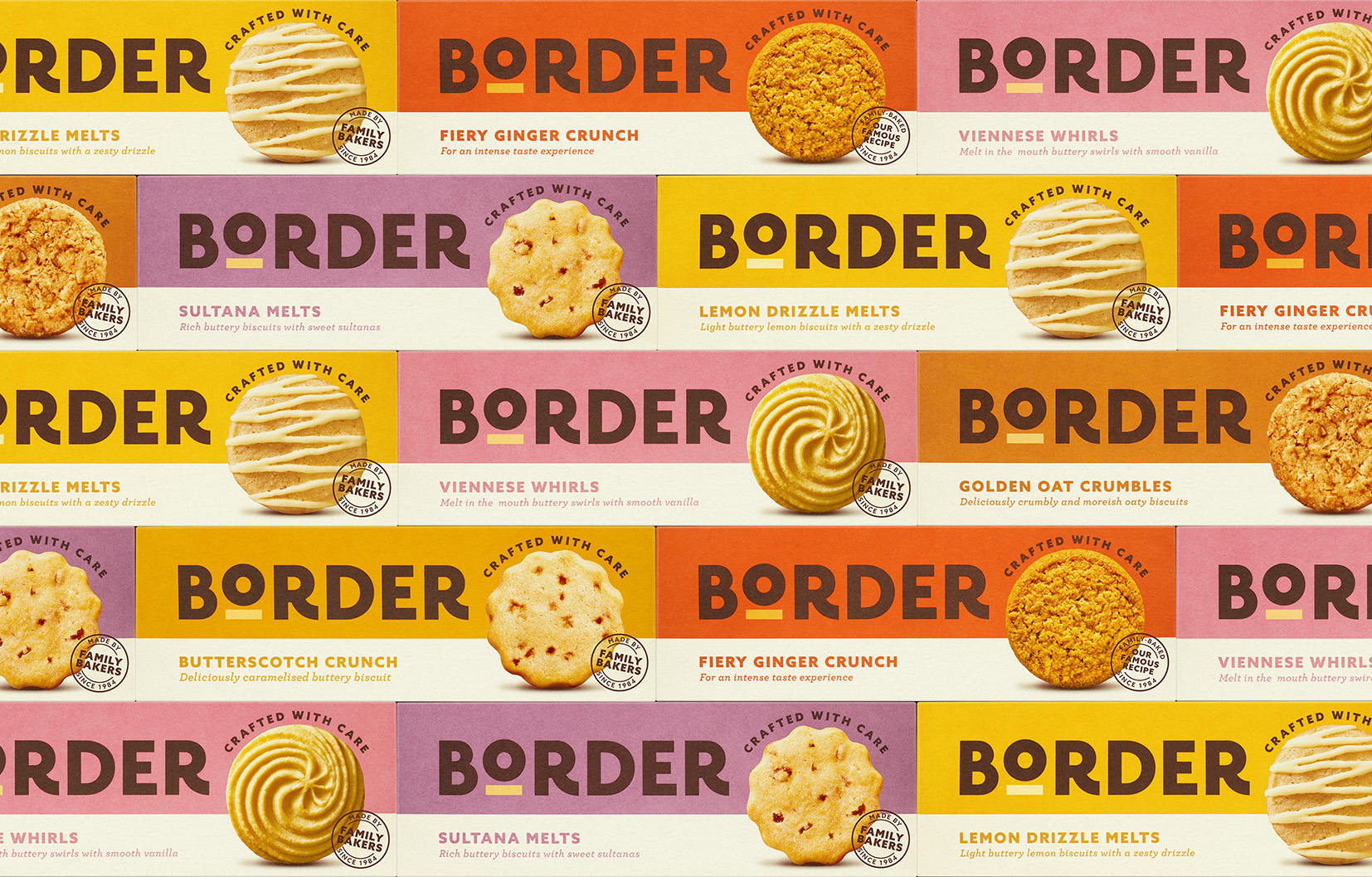
After a considerable repositioning exercise, B&B studio recently worked with Border Biscuits to create a significant identity and packaging design rebrand. The result is an elevated visual identity that brings more transparency to the delicious brand. In addition, the bold typography and elevated “O” create a sophisticated yet powerful impact on the packaging that feels more inclusive and playful. The redesign feels modern yet utterly timeless, implementing a beautiful mix of different elements that come together beautifully.

B&B studio has partnered with Border Biscuits on a major rebrand of its identity and packaging design following a significant repositioning exercise. Created to help the brand become the UK’s number one accessible premium biscuit, the rebrand was announced by Border as the ‘biggest move in its 38-year history, and coincides with new product launches in its chocolate covered range.
Get unlimited access to latest industry news, 27,000+ articles and case studies.
Have an account? Sign in