Togo’s Cartoony Rebrand Brings the Italian Chocolates Into the 21st Century
By
Published
Filed under
By
Published
Filed under
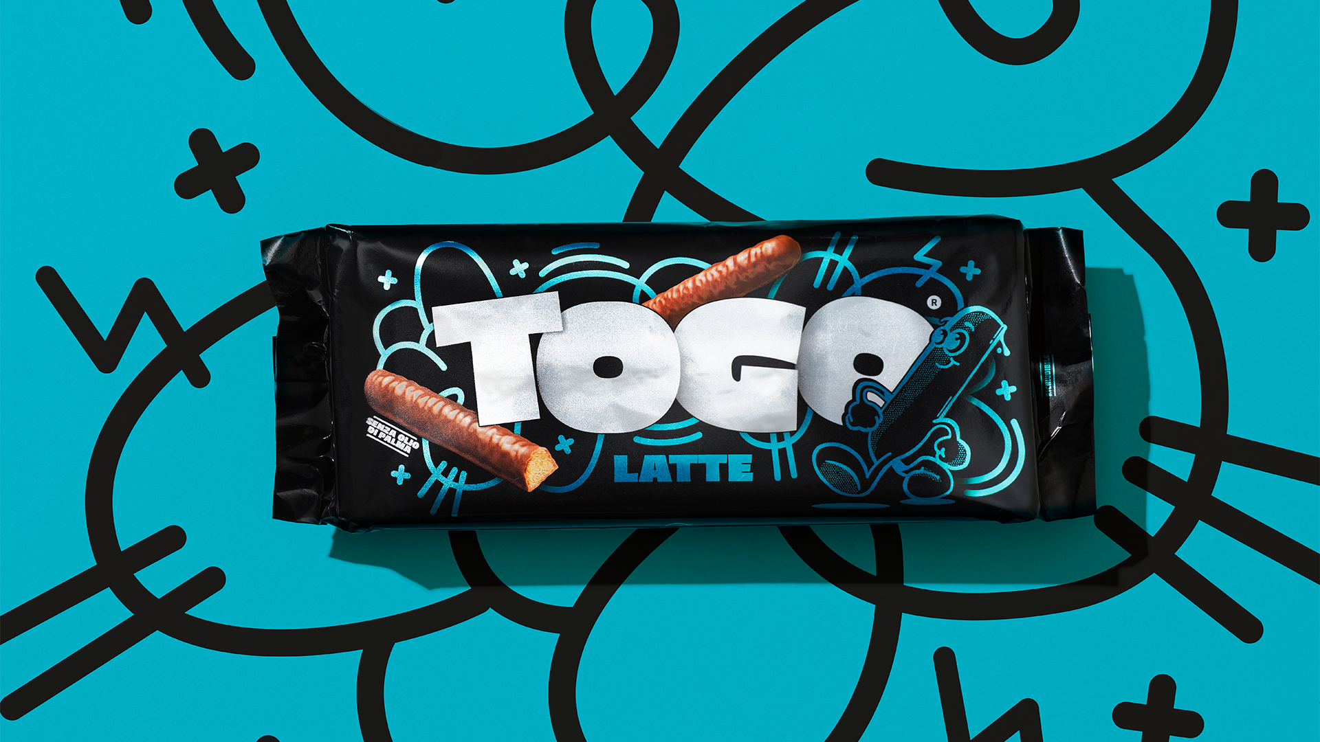
Italy’s Marimo gave the chocolate brand Togo a spunky upgrade with bright colors, dynamic illustration details, and plenty of personality. While the old branding had a classic 20th century dinner table look, the more modern redesign uses graffiti-esque detail and bold, bubbly sans serif to grab attention.

Togo, a time-honored brand in the Barilla portfolio, is back on the shelves with a new visual identity that contains revolutionary storytelling elements: a bold, assertive, more modern logo, conceived to adapt to the most diverse ecosystems (from PoS to social media), a distinctive character that generates warmth and creates connections with people, all topped off by vibrant, metallic, pop packaging, which has what it takes to compete with the most on-trend snacks.