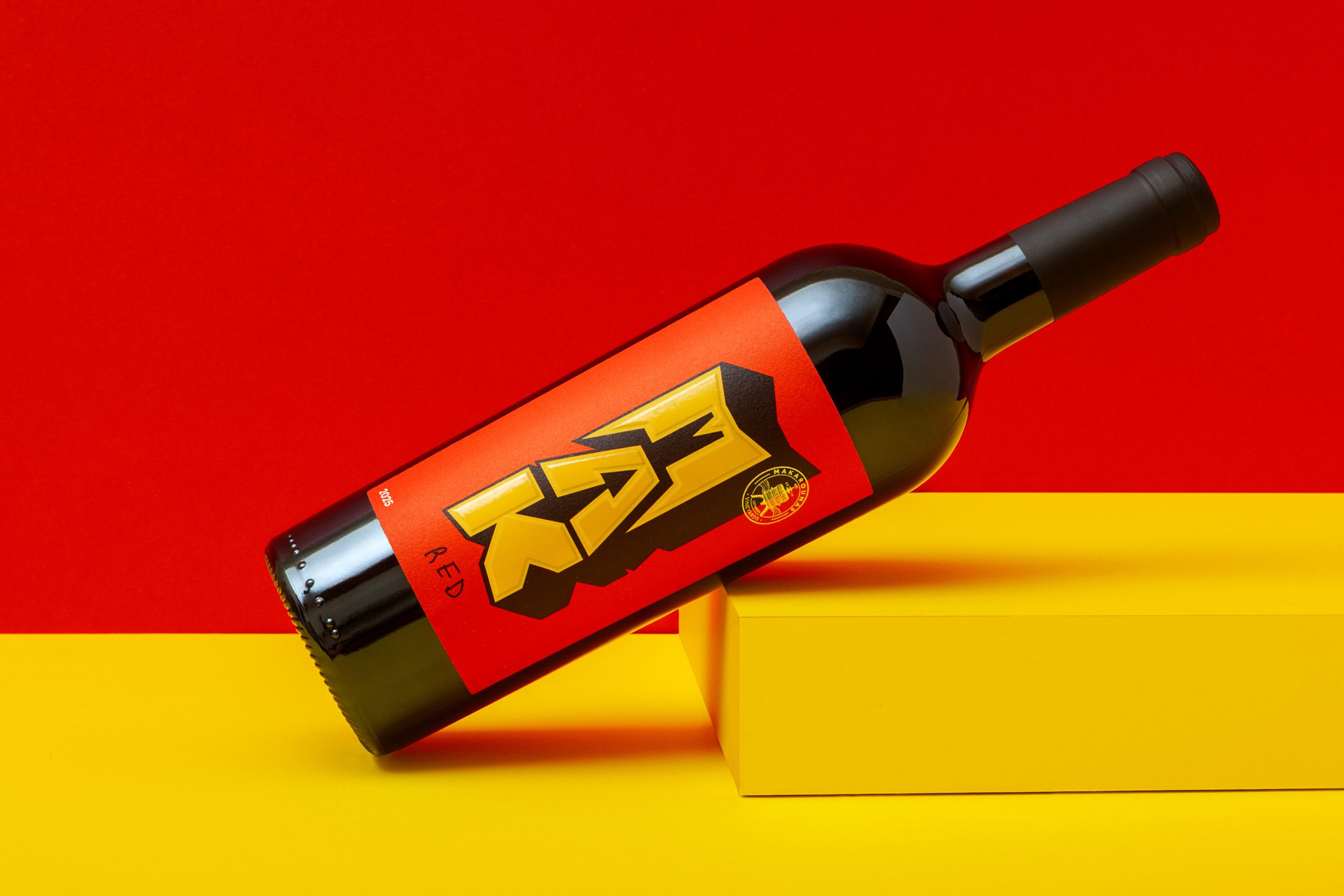
MAK by Marios Karystios gives wine a graphic identity that feels closer to street culture than the traditional vineyard aesthetic. The oversized MAK lettering has a chunky, dimensional character reminiscent of comic book titles, while the scribbled varietal names add an intentionally loose human touch. Even the box becomes part of the system, extending those giant letters across its panels and making the branding feel collectible rather than purely functional.
It taps perfectly into a world of expressive typography and high-energy color, giving wine a younger, more spontaneous visual language without losing its sense of craft.