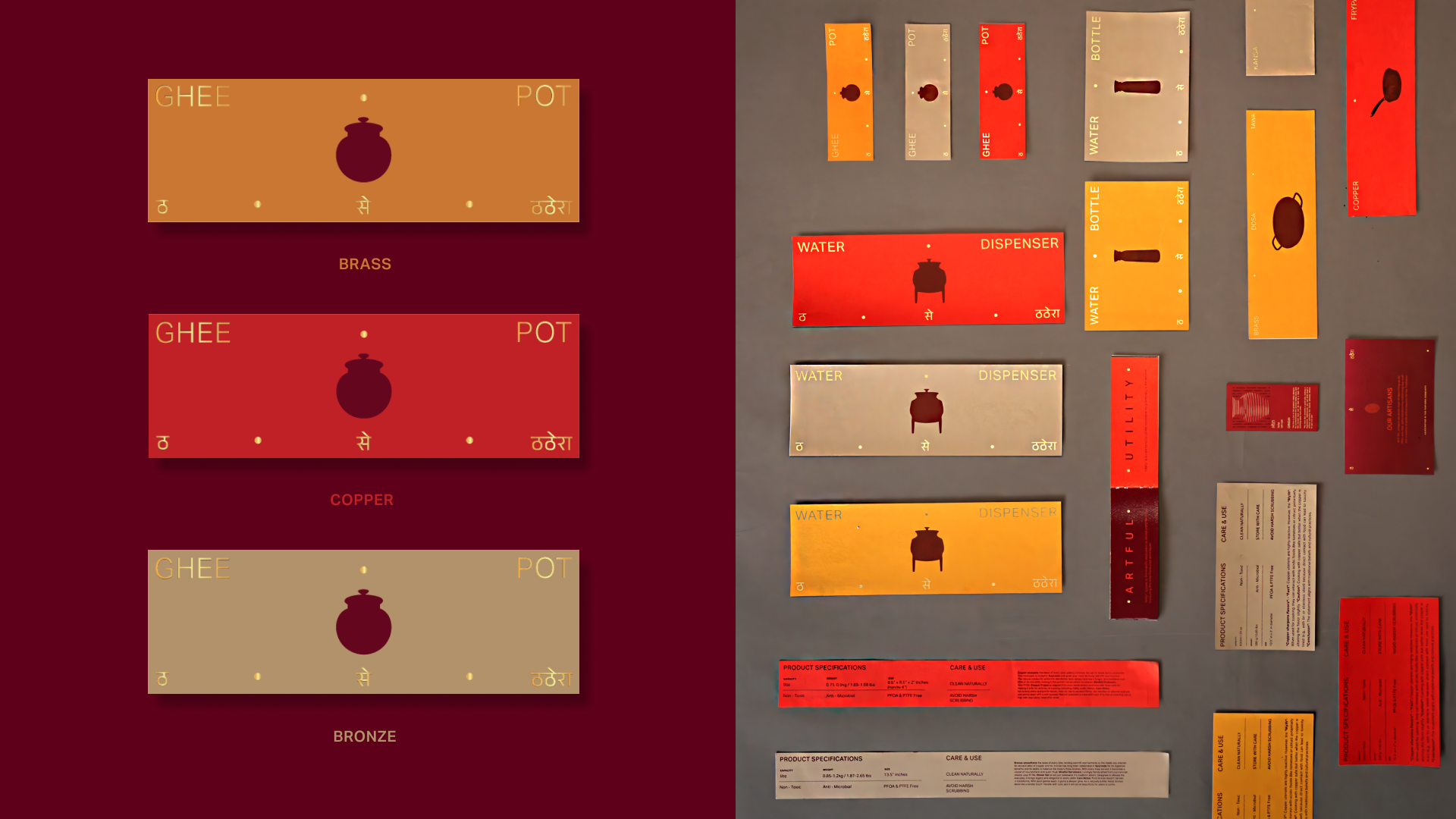
Cookware packaging is moving beyond polished minimalism, and P•TAL shows how cultural craft can become the foundation. Mother Tongue Design builds the system around rich colors, translating the actual materials and processes of India’s Thathera craft into an intuitive color language. Simple vessel silhouettes reference hammer marks, metalworking, and transformation, giving the graphics a wonderful connection to the hands and techniques behind each object.
Spacious typography and subtle multilingual details lend the boxes a refined editorial character, while saturated color blocks keep everything approachable. P•TAL makes the box itself an expression of artful utility, joining the growing CPG shift toward culturally specific design that looks forward rather than relying on nostalgia.