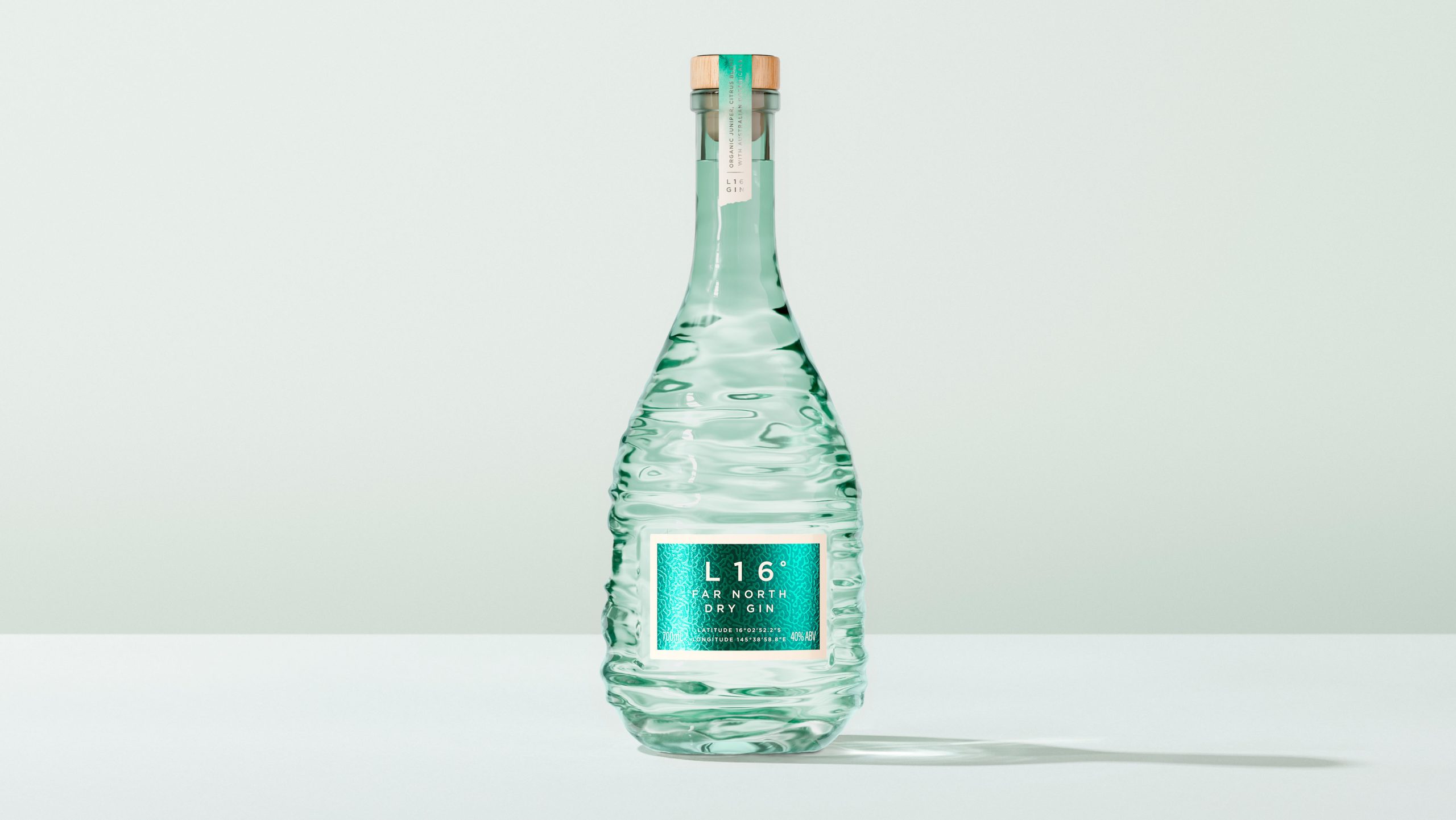
Most spirits packaging wants you to feel like you’re standing in a heritage distillery, surrounded by copper stills and weathered oak, but L16° Far North Dry Gin puts you underwater.
Designer Clay Andrews translated the experience of standing waist-deep in the outer Great Barrier Reef’s coral cay shallows into a full material system, where every finish, texture, and color choice is doing the work of recreating light as it refracts through moving water.
What separates this from the craft gin shelf is that every single material decision, the pale beechwood cap introducing natural warmth, the aqua-tinted glass bottle with sculpted ridges that distort light like moving water, the sand-toned label border anchoring the vivid teal, works together as one unified sensory translation of a single memory, and that level of conceptual discipline is genuinely rare.