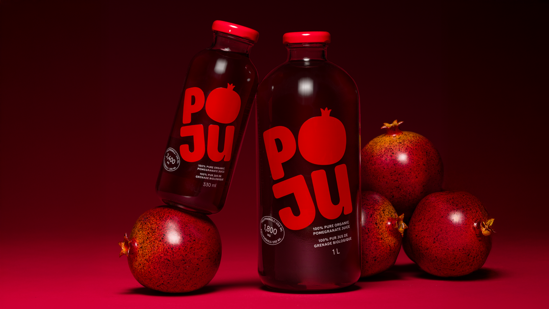
- Poju Organic Pomegranate Juice gets a brand design courtesy of Toolbox Design, all about the juice’s health benefits and ancient Azerbaijani origins.
- With a clear bottle and limited on-bottle graphics, the pomegranate juice itself shines through as the star of the show.
In a crowded category of canned and bottled beverages we’re told will revolutionize our health, Poju Organic Pomegranate Juice breaks through with a sleek yet punchy bottle design.
Created in two colorways, the design features a clear bottle colored by the purple-red hue of pomegranate juice on the inside, with pink (with pulp) or red (without pulp) accents on the outside, none more charming than the bottle cap.

Toolbox Design developed a brand identity that enforces the antioxidant richness and benefits of pomegranate juice, while tracing its roots back to Azerbaijan, “the birthplace of the pomegranate.” The apothecary-inspired clear bottle choice was intentionally made to let the juice itself really shine through (quite literally), with no label and minimal glass graphics so as not to obscure the juice’s splendor. The geometric symbol on the bottle cap is pulled directly from the Azerbaijani design language, harkening to the storied ancient origins of pomegranate juice.
These historic details underscore how pomegranate juice’s quality has endured over the centuries, and now flourishes in the Poju bottle.

POJU Organic Pomegranate Juice is the elixir of the ages. Unchanged across millennia, “The King of Fruits” ushers in a new era, where ancient wisdom meets modern health. Toolbox Design developed, named and designed the POJU Organic Pomegranate Juice brand, while highlighting the antioxidant benefits of the juice, and celebrating its ancient Azerbaijani roots.
The goal was to deliberately depart the ‘juice’ category and become a staple, an essential part of one‘s health ritual, and an automatic choice for those wanting to do right by themselves and those they love.

Packaging design began with a philosophy of highlighting the essence of the juice within, its quality and purity captured in a bespoke glass bottle, designed with recyclability in mind.
Vivid brand SKU colours evoke a sense of freshness and energy. The juice ‘speaks’ for itself with a label-free bottle, the brand printed direct to glass. A wordmark with hieroglyphic origins, and prominent callouts on the front celebrate the juice’s antioxidant power. As a final touch, an “Easter egg“ awaits on the lid. A geometric icon inspired by Azerbaijan‘s graphic language, and a nod to POJU’s origins and the birthplace of the pomegranate.