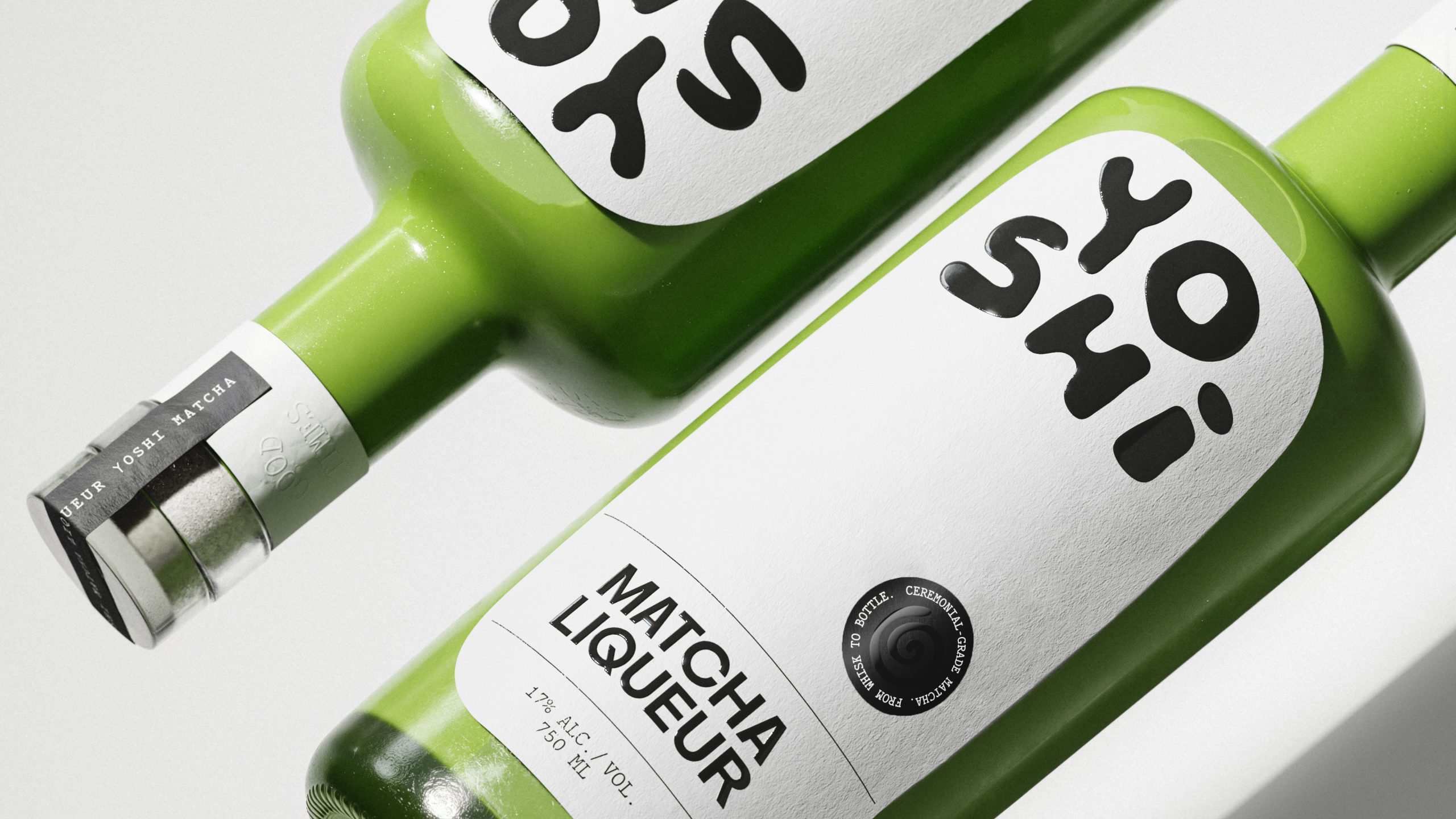
Yoshi’s packaging leans into an irreverent visual language that feels pulled from early streetwear graphics and 2000s import snack culture rather than the usual craft-liqueur cues.
Saint Urbain builds the whole system around chunky, off-kilter letterforms that read like they were piped onto the label with icing, matcha-flavored, of course. When paired with ultra-minimal layouts and a bottle that allows the unmistakable green to shine through, it’s a smart detour from the category’s premium-heavy playbook, trading ornate detailing for something closer to a zine cover.


