Volta Studio Revisits the 1940s For Arcádia’s Chocolate Packaging
By
Published
Filed under

By
Published
Filed under
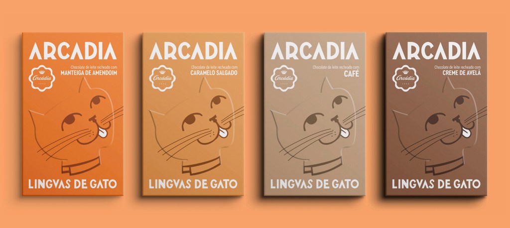
The packaging for Arcádia, designed by Volta Studio, blends nostalgic elements with bold details. The oversized typography, inspired by the lettering from Arcádia’s original storefront, is displayed, giving the design a retro vibe. The embossed cat illustration, directly borrowed from the brand’s 1940s packaging, takes center stage with its subtle texture. Each flavor features a distinct color palette, creating a fresh and young look while keeping the design cohesive and inviting.
Get unlimited access to latest industry news, 27,000+ articles and case studies.
Have an account? Sign in


