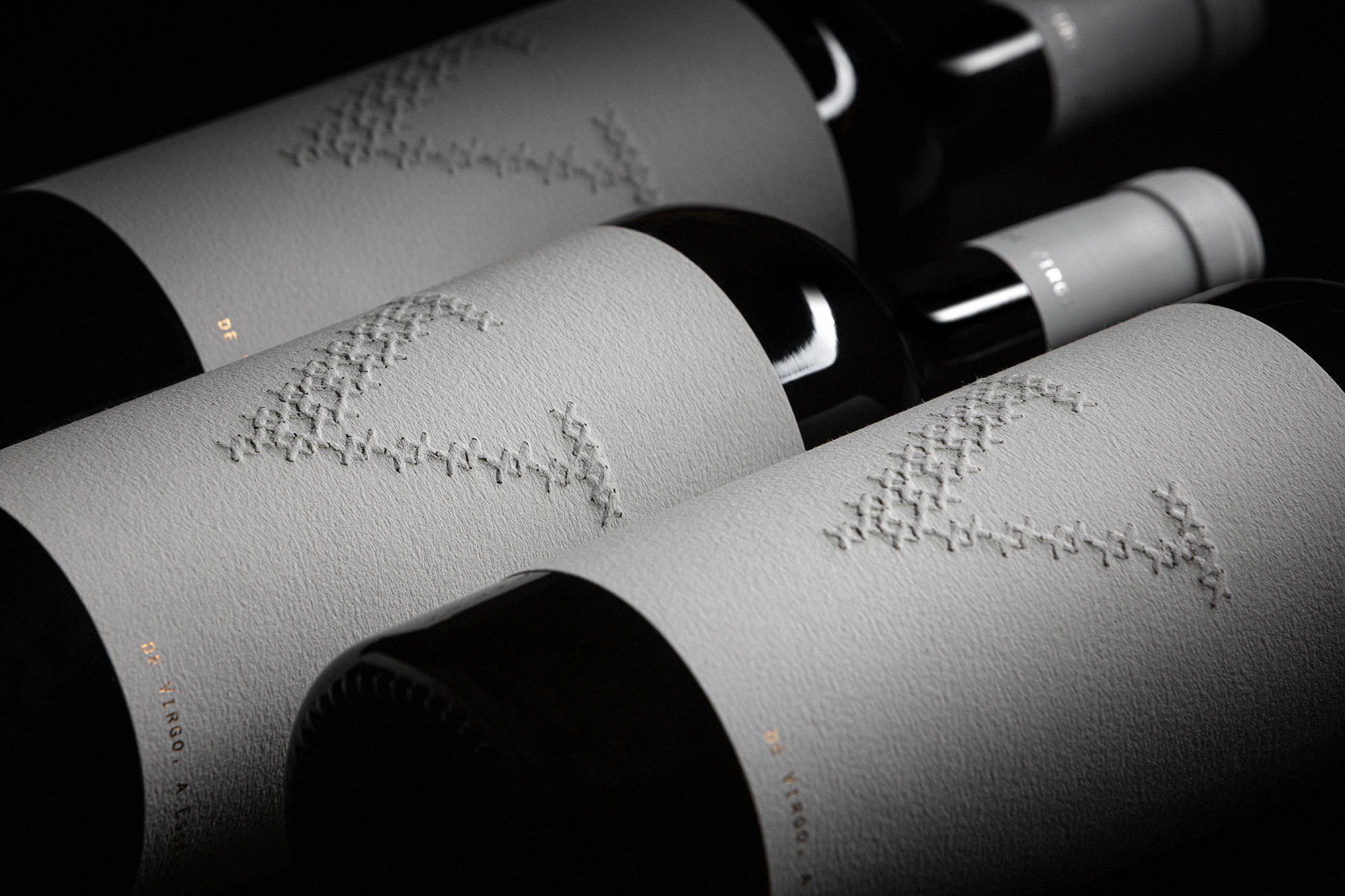
Elegance doesn’t even begin to describe the packaging design BRAVA created for Torre do Frade’s Virgo wine. The sleek, textured white label is a blank slate for what’s within. Allowing drinkers to develop their own story about the wine, the immaculate use of white space creates an imaginative, inspiring landscape. Sometimes, it’s effective when packaging allows space for stories to be created instead of presented.

At Torre do Frade, the 2017 harvest revealed a Virgo with an extraordinary profile and a more complex structure than usual. They challenged us to “create a label that communicates a wine ahead of its ‘father’”. Thus was born V de Virgo, “an evolved relative, with an elegant and striking image, that communicates a solid wine, from a more experienced generation that knows what it wants.” Perpetuating the concept of the family to which it belongs, V de Virgo is also a blank page, waiting to be explored. Embroidery, as a symbol of tradition and excellence, gives the label the identity of this family member and the creative expression so characteristic of the brand.