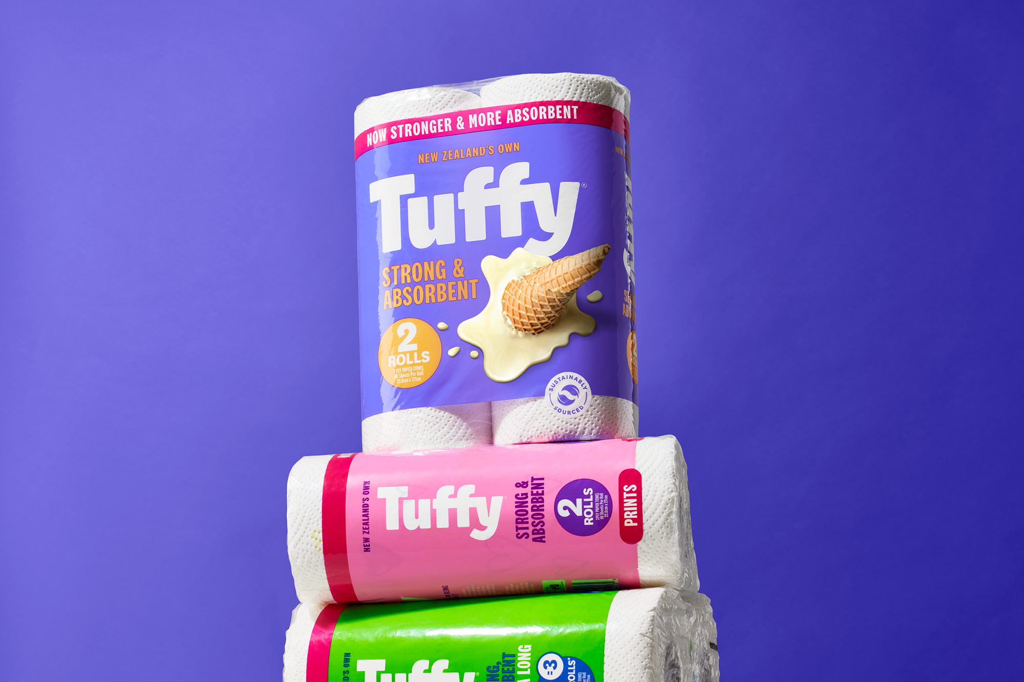
It would be both unfair and inaccurate to give credit to corporate conglomerates for pushing creative limits. Massive labels’ packaging systems, specifically those of the paper towel and toilet paper variety, often feel stale and unapproachable, completely out of touch with the contemporary consumer. Onfire Design recently worked with Tuffy, a paper towel brand, to refresh the packaging system. The result is a bright and dynamic design that doesn’t feel invasive to the market but, when compared to its counterparts, breathes life upon the shelves. The bright colors and interesting, rounded typography create a sense of harmony that has been missing from the space.

The paper towel category can be considered one of the last supermarket areas that has lacked any branded effort to inject personality and relevance into the proposition. Instead, it is an example of brands following a bland, commoditised norm. The team behind Tuffy were aware of several issues with the current brand and was open to a reinvention of the brand and, in doing so, challenging expectations. Our response was to reframe what a Tuffy towel is used for in a modern New Zealand family home – the small messes that happen every day. Our new positioning of ‘Mess Happens, Get Tuff!’ is a simple proposition…these things happen, and Tuffy is there to help out. It is a universal, democratic idea with positivity and a Kiwi ‘can-do’ attitude. This allowed us to relook at the packaging from a different angle.


