The Sundae Cone, Nestlé Drumstick, Releases Its New Packaging Redesign
By
Published
Filed under
By
Published
Filed under
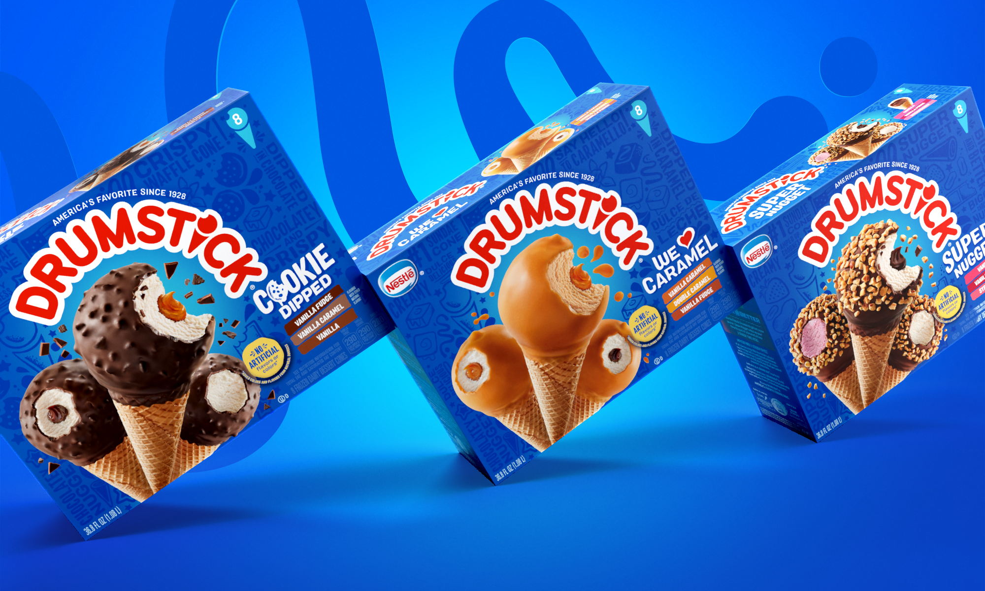
Just because summer is over doesn’t mean we have to stop eating ice cream. Chase Design Group just announced its rebrand for beloved ice cream brand Drumstick. The new look keeps the blue background recognizable, but the new design implements flavor-inspired illustrations, fresh copywriting pointing out delicious attributes, and new imagery. The rebrand reflects the ice cream’s bold flavors and continues to differentiate the brand from its competitors.
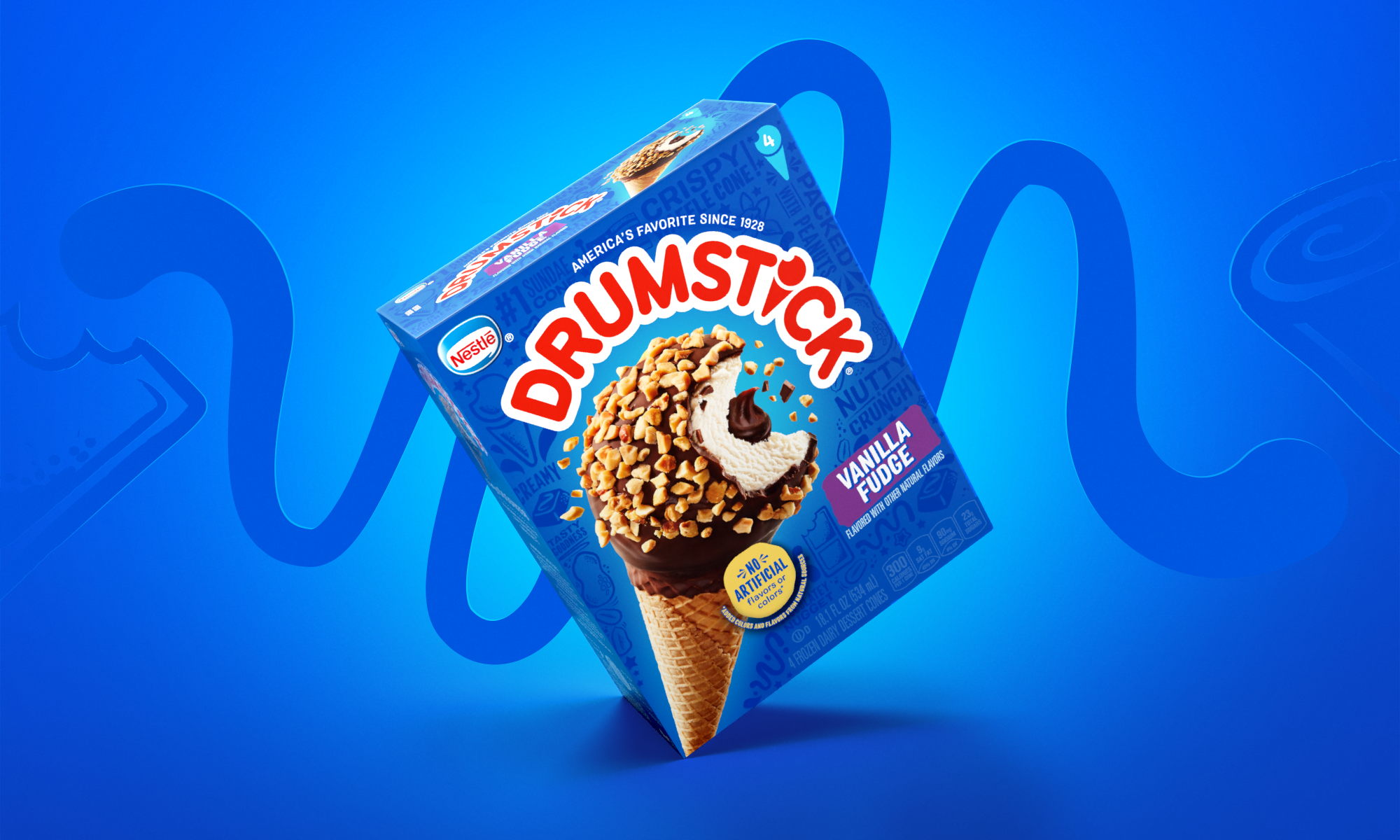
Since 1928, eating a Nestlé® Drumstick® sundae cone has been an adventure involving a multitude of senses. From the crunchy sound of the peanuts to the creamy vanilla, and down to the chocolatey nugget, it’s truly “America’s Favorite Sundae Cone.” When competitors, including many private labels, started imitating the lineup and visual brand cues, creating a homogenous sea of blue at shelf, it was time to redesign the entire portfolio.
Get unlimited access to latest industry news, 27,000+ articles and case studies.
Have an account? Sign in


