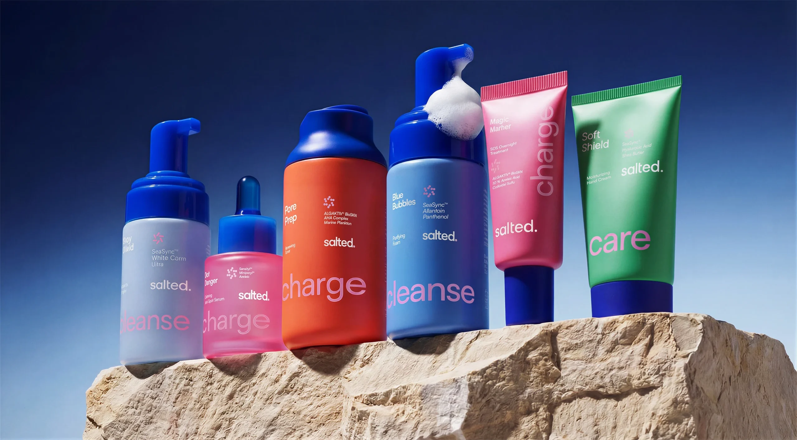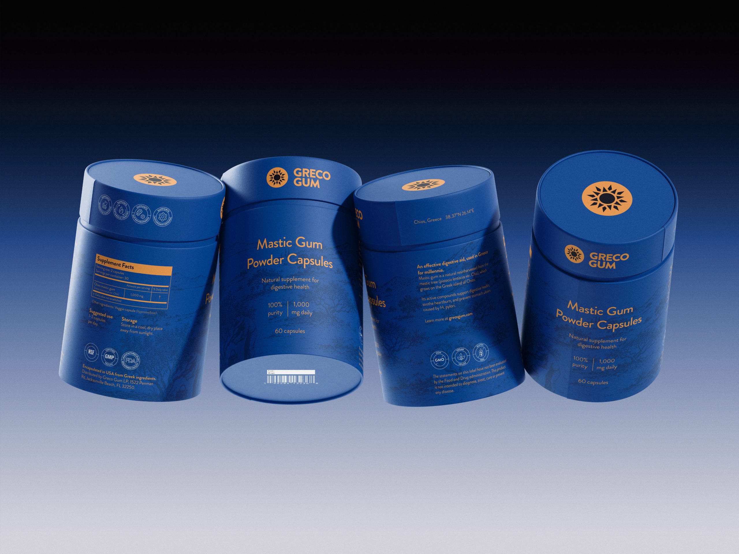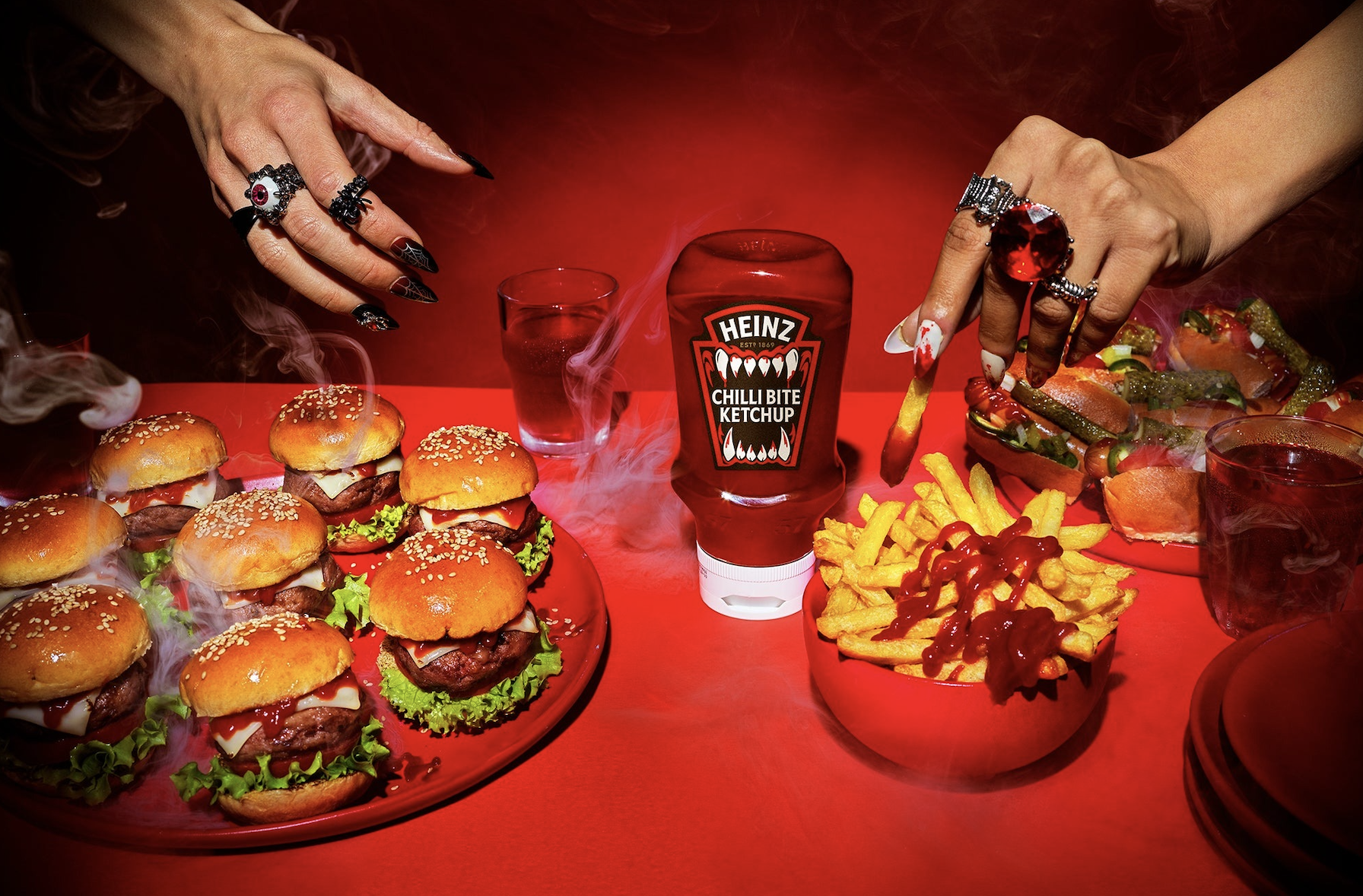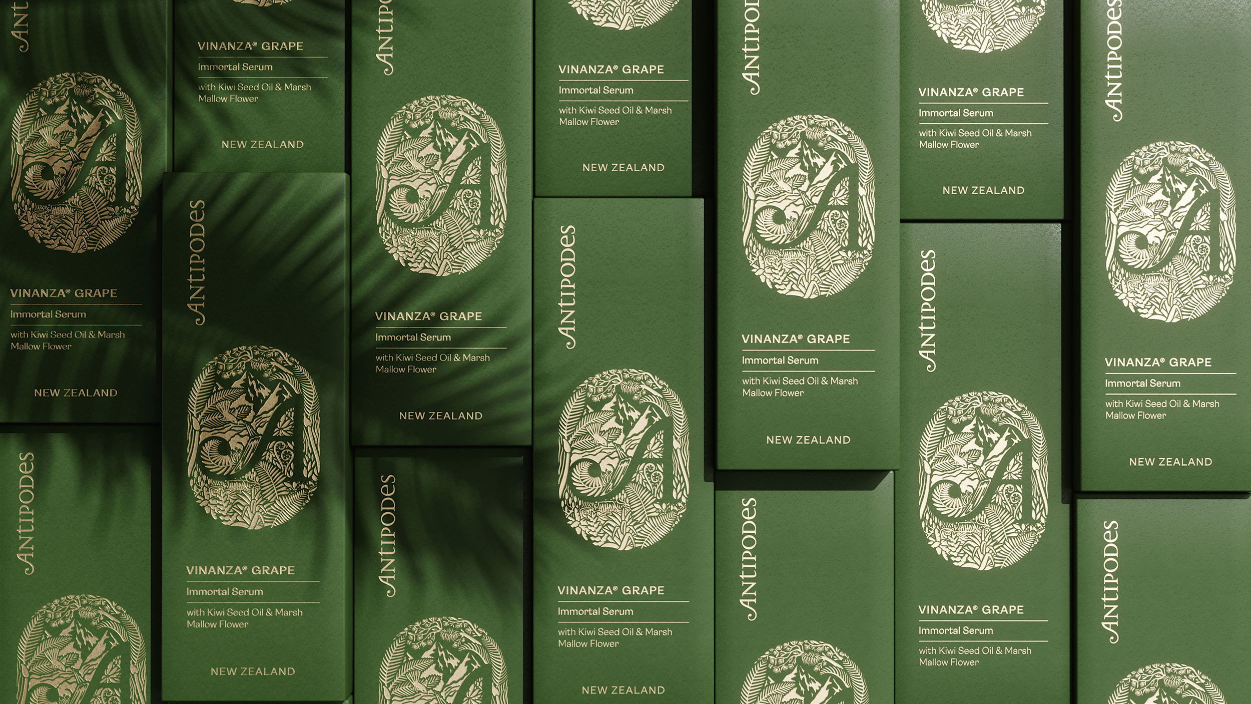
Antipodes is a conceptual redesign created by Petitmoulin Studio to pay homage to the abundant nature of New Zealand and the scientific innovation of their products. The packaging design is both natural and refined, proving that the products are of remarkably high quality. The handmade pattern of the illustrated logo is debased with a gold foil stamping on the outside of the product’s box, adding a perfect shimmering touch to and rich and earthy green box. Antipodes is premium through this conceptual branding alone.
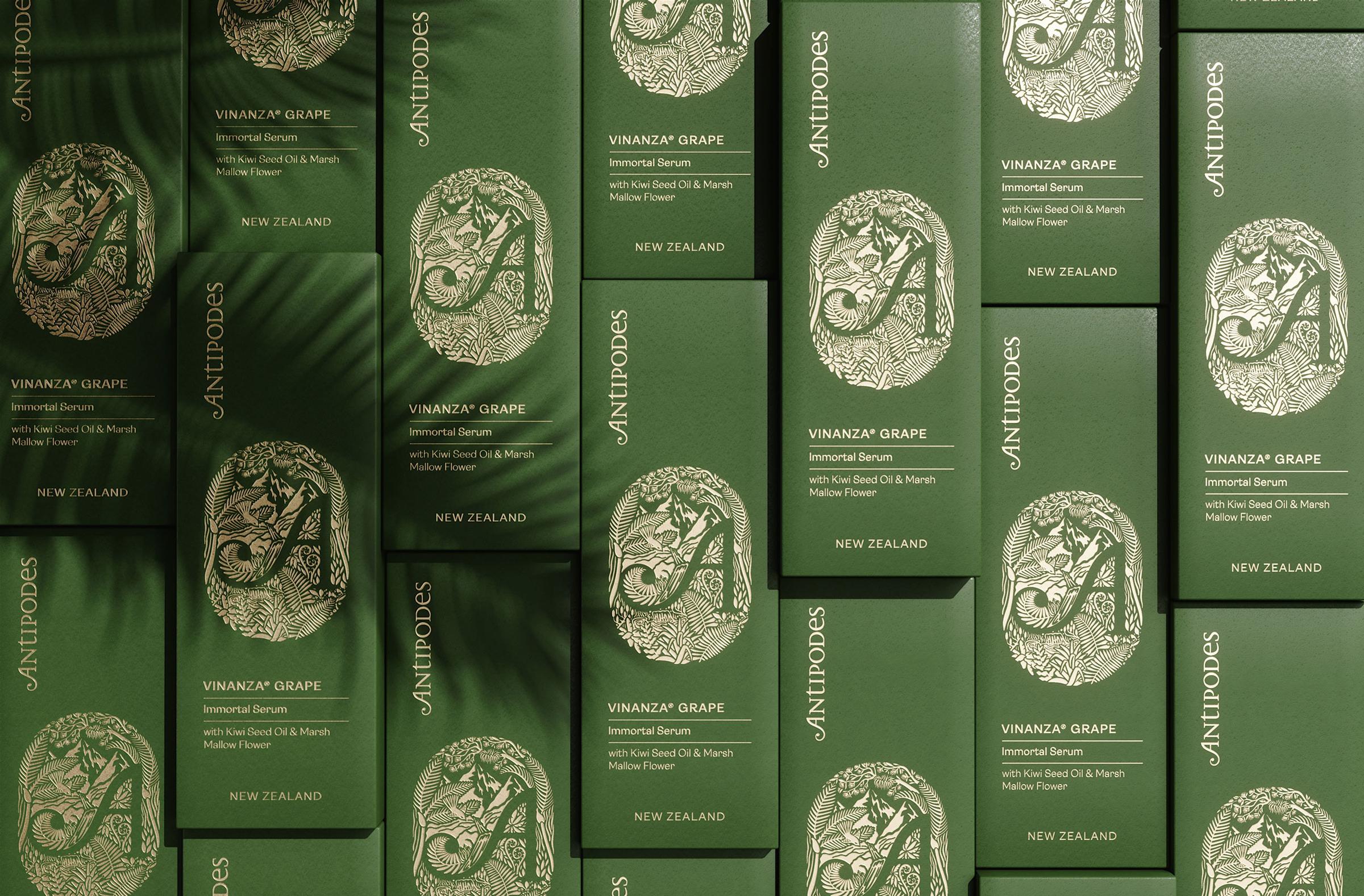
“New Zealand is 42 degrees south of the Equator, two islands surrounded by water that has evolved over millions of years of unpolluted nature, low population density and some of the world’s most untouched nature.” Antipodes’ brand focuses on delivering the world’s highest quality skincare from her lush green New Zealand forests out here on the edge of the world.