Is men’s grooming finally moving away from performative masculinity and toward something more grounded and authentic?
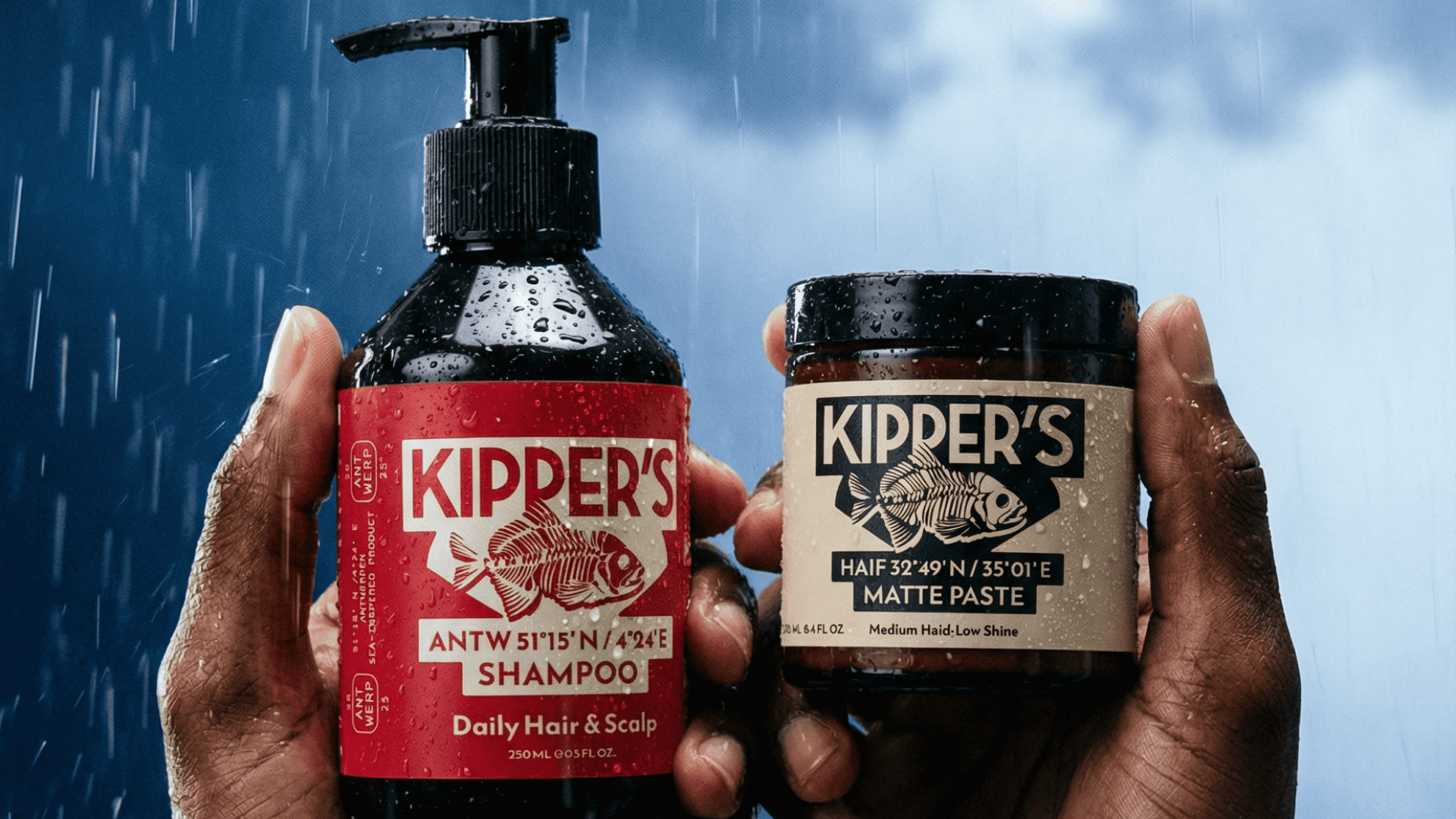
If it is, it’ll be a slow transition, but Kipper’s designed by co+lab points towards a potential cultural shift with the quiet confidence of a brand that has nothing to prove and everything to say.
The central illustration of a fish skeleton resembles a woodcut engraving, drawing on a long tradition of port-city working-class iconography and maritime trade imagery that communicates character without a single word of explanation. The geographic coordinates printed on each product, actual latitude and longitude references that ground the brand in specific real places, are a detail that adds narrative depth to every label. Kipper’s leans on commitment to restraint and meaning over spectacle, creating a brand that treats a daily hair routine as an act of quiet self-respect.