TEAM DR JOSEPH’s Simple Approach To Beauty Packaging Is Highly Intentional
By
Published
Filed under

By
Published
Filed under
Simple packaging can easily be mistaken for “bland” packaging, however, TEAM DR JOSEPH’s minimalistic take is anything but bland. Headless Horse designed the skincare brand’s packaging with sustainability in mind, which is reflected through the straightforward design and no-frills aesthetic. When it comes to skincare, less is often more, highlighted through the sans-serif typography and lack of color. This packaging system is simple, but it’s highly effective and most definitely intentional.
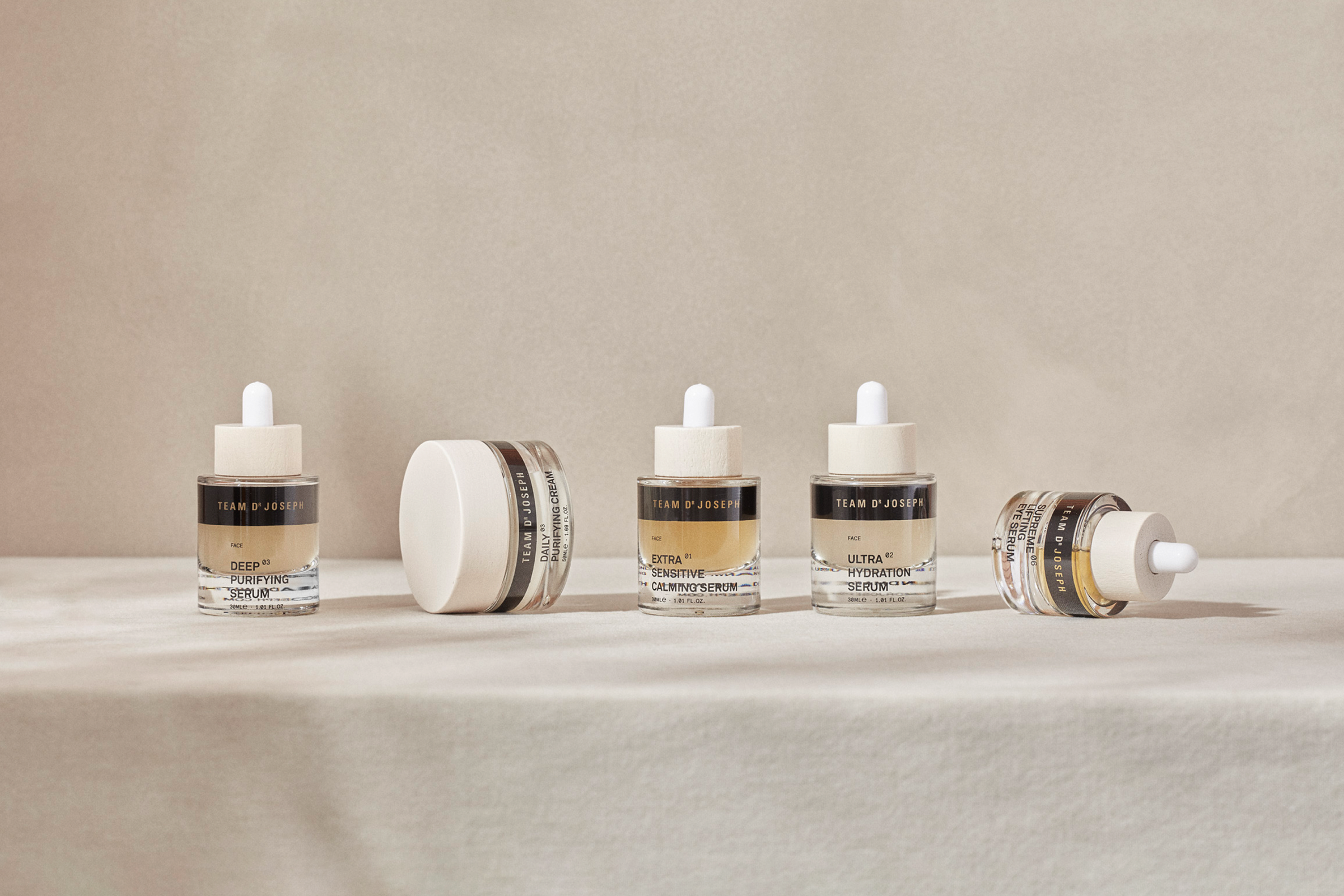
We were approached by TEAM DR JOSEPH to create a refreshed identity. Our objective was to develop an identity and packaging design to be both sustainable and sustained. An identity which was in alignment with the quality of TEAM DR JOSEPH’s formulae, and helping articulate the family’s attention to detail and commitment to producing result-driven skincare — sustainably.
Get unlimited access to latest industry news, 27,000+ articles and case studies.
Have an account? Sign in