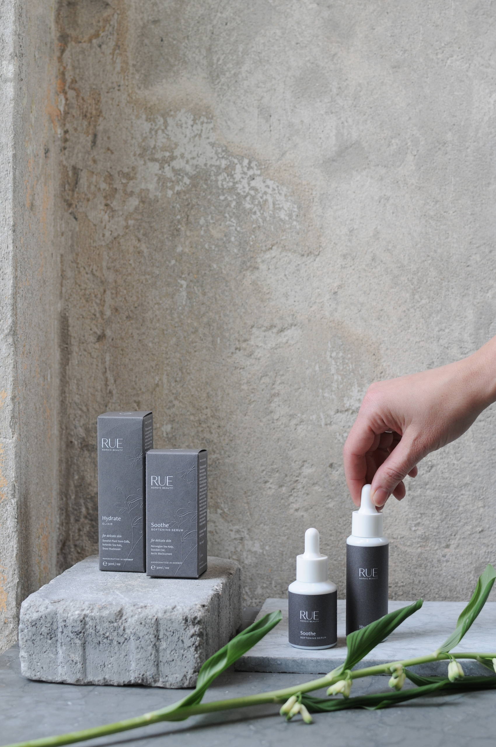
The design for Rue Nordic Beauty is stunning in how clean, modern, and no-nonsense it is. As direct and natural as the ingredients the product contains, the packaging design uses a clean dark grey as the color for it’s packaging. Allowing a clean white bottle dropper design to be the carrier of the product, it gives Rue a distinct authority in the skincare space as being medicinal. The type on the box is crisp, utilizing enough blank space to convey luxury. Rue beauty is unassuming on your shelf, but that’s why you’ll find yourself always drawn to it.
With the seeds of a brand planted firmly in her mind, Kristina, the formulator and founder behind the stunningly sustainable Rue Nordic Beauty, approached me with a logo, an illustration of a rue plant, and an idea. Looking to elevate her brand from concept validation to an international brand known and loved for bringing ease to daily beauty rituals, we paired our talents to create a holistic visual identity inspired by Scandinavia’s deep seas and stormy skies.
Taking inspiration from a moodboard that highlighted nature as a vibrant yet sustainable force, I selected colors and typography to create a modern feel that contrasted Rue’s hand-drawn illustration and grounded the brand. Then we applied that visual identity to the more tangible brand elements — packaging. To enhance the customer experience and differentiate the brand, I sourced textured fibers that would stimulate the senses while establishing the premium feeling that Rue embodies.


