THIS IS IT! DIELINE Awards 2026 Late Entry Deadline Ends Feb 28
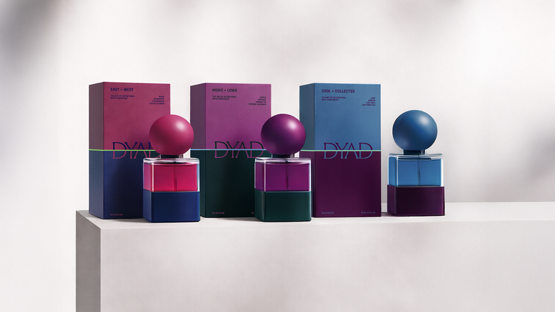
We’re starting to see more and more THC and CBD cocktails enter the market, seemingly heralding the notion that liquid might be the ideal delivery system.
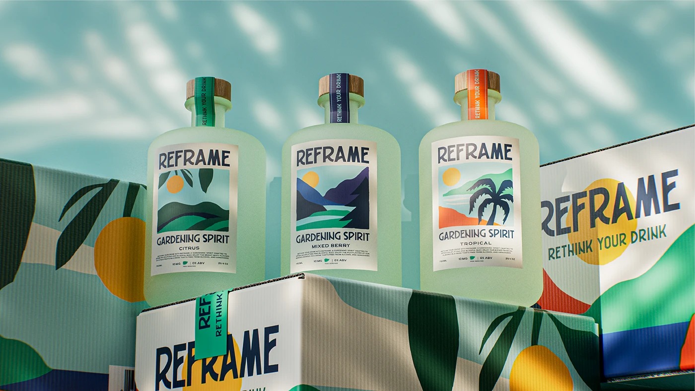
For Reframe, Hi! ESTUDIO reimagines the brand’s visual world through a box system that translates the spirit into landscape, rhythm, and color. Layered planes and synthetic shapes form stylized suns, mountains, and palms, blending natural silhouettes with simplified geometry in a nod to mid-century travel posters.
Get unlimited access to latest industry news, 27,000+ articles and case studies.
Have an account? Sign in