PERC’s In-House-Designed Branding Is A Visual Jolt Of Caffeine
By
Published
Filed under
By
Published
Filed under
Georgia-based Panther’s Eye Roasting Company realized its name is a bit of a mouthful.
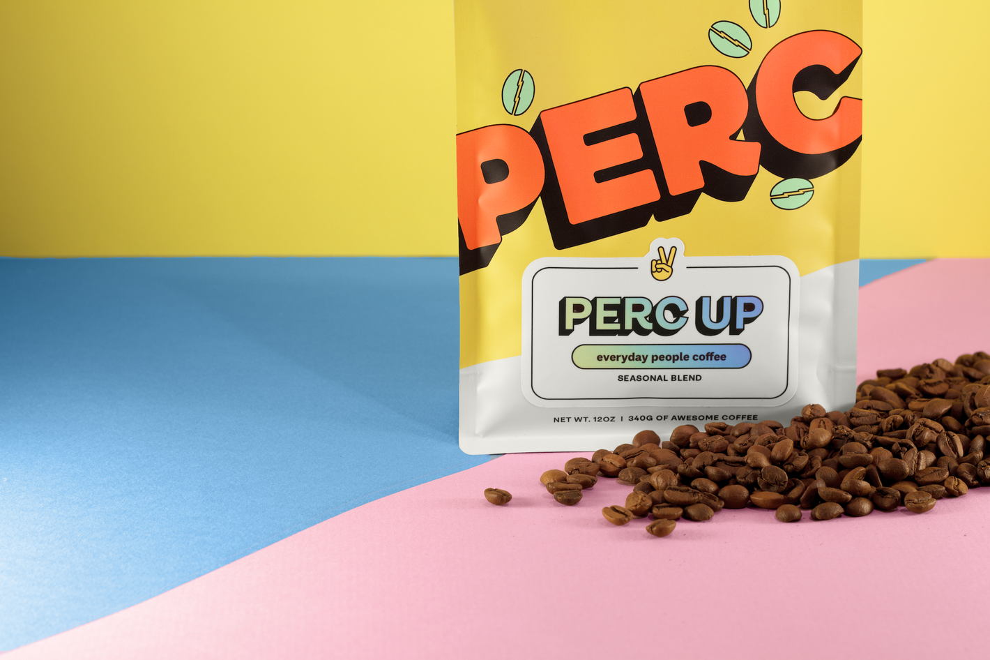
Fortunately for them, the acronym PERC works like gangbusters for a coffee brand. Not only is it a homophone for “perk,” which coffee induces in most of us, but it’s also shorthand for “percolator,” a brewing method that was more popular before the widespread adoption of automatic drip brewers and instant coffee.
PERC’s energy is on full display with the rest of its branding, including the packaging. Designed in-house by Brad Praria with Philip Brown, PERC’s packaging manifests that jolt of alertness fueled by caffeine.
Get unlimited access to latest industry news, 27,000+ articles and case studies.
Have an account? Sign in