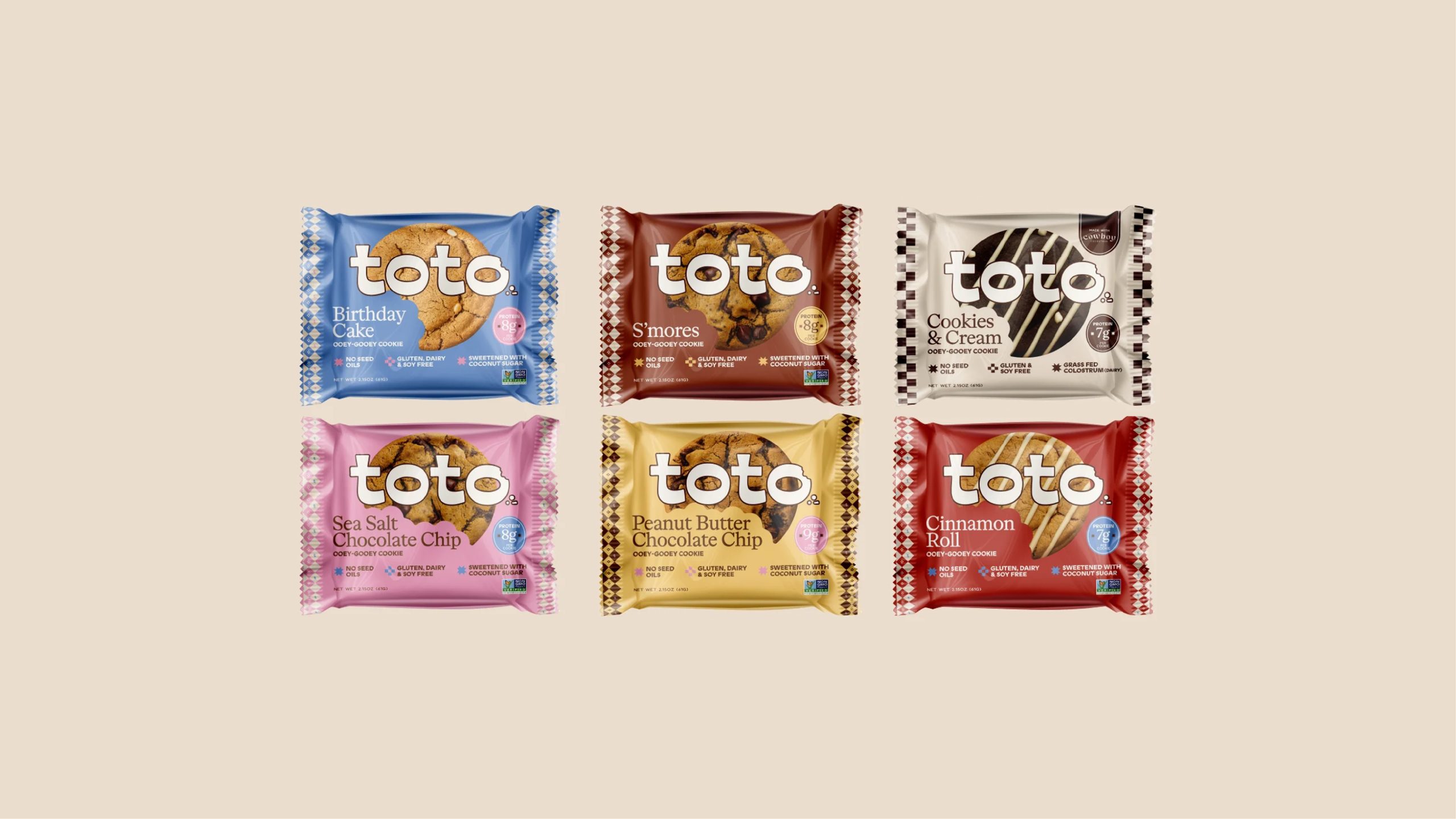
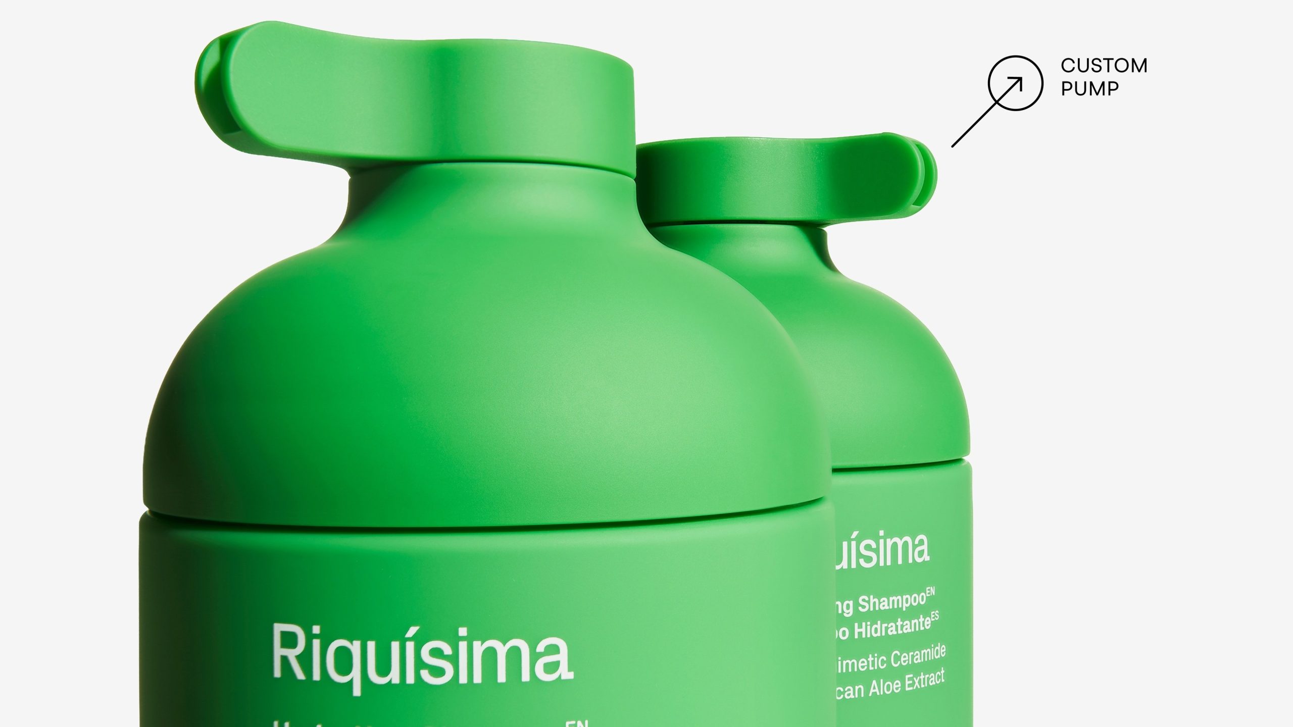
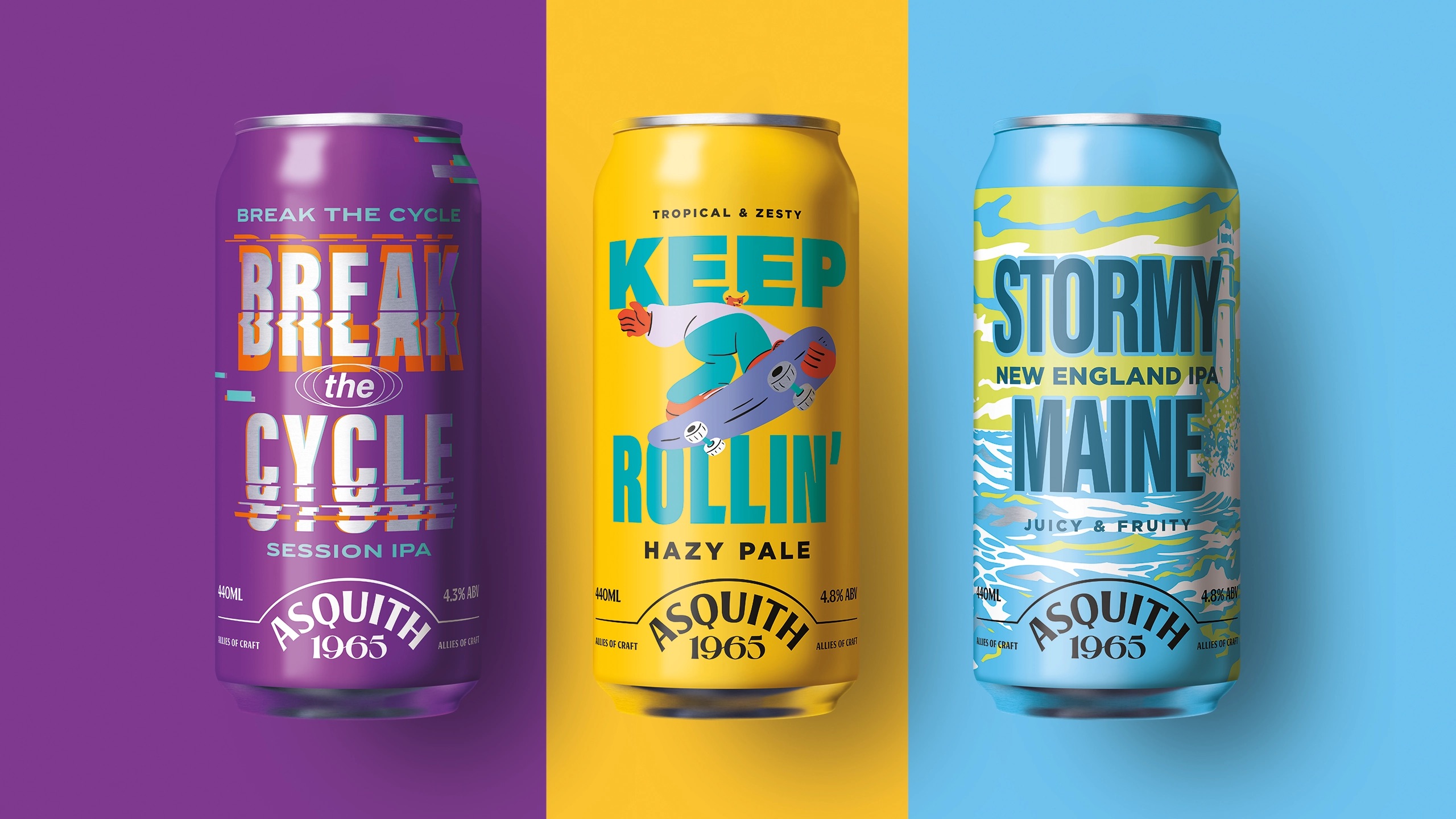
With a playful nod to 90s aesthetics, Penley’s packaging, designed by Simple Integrated Marketing, is simple yet immersive. The light-weight glass bottle, paired with a brightly hued box, creates a packaging experience that makes the brand’s logo truly come to life. It’s refreshing to see a brand’s outer box become part of the packaging suite, proving that every touchpoint does matter and can make an impact on consumer’s shopping experience.
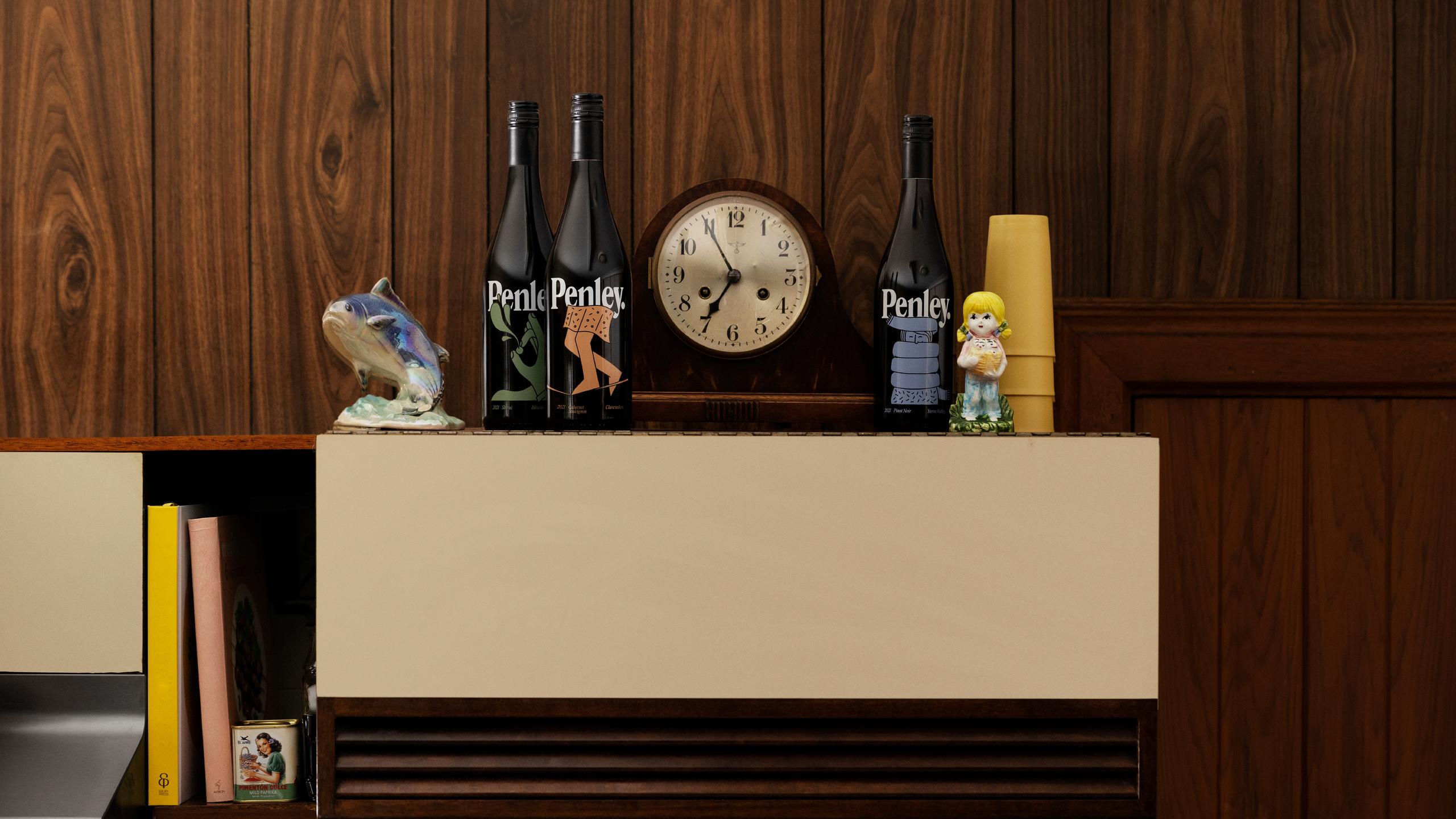
Penley —formerly Penley Estate— is a family-owned winery based in Coonawarra, South Australia, a region famous for its red wines and strip of terra rossa “red soil”. Making a good vintage, a little vintage — In an industry where black and gold runs rampant for premium wine brands, Penley’s palette lets it hair down and splashes colour around with a drop of red.