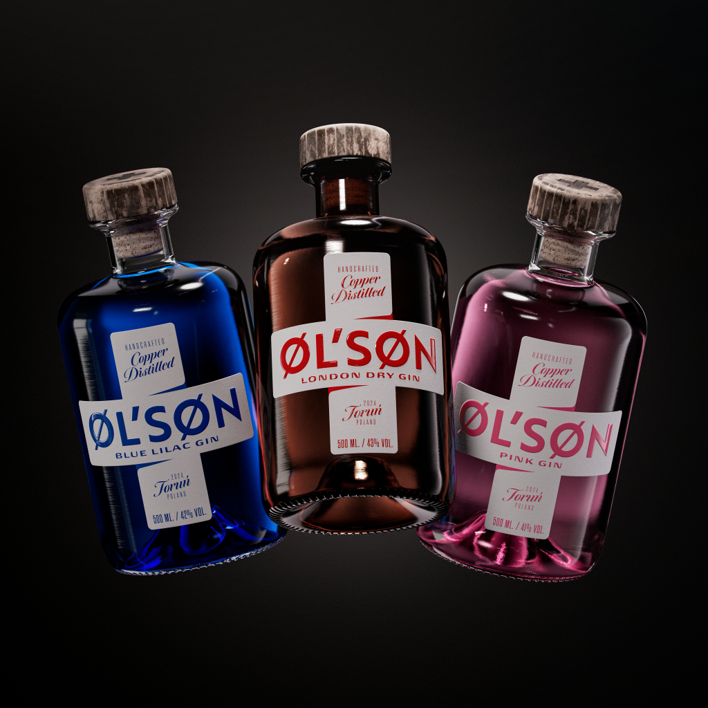
Designed by Van Heertum Design VHD, ØL’SØN Gin’s packaging beautifully melds family heritage with contemporary playfulness. The bottles feature a cross motif, tying in the Gothic origins of Poland’s Toruń and referencing familial connections. The labels, incorporating mathematical symbols and game references, make the brand visually compelling and memorable on the shelf.