Mario Carpe’s packaging design for Collective Arts Rhubarb & Hibiscus Gin is a visual delight, reflecting the brewery’s commitment to merging craft beverages with global artistic talents. Commissioned for this limited-edition gin, the bottle art showcases a playful blend of botanicals inspired by the first bite of an orange, resulting in a juicy and floral profile with a tart, warm ginger finish. Inspired by the juniper leaf, Carpe’s extended geometrical and minimal design exudes polish, emphasizing the spirit’s refined nature. The pink color of the liquid adds a playful and artistic touch, making it an ideal choice for those who appreciate spirits, design, and art.
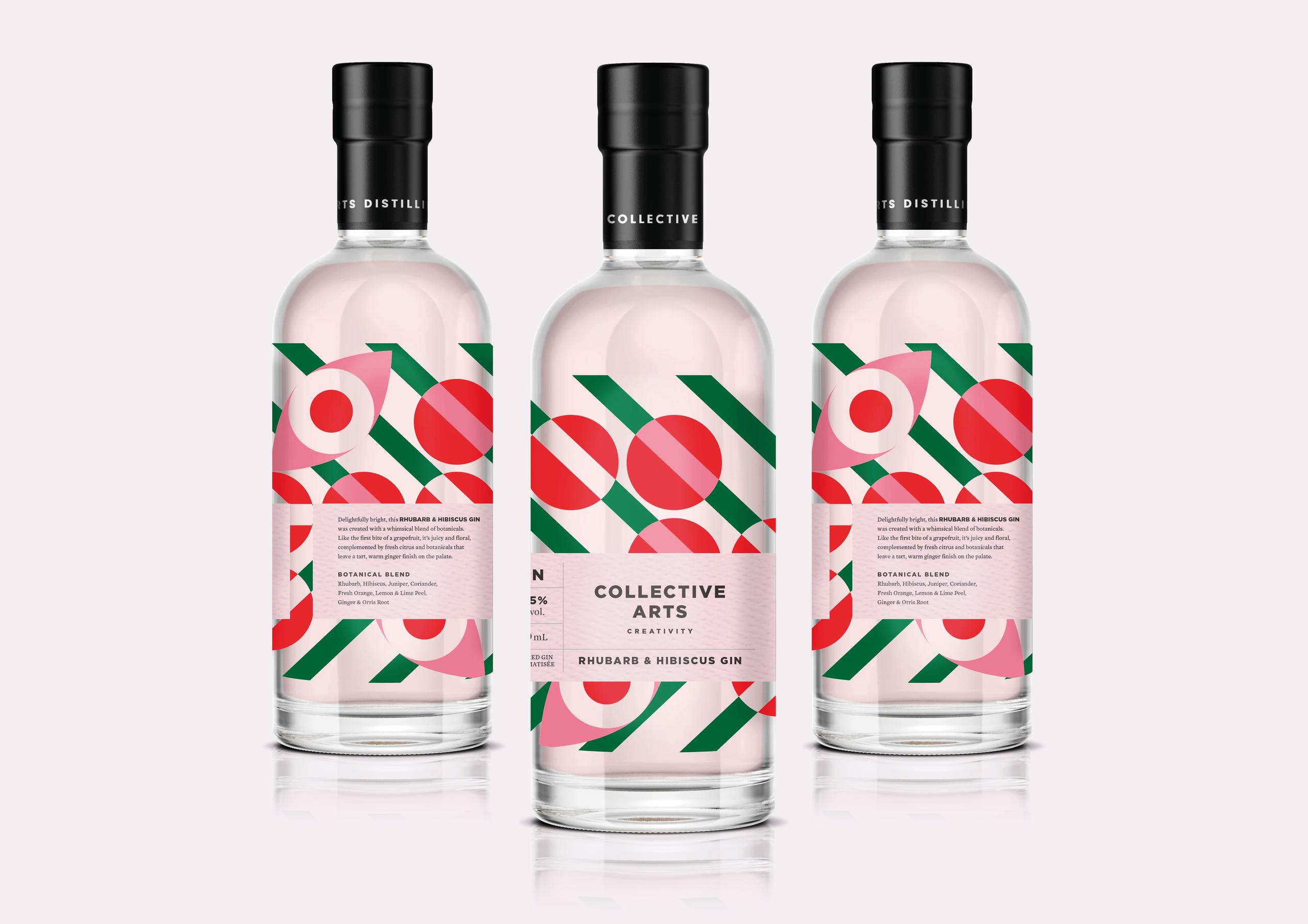
Collective Arts Brewing was started in 2013 and fuses the creativity of craft beverages with the inspired talents of artists from around the world. They feature limited-edition works of art on their labels, and they work to make sure the liquid on the inside is as diverse and creative as the artists they profile. Mario Carpe was commissioned to create the bottle art for their new Rhubarb and Hibiscus Gin, which is delightfully bright, and was created with a whimsical blend of botanicals.