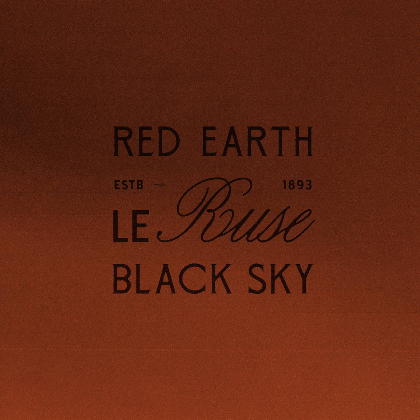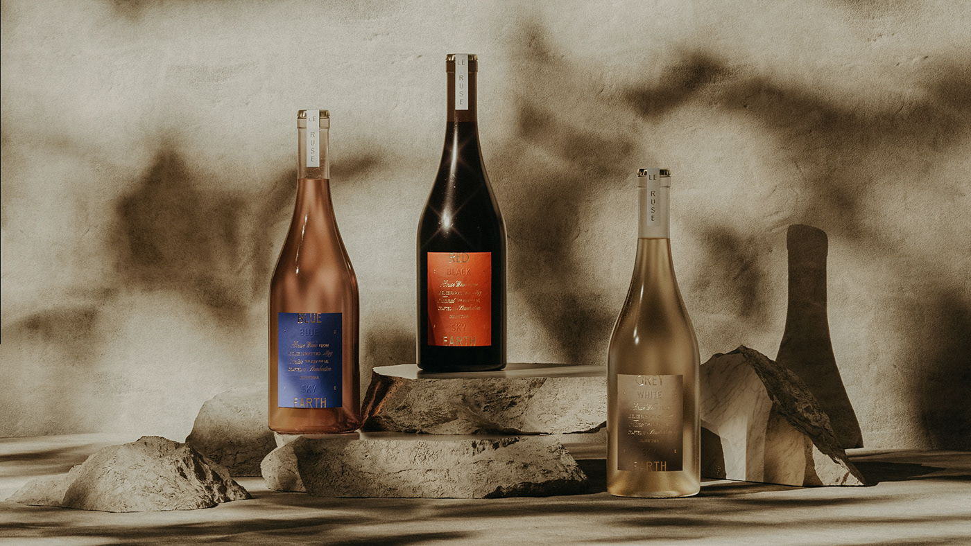
Studio MPLS designed a beautifully moody and equally mysterious label design for Le Ruse’s bottles. The deeply decadent colors paired with romantic typography create an aesthetic that perfectly matches the feeling wine effuses. Plus, the innovative use of embossing techniques proves that the attention to detail in the designing of this packaging system is unparalleled.