Gin Labels For Longcreaux Distilling Co. Create a Delightful Aesthetic
By
Published
Filed under
By
Published
Filed under
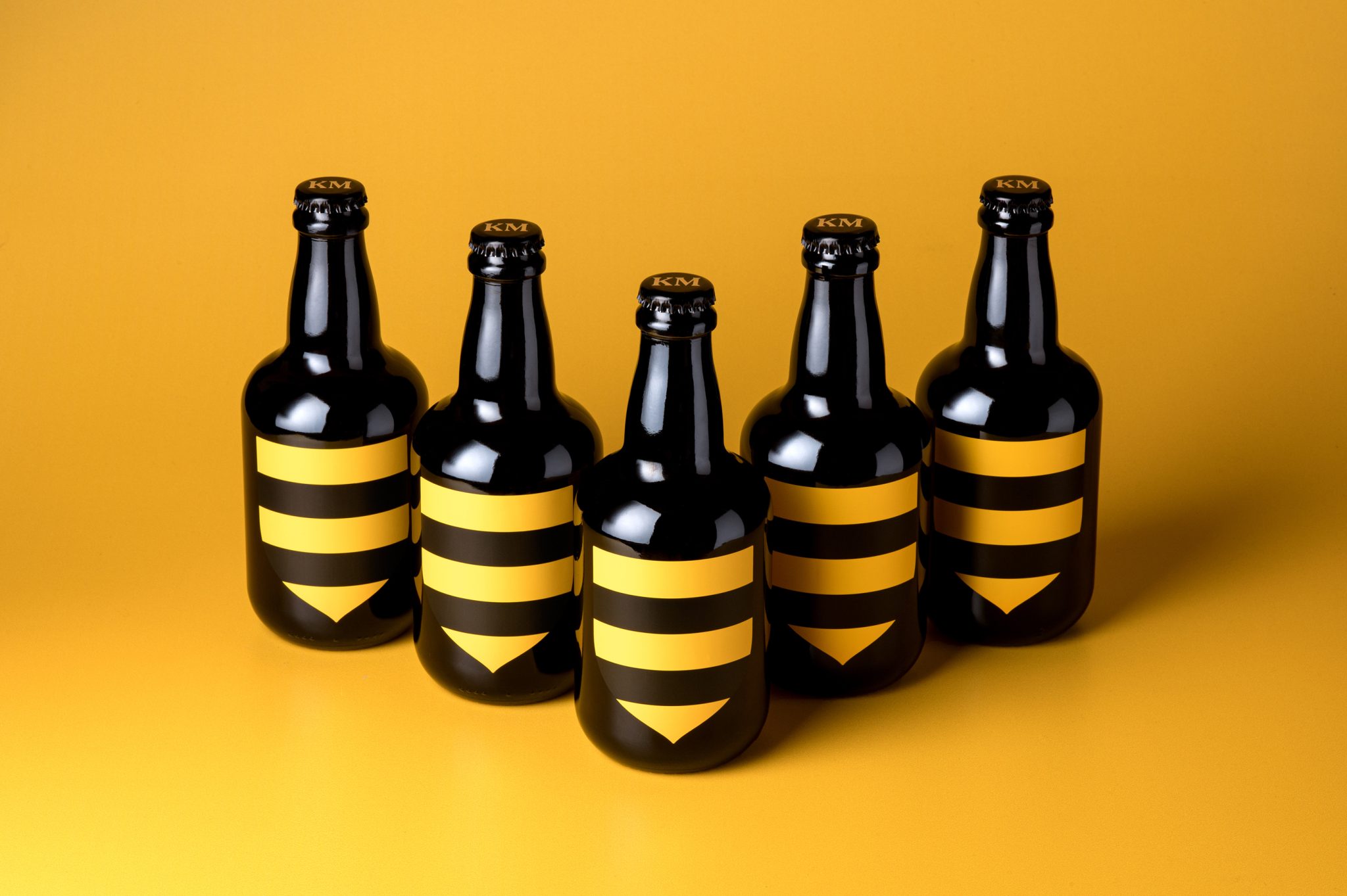
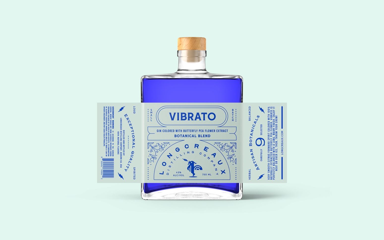
Typography and a beautifully executed format consume Longcreaux Distilling Co.’s packaging, designed by PUSH iQ. The square bottles and wooden stopper complement the more modern label aesthetic. The label is delightful, from the arched typography to the dainty illustrations, ideal for sharing a drink.
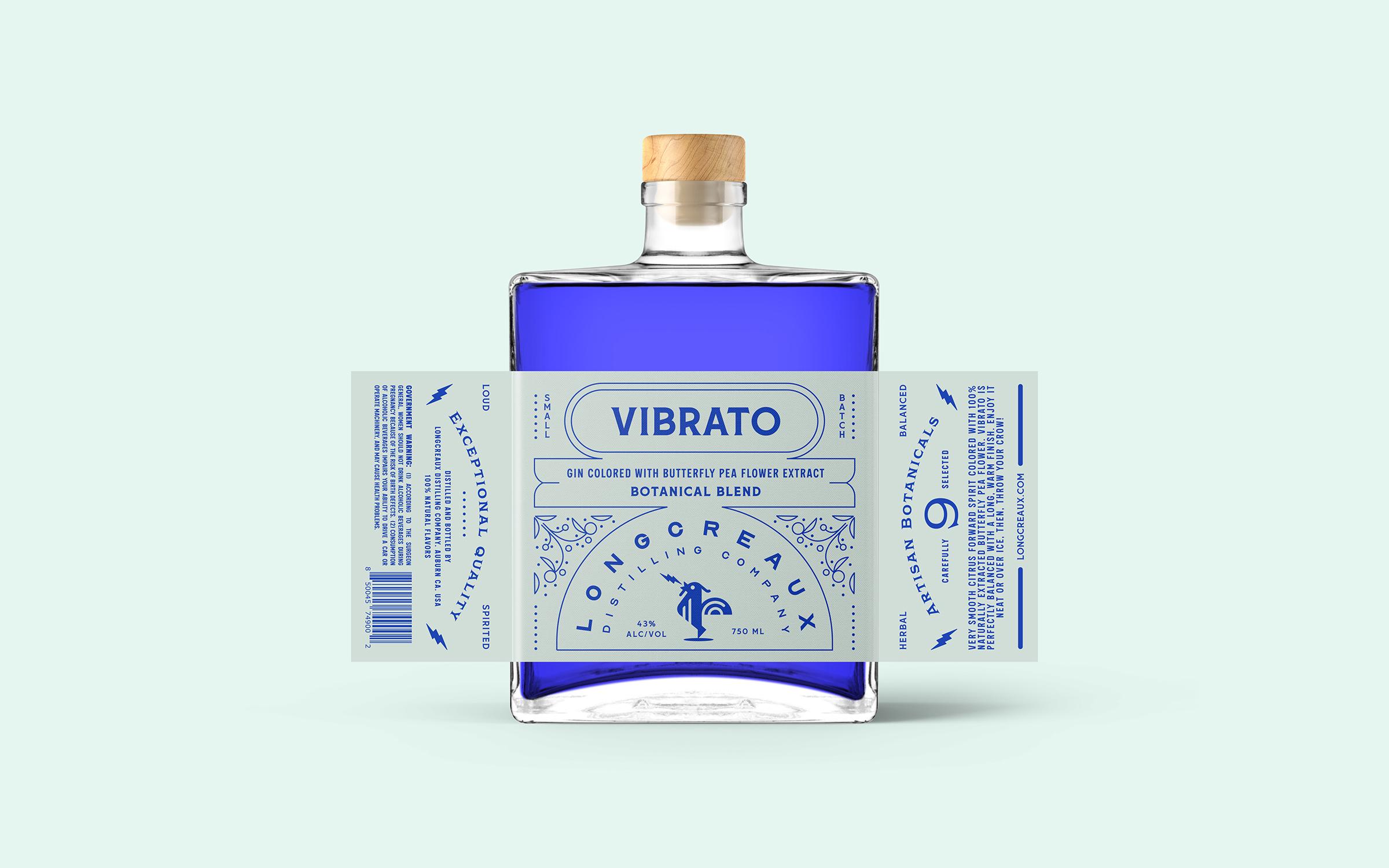
The brand is Longcreaux Distilling Co. Named after a Longcrow chicken. Its like a regular chicken – but cooler and louder. Identified by its unusually long-drawn-out crow, tone and melody. The master distiller of Longcreaux Distilling Co. approaches each blend of their spirits with unique perspective… To “Deconstruct” and “Reimagine”.
Get unlimited access to latest industry news, 27,000+ articles and case studies.
Have an account? Sign in