Foundation Coffee Levels Up with Packaging That’s Grounds for Attention
By
Published
Filed under
By
Published
Filed under
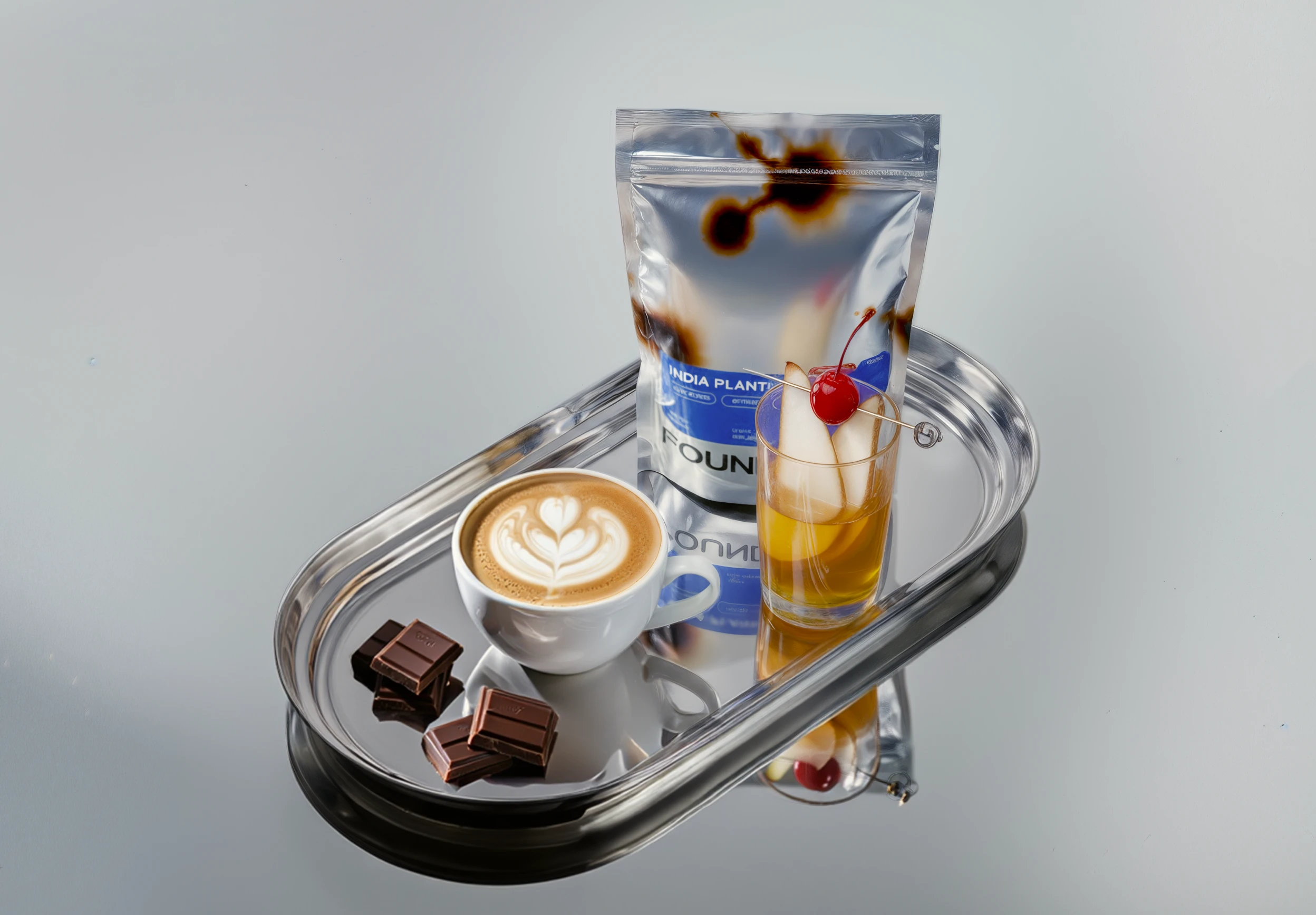
Foundation Coffee Roasters’ packaging leans into a sci-fi lab aesthetic, pairing chrome-like surfaces with fractal burn patterns that look like they’re pulled from a physics textbook. Designer Natalia Balabash uses the reflective material as both canvas and signal, letting the organic, branching graphics break the sterility of the metallic base.
The typography is clean and heavy with an almost industrial tone. On the bag, a bright blue info block snaps the layout into place, giving tasting notes and origin details a clear landing zone amid all the visual static.
Get unlimited access to latest industry news, 27,000+ articles and case studies.
Have an account? Sign in