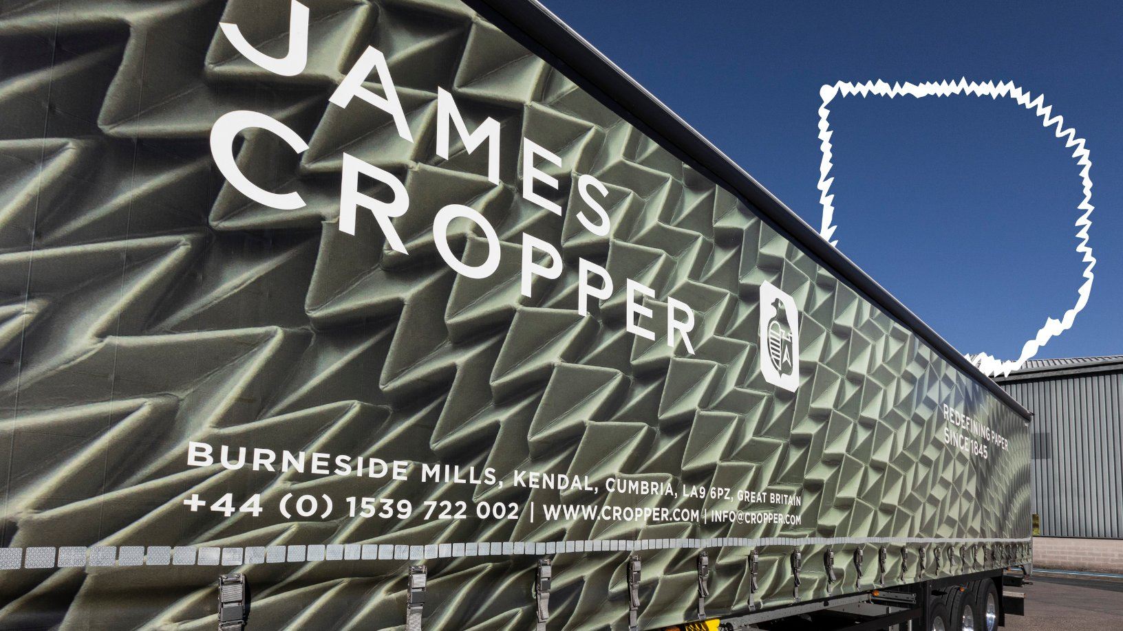
James Cropper, founded in 1845, serves as Europe’s leading colored and specialist paper mill. Recently, the company underwent a redesign for its paper delivery fleet thanks to the sixth generation chairman Mark Cropper.
“The paper fleet was one of the very first things to be branded in the 1960s when we introduced a pigeon logo that was linked to the family crest,” says Cropper. “This was revised in the late 1980s and then in 2000 because I felt the logo and typography in the last format was very bland. There was no further imagery of any kind on the fleet. It didn’t represent what we stood for and needed to be overturned.”