Food photographers are the unsung master craftspeople in the world of CPG and food and beverage branding.
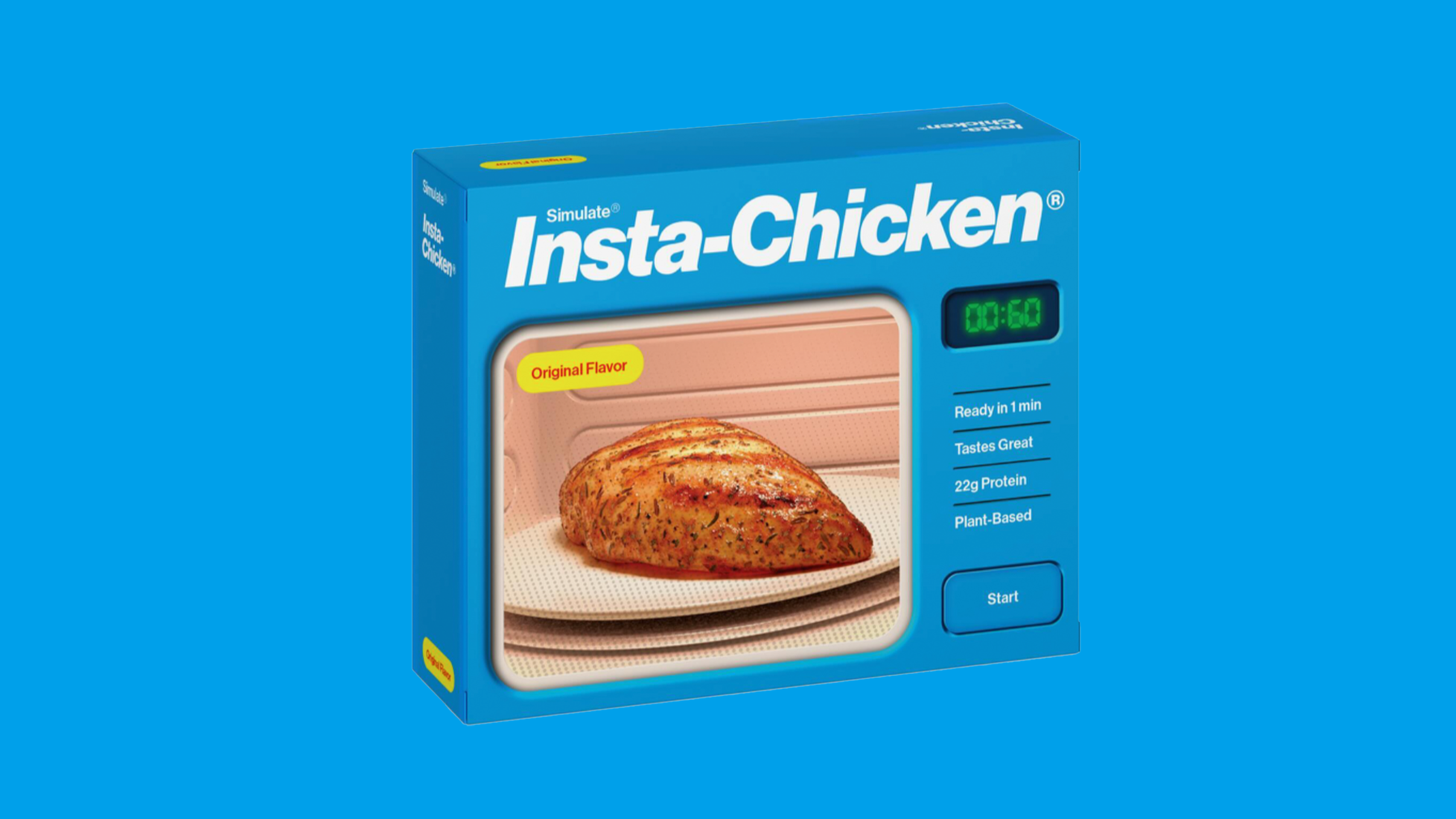
A stunning visual identity system paired with a stellar wordmark or logo is great and all, but for my money, appetite factor will always be king. I’ve long been impressed by the vile things that photographers will do to make food visually appealing, from using motor oil on pancakes (the flapjack doesn’t soak up the oil like it does syrup) or adding glue to mozzarella for an exaggerated and not-at-all IRL cheese pull. Or maybe it’s adding a little bit of oil or a spritz of water to give your images that little extra pop or shine. It’s what sets apart the Dominos and Pizza Huts of this world from run-of-the-mill plasticized rollerink pizza.
And that leads me to a simple truth I’ve learned over the years after having looked at thousands of boxes and bottles and pouches often adorned with images of cherished ingredients or beloved regional dishes, my sort of Michael Pollan-esque mantra about branding the things we eat.