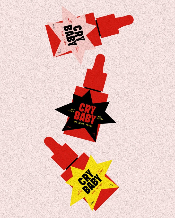
CRYBABY’s packaging by Maslo Studio borrows its bold attitude from protest posters and underground comics. Chunky condensed typography punches forward with tabloid urgency, centered inside a jagged starburst frame. Saturated reds and high contrast accents telegraph heat and intensity without culinary clichés.
There are no literal illustrations, only graphic symbols, which set it apart from the folksy cues common in hot sauce branding and push it closer to street culture than pantry shelf. Plus, the dropper form factor is entirely different than the glass bottles we’re used to seeing. If it’s that hot, only a drop’ll do.