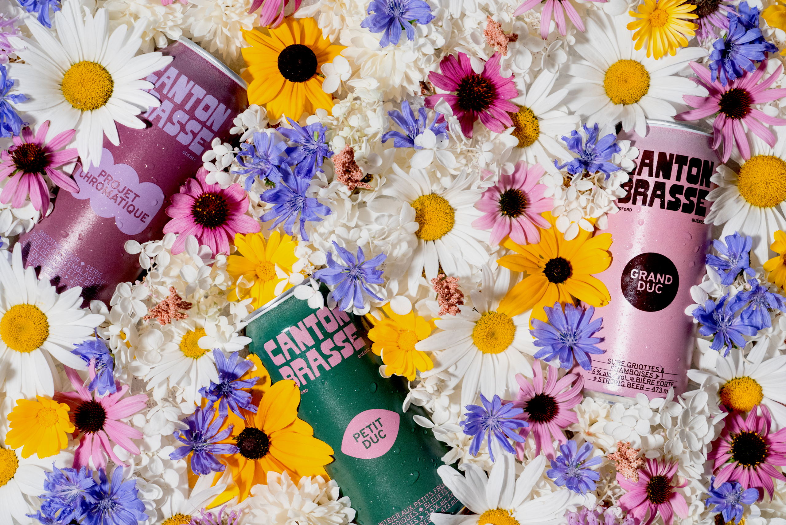
Studio Miles’ packaging design for Canton Brasse Microbrewery reflects a thoughtful redefinition of the brewery’s visual identity. The packaging draws inspiration from the brewery’s stunning location on the edge of Mount Orford National Park. The design captures the essence of wide-open spaces, aiming to create a strong connection between the brand and the local community, tourists, and outdoor enthusiasts. Incorporating elements from the nostalgic West Coast National Parks and outdoor themes adds a touch of authenticity and warmth, while the typographic design creates a memorable visual identity. The color palette is inspired by nature and reminiscent of 70s design, contributing to a vibrant packaging system that evokes the feeling of cracking open a beautiful beer after a rewarding day exploring the great outdoors.

The Canton Brasse microbrewery, located on the edge of Mount Orford National Park, contacted us to redefine their visual identity. After a few years of activity, their intentions have become clearer: to become one of the most visit microbreweries in the Eastern Townships and to create a real feeling of belonging to the brand among locals, tourists and lovers of fresh air.


