Jesy Moliterno designed the sleek packaging design for Cantine Sanpancrazio’s Rosalbòre. The circular cutout in the middle of the label is an innovative way to allow the wine to become part of the design. “Rosalbòre” translates to “pink sunrise light.” This label does a mystifying job of allowing the stunning shade to become the center of it all. Plus, the white label acts as a crisp, clean contrast.
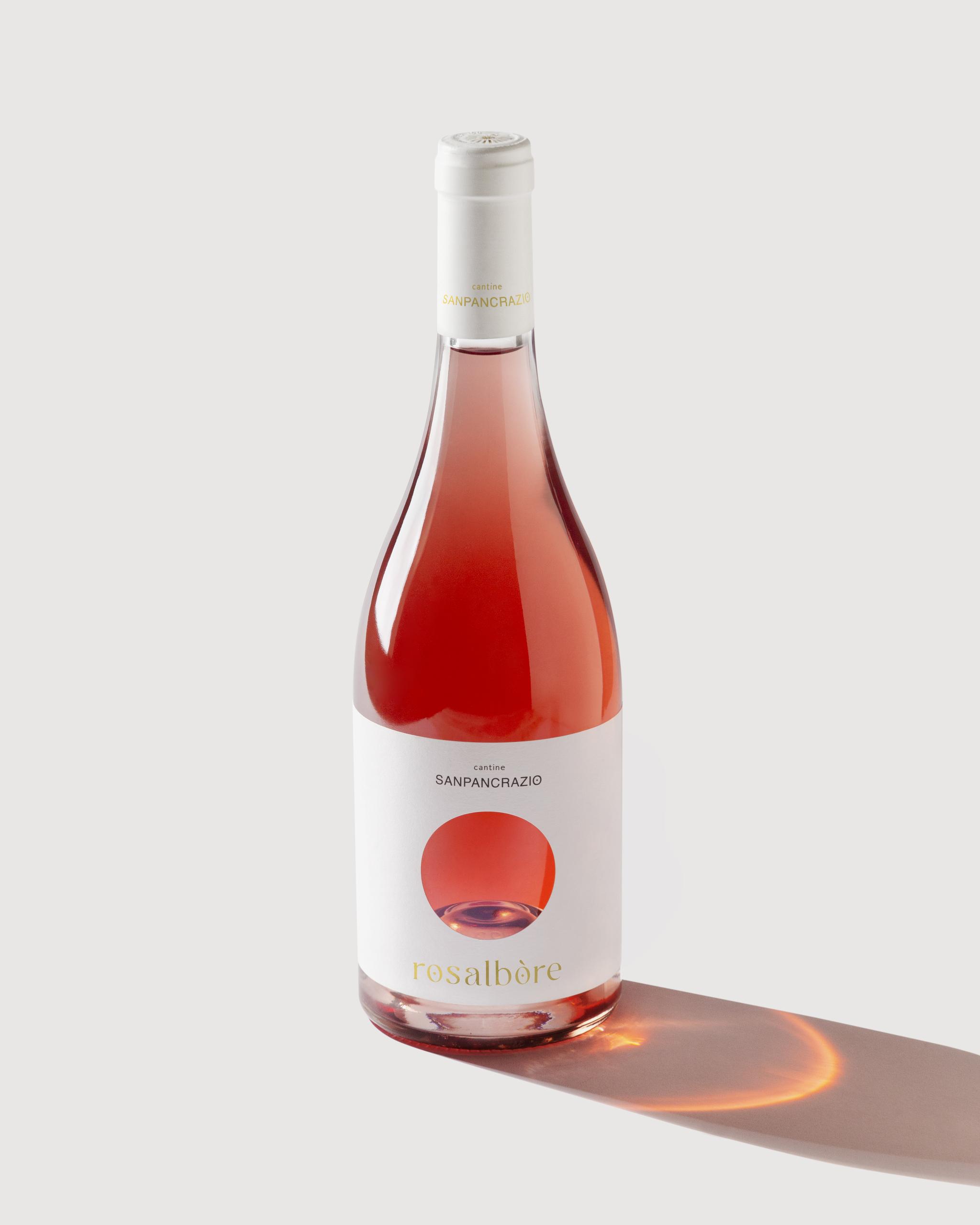
A super minimalistic and conceptual label designed x Rosalbòre rosè wine by Cantine Sanpancrazio. A white label with a round hole reveals the bright cherry color of the wine through the clear bottle glass. The concept and design are inspired by the soft pink sunrise light above the Apulian sea, representing the wine name itself, Rosalbòre, which means indeed “pink sunrise light”. Less is always more when shapes and colors come to help. Printed on natural paper © Fasson Cotton Touch Plus with gold foil details. Presented at © Vinitaly 2023.